Medix Biochemica
Rebranding in-vitro
Rebranding in-vitro
Medix Biochemica is a market-leading in vitro diagnostics raw material supplier with Finnish roots and global branches. They produce and supply high-quality antibodies, antigens and other critical IVD raw materials to enable our IVD customers to manufacture diagnostic tests and supporting materials all around the world.

Project type
Project type
Branding
Branding
Company
Company
Medix Biochemica
Medix Biochemica
Location
Location
UK
UK
Industry
Industry
Pharmacuticals
Pharmacuticals
Role
Role
Co-creative lead
Co-creative lead
Tools
Tools
Adobe
Adobe
Empathise
The problem
Medix Biochemica were a small in-vito diagnostic supplier base din Finland. They’d recently expanded and bought up a lot of competition worldwide to be a worldwide outfit.
Due to the fragmented nature of each companies e-commerce platform they decided to combine each store into a single portal that customers can use.
Research objective
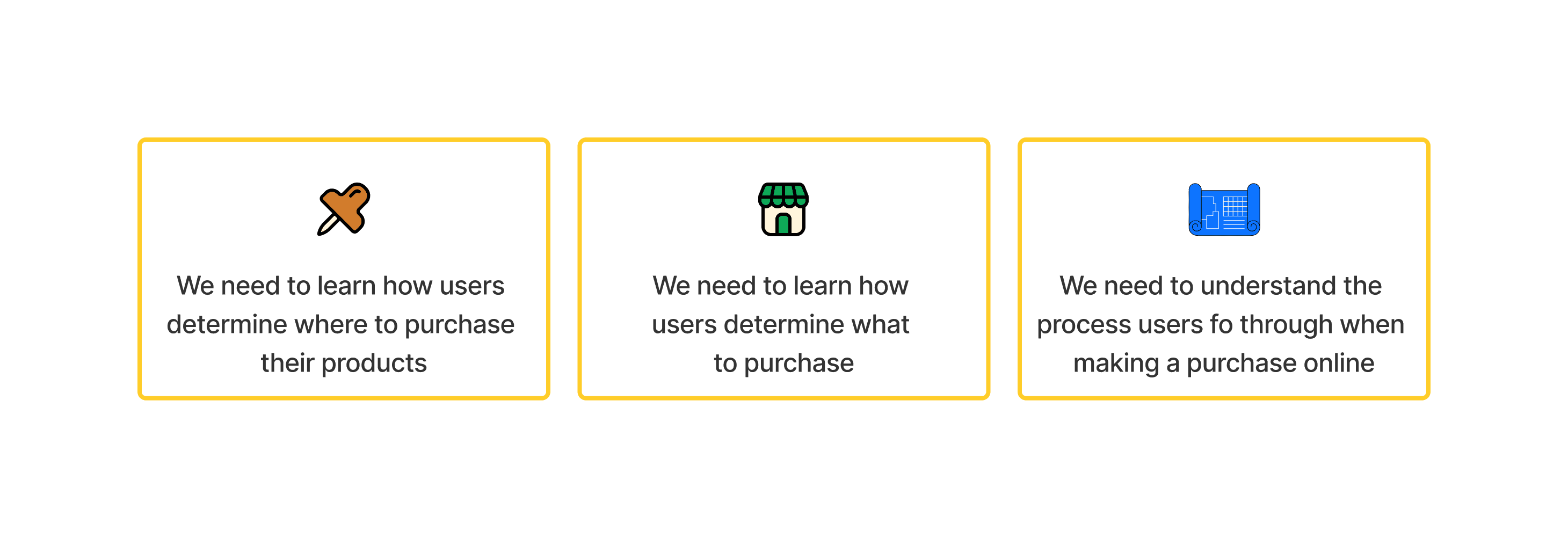
When conducting UX research for building an in-vitro e-commerce store like Medix Biochemica, it's important to define specific objectives that align with both business goals and user needs. These objectives will guide the research process and help ensure that the platform delivers a seamless experience for users, such as researchers, lab technicians, procurement specialists, or others in the biotech and life sciences industries. Here are some key UX research objectives for such a project:

Getting to know our competitors
In the in-vitro diagnostics (IVD) raw materials supplier market, several companies provide key components like antibodies, enzymes, antigens, and other reagents essential for the development and production of diagnostic tests. Some of the main competitors in this market include:
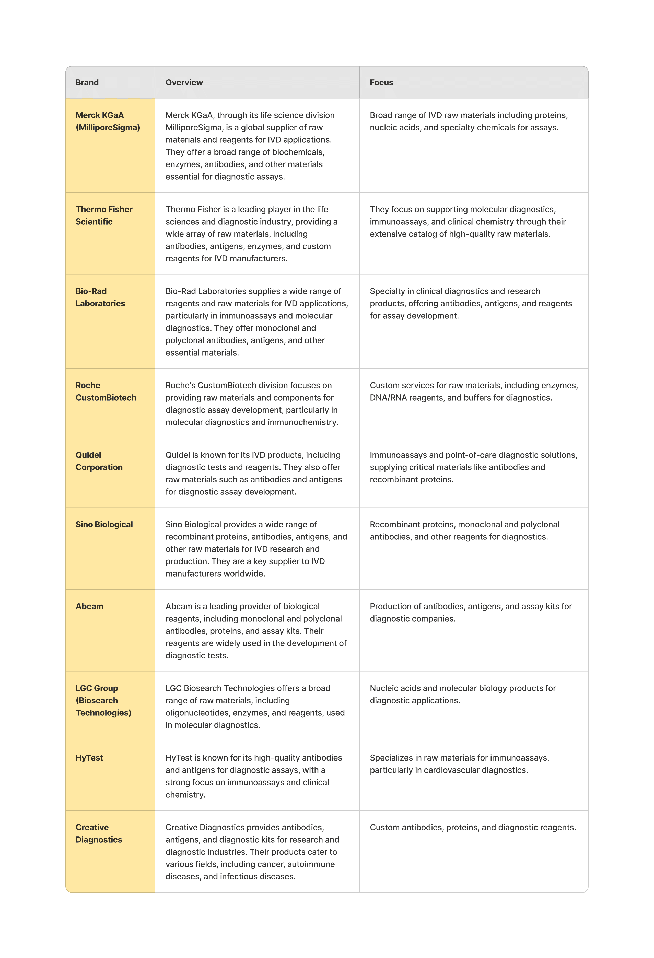

These companies serve as direct competitors to Medix Biochemica, offering a variety of raw materials for the production of in-vitro diagnostic assays, including molecular diagnostics, immunoassays, and clinical chemistry products. Each has its own strengths, whether in terms of product range, custom manufacturing, or global distribution, which differentiates them in the market.
Getting to know our buyers
We interviewed a select group who shop for in-vitro diagnostic products online with varying levels of seniority. We conducted all online.
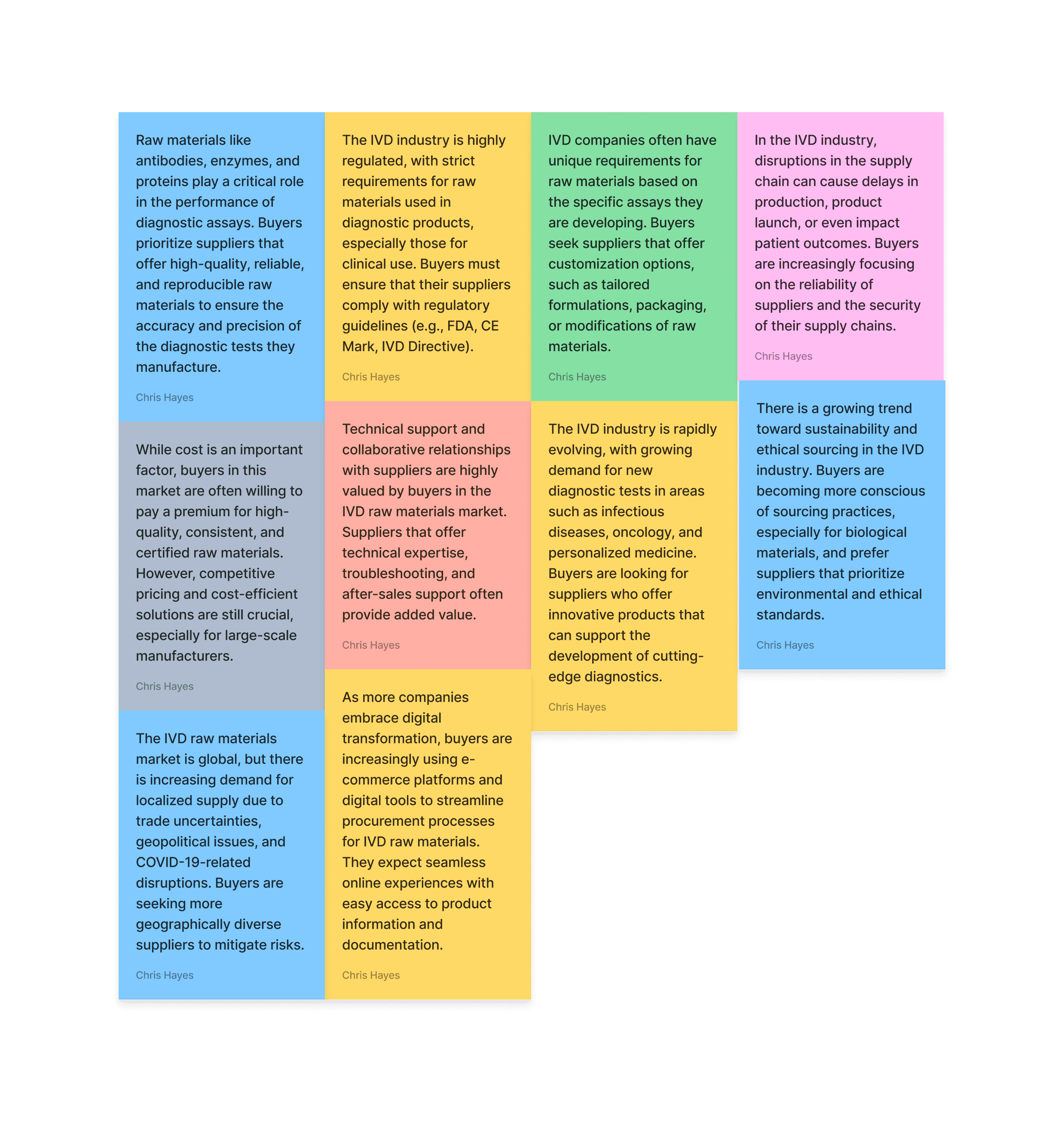

Key user insights
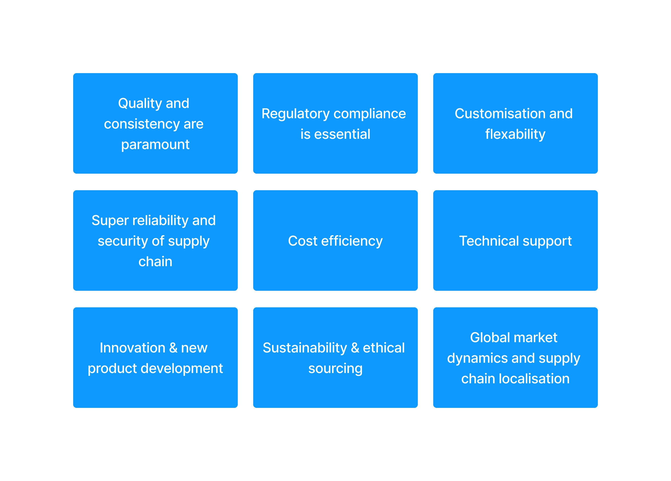

By understanding these insights, buyers can make more informed decisions in sourcing IVD raw materials, ensuring they align with both quality and operational needs, while also adapting to industry trends like sustainability, innovation, and digital procurement.
Define
Research findings
We interviewed a select group who shop for in-vitro diagnostic products online with varying levels of seniority. We conducted all online.
Connect to Content
Add layers or components to swipe between.
How can a website help users make a purchase?
At this stage we were sensitive to the clients pre-vetted solution but after testing this on a browser it was a bit difficult to understand the flow of information but it did have 1 good value.
+ Information was live and allowed you to change your parameters for different results
- Interface was clunky and not very intuative for a patient who wouldn’t understand many of the terms
We workshopped a solution with the client to find a good webapp-friendly solution.
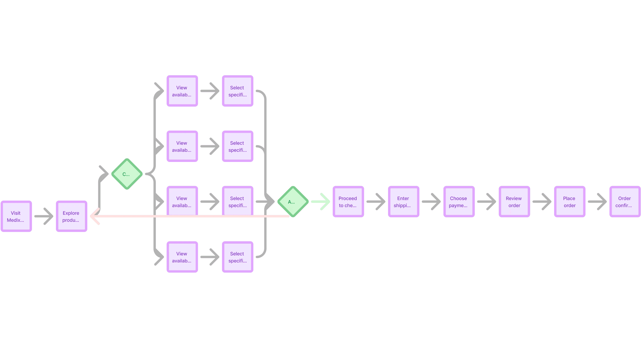
Understanding the product flow
Medix sell over 5,000 products, trying to design an intuitive user flow that helps users navigate through the website easily was a challenge. Many catagories are bucketed into single catagories meaning the unit list was far too long. Or incorrectly bucketed into an existing list to keep user flow clean, but would then be mislabelled.
We eventually managed to bucket it into these main catagories:


These categories cover a wide range of raw materials and reagents essential for diagnostic development and research.

Ideate
Refereces and inspiration
The in-vitro industry isn’t particularly big, so example references were easy to come by for wireframing. We also needed to plug into an existing framework laid down as a baseline code for the new website.
At this stage we were sensitive to the clients pre-vetted solution but after testing this on a browser it was a bit difficult to understand the flow of information but it did have 1 good value.
+ Information was live and allowed you to change your parameters for different results
- Interface was clunky and not very intuative for a patient who wouldn’t understand many of the terms
We workshopped a solution with the client to find a good webapp-friendly solution.
Connect to Content
Add layers or components to swipe between.
After setting out initial mid-fid wireframes key stakeholders wanted a search feature that hero’s on the page for repeat customers. We opted for a repeat-customer feature that allowed customer to re-order easily through their REP or a single click. Stakeholders pushed for a prominent search feature so we looked at a few websites who’s search bar was a key stake in their product.
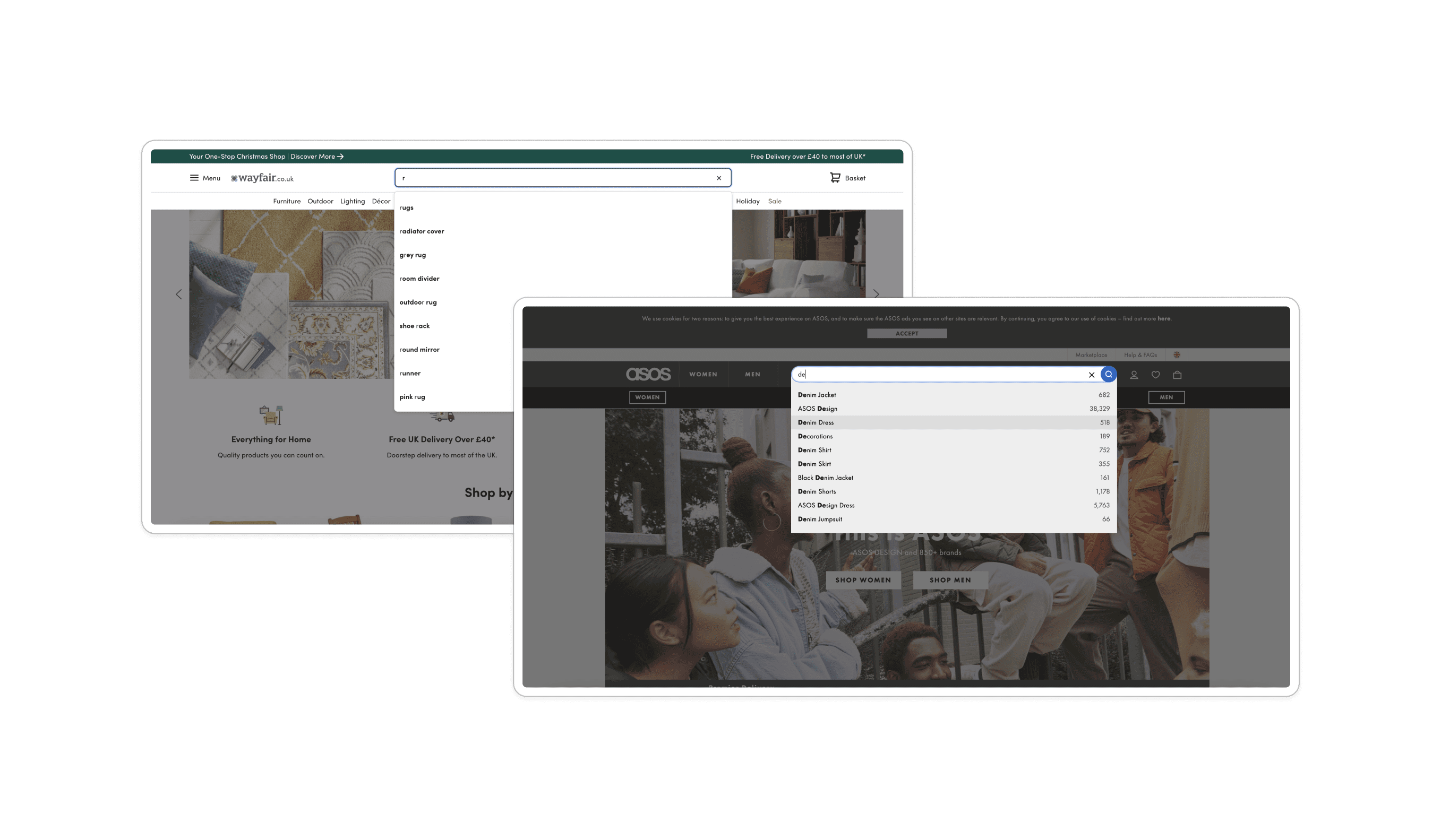

We looked at a few search features that laddered up to our overall business goals
Connect to Content
Add layers or components to swipe between.
Prototype
At this stage we have a working wireframe we were happy with and so started to flow the branding in. We were part of the team understanding their fragmented brand by harmonising it and building their brand guidelines so to flow their brand styling into the UI was an easy lift. As we did so we incrementally tested pages with our UT base to make sure everything flowed in as normal.
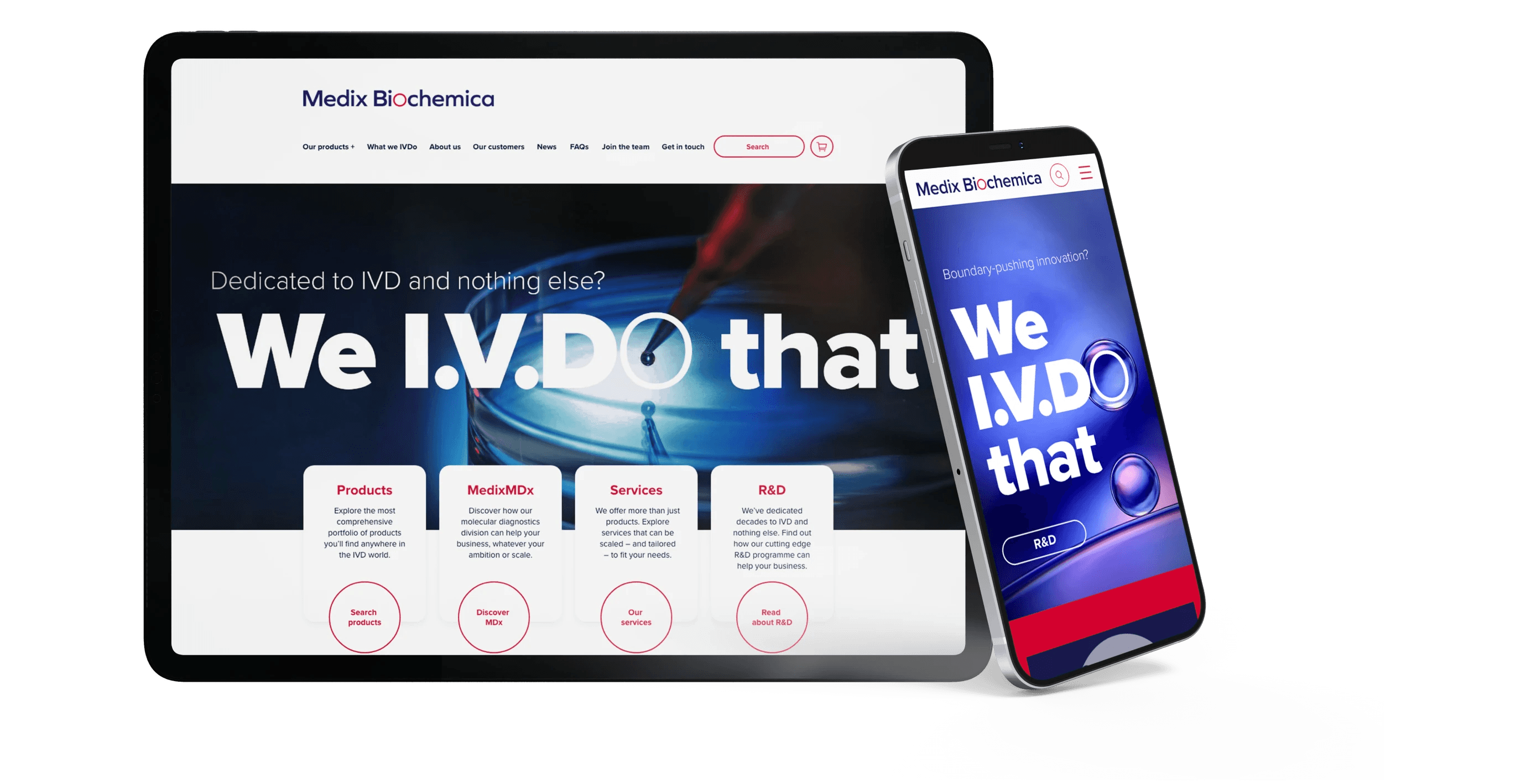

Iterating based on usability tests
We looked at usability testing for four main criteria to help optimise for a user-first experience
Navigation & Search: Test how easily users can find specific products or information using the site's navigation, search bar, and filters.
Product Pages: Evaluate whether product details are sufficient and clearly presented, allowing users to make informed purchasing decisions.
Checkout Process: Test the ease of the ordering process, including account creation, payment options, and order confirmation.
Mobile Usability: Assess the mobile responsiveness and ease of use on different devices.
Iterating the search features
Key stakeholders were keen to refine the search feature even further, so we looked at several options that included the key styling to help bring it to life.
Connect to Content
Add layers or components to swipe between.
Finalising for development
Once stakeholders were on board we started to flow files over to development. We did small iterations of user testing as we went through to tweak certain aspects of the site.
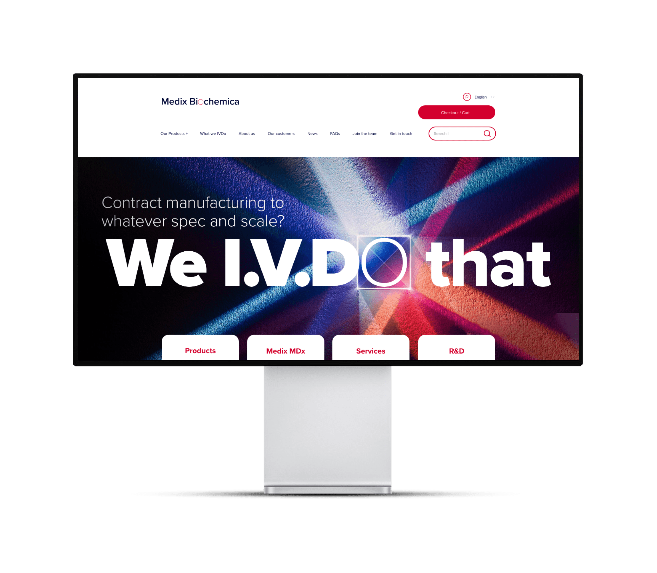
The hero screen moved from a single image to a video showcasing the five main areas of the business. we used key photography from the I.V.Do Campaign overlaid by the hero typography to create a carousel video.

Empathise
The problem
Medix Biochemica, a Finnish in-vitro diagnostics supplier, seeks to rebrand to strengthen its market presence and improve customer engagement.
Interviews and surveys
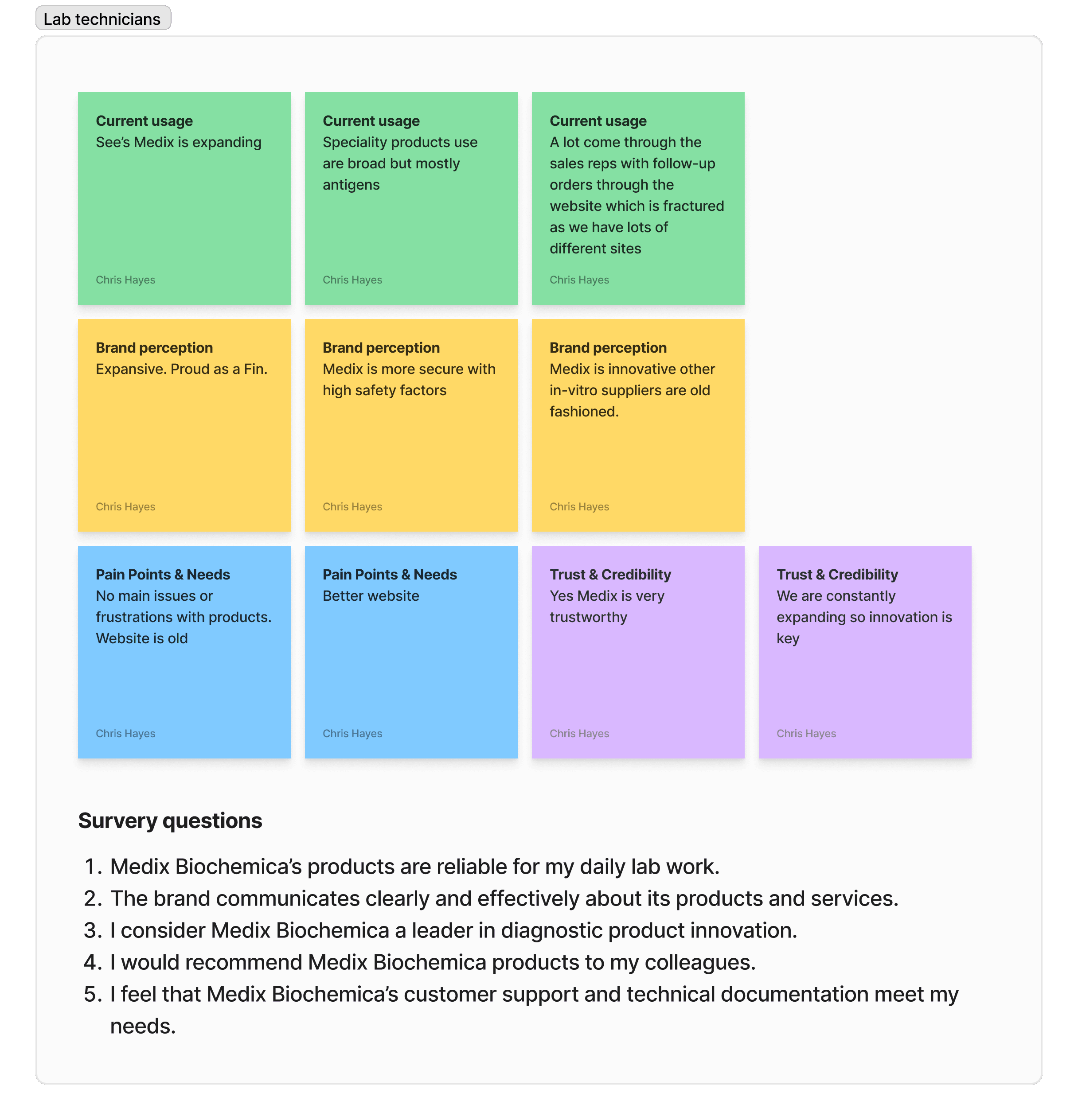
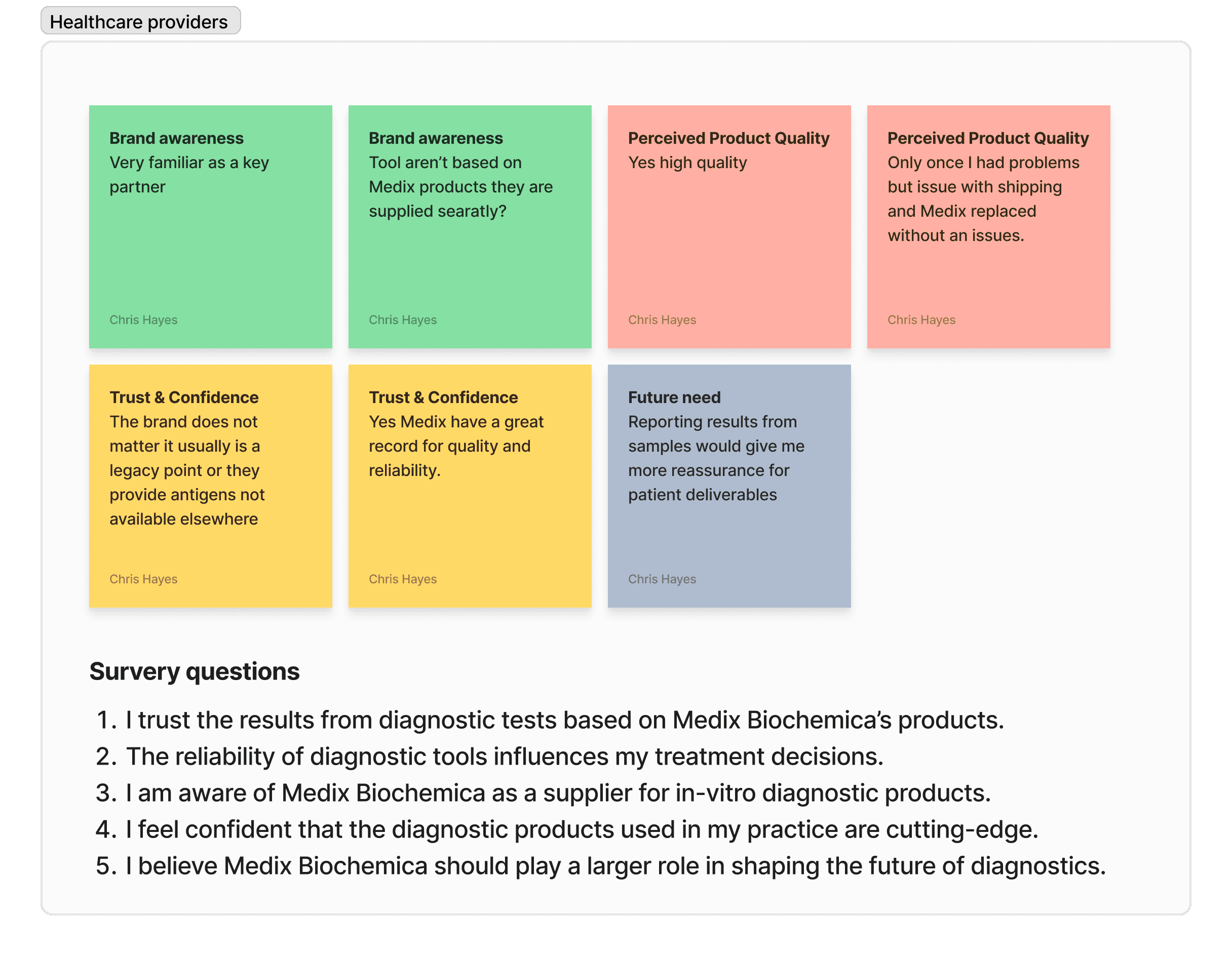
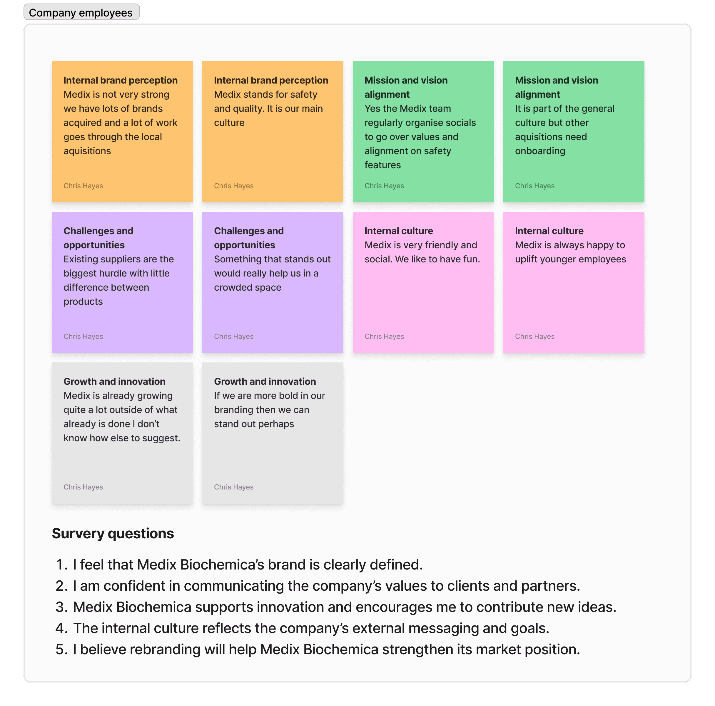
We conducted interviews with various stakeholders, such as lab technicians, healthcare providers, company employees, and industry experts. Capturing insights on how they perceive Medix Biochemica, their experiences with the products, and expectations from the brand.
Competitive research
Next, we analyze competitors’ branding strategies in the diagnostics and biotech sector. Understand what works well for them, how they differentiate, and what opportunities exist for Medix Biochemica to stand out.

Customer journey Mapping
We explored touchpoints where customers interact with the brand (e.g., website, sales, product experience). You can see where we found friction points or gaps in communication and user experience.
Note: This stemmed from the original ask of a new website, so website insights can be found in the case study here.
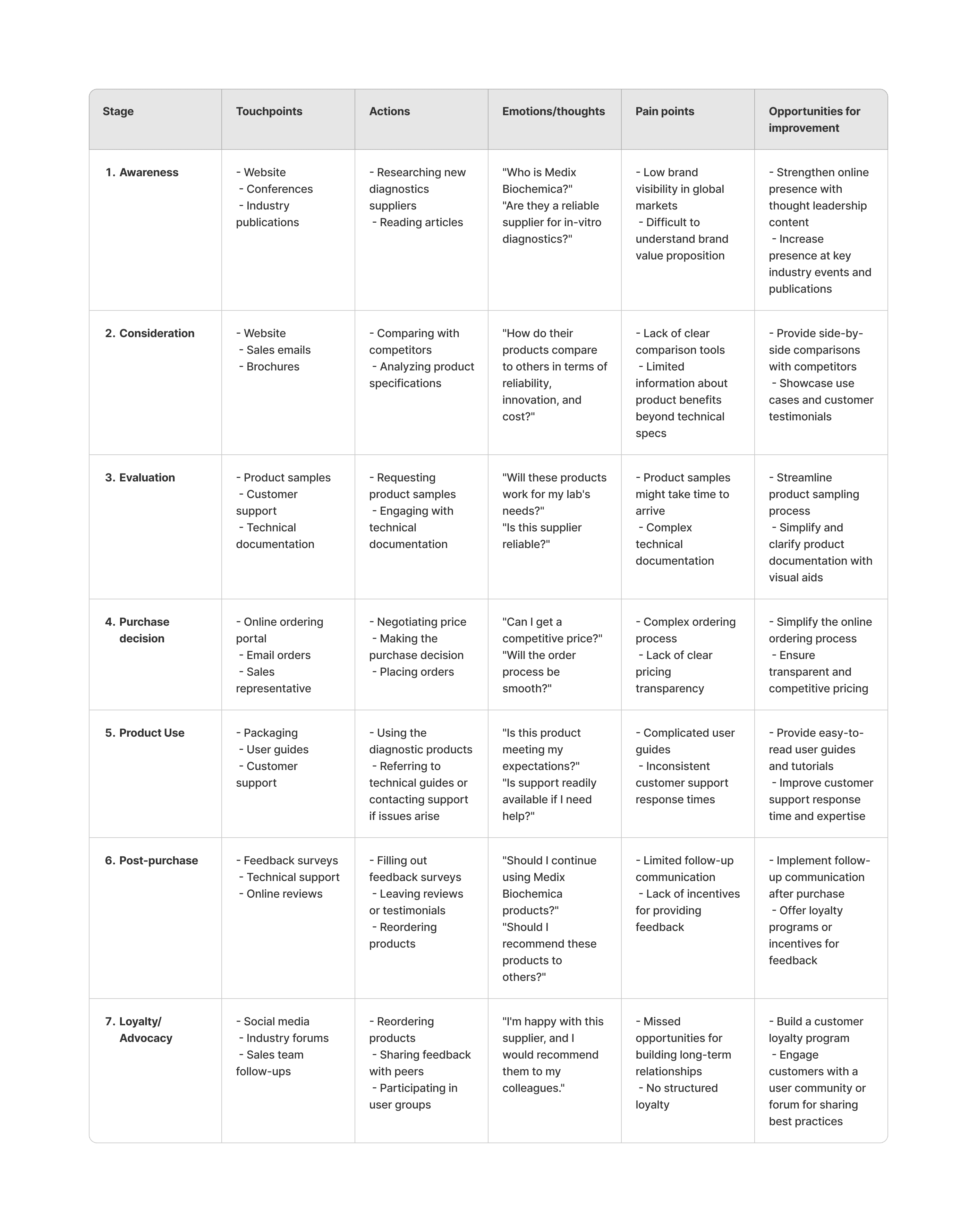
This Customer Journey Map provides a clear view of how lab technicians interact with Medix Biochemica at every stage, from awareness to loyalty. It reveals opportunities for improvement, particularly in raising brand awareness, simplifying technical resources, improving customer support, and building customer loyalty programs. These insights can inform rebranding efforts to enhance the overall customer experience.
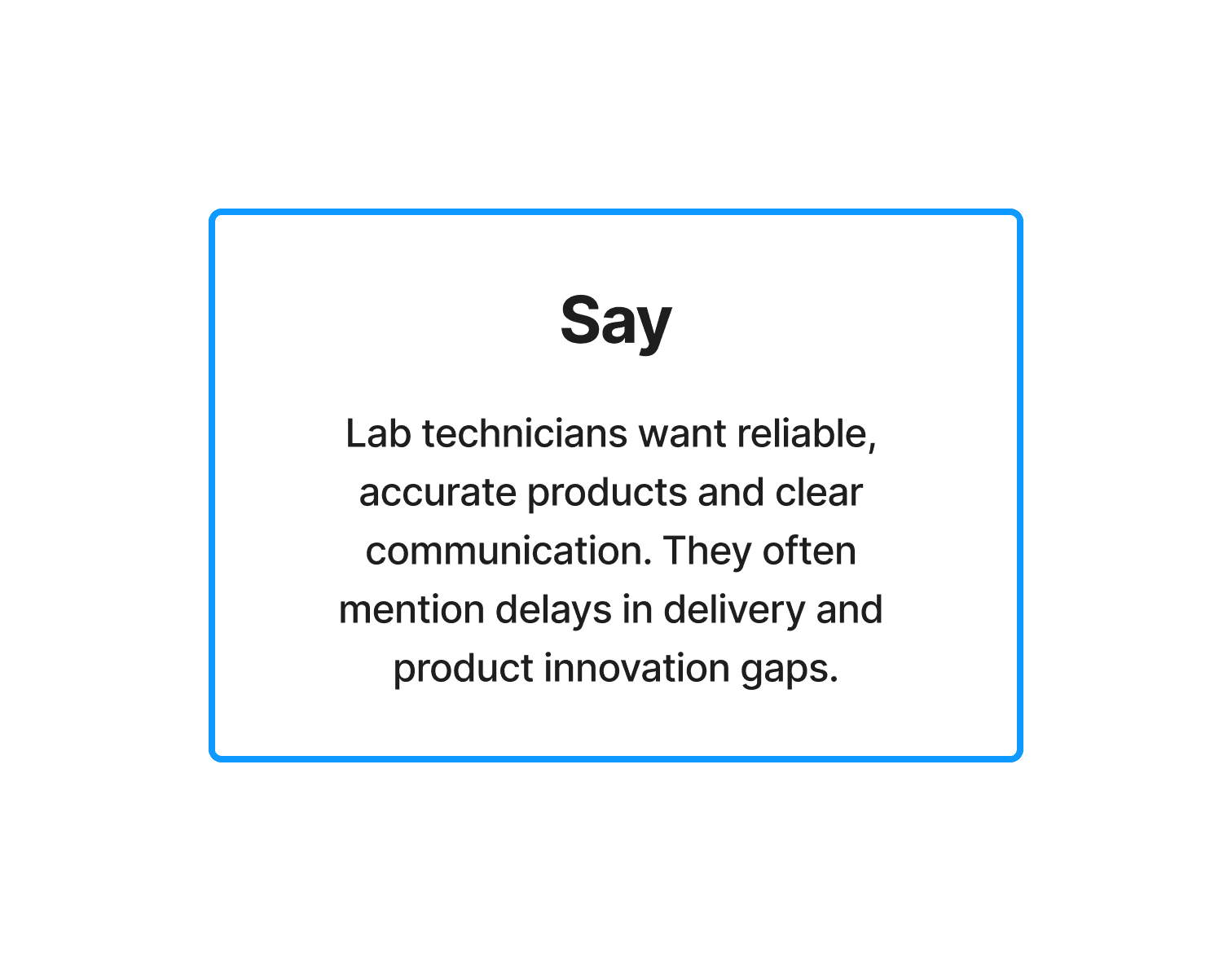
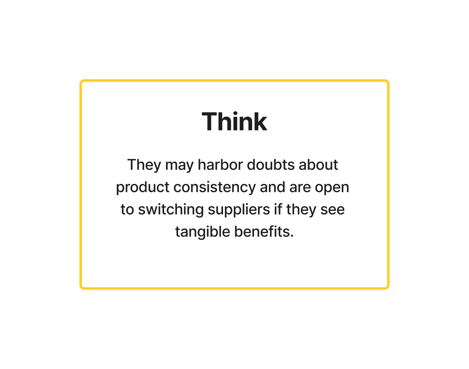
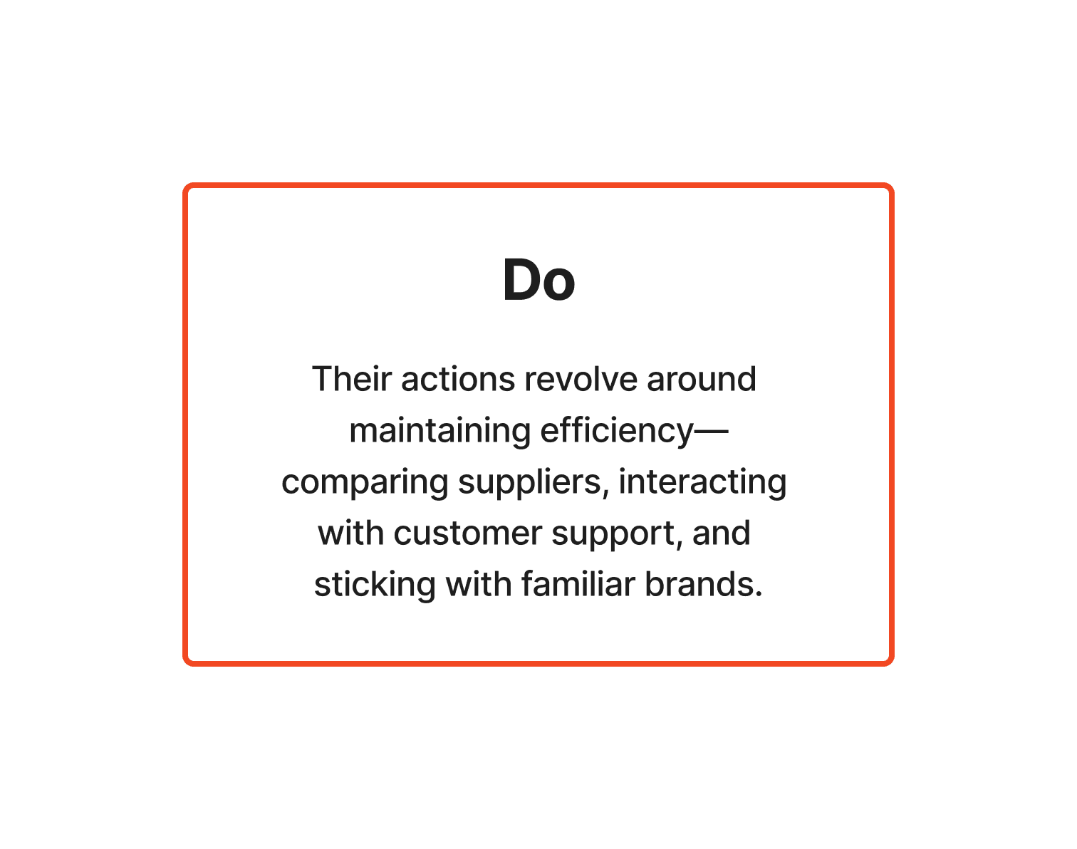
Empathy map

Define
Goal
We want to clearly articulate the challenges and insights gathered to shape the direction of the rebranding efforts.
Key challenge
Medix Biochemica and it's acquired affiliates is perceived as a reliable but under-recognised supplier in the international market, with room to modernise its brand image and connect better with a broader audience.
User needs
Stakeholders need clarity, trust, and a strong connection to the company’s innovation and quality standards.
Brand positioning statement
Current: "A trusted supplier of diagnostic raw materials."
Future: "A global leader empowering diagnostics with innovative, quality-driven solutions."
Brand attributes to highlight
Innovation, trust, global reach, reliability, sustainability, and cutting-edge science.
Ideate & Prototyping
Workshop and brainstorming
We brought together cross-functional teams, including strategy, design, art direction, and leadership, to brainstorm potential directions for the brand refresh.
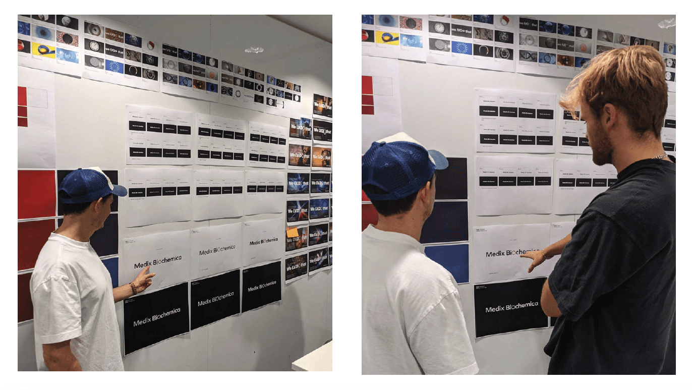
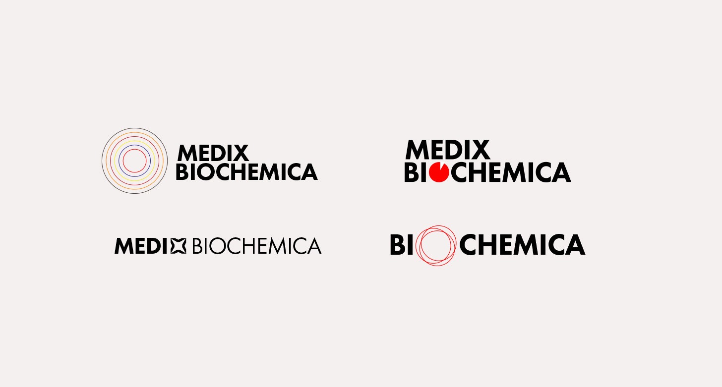
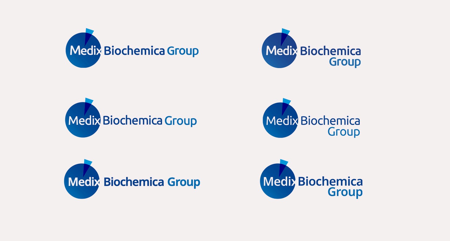
Early ideas for brand identity and logos
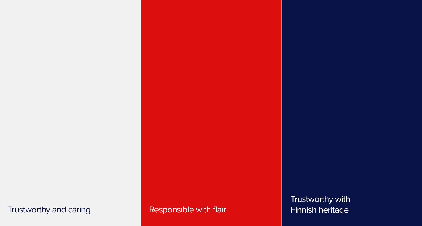
At first we looked at combining the existing Medix identities into a single cohesive brand. A modern, clean logo with strong colours that communicate trust, science, and innovation (e.g., deeper shades of blue or green with accents of vibrant colours to indicate forward-thinking).
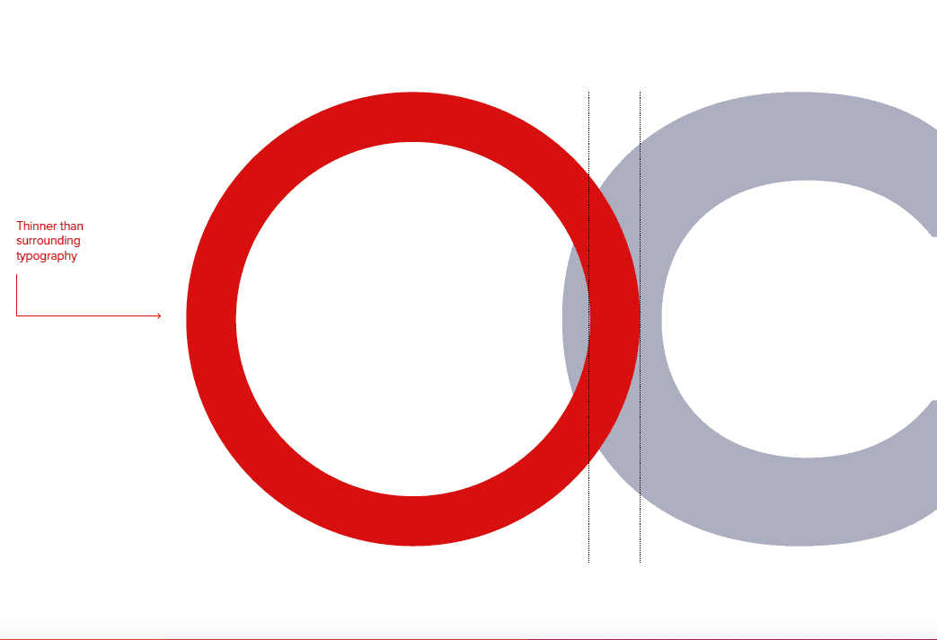
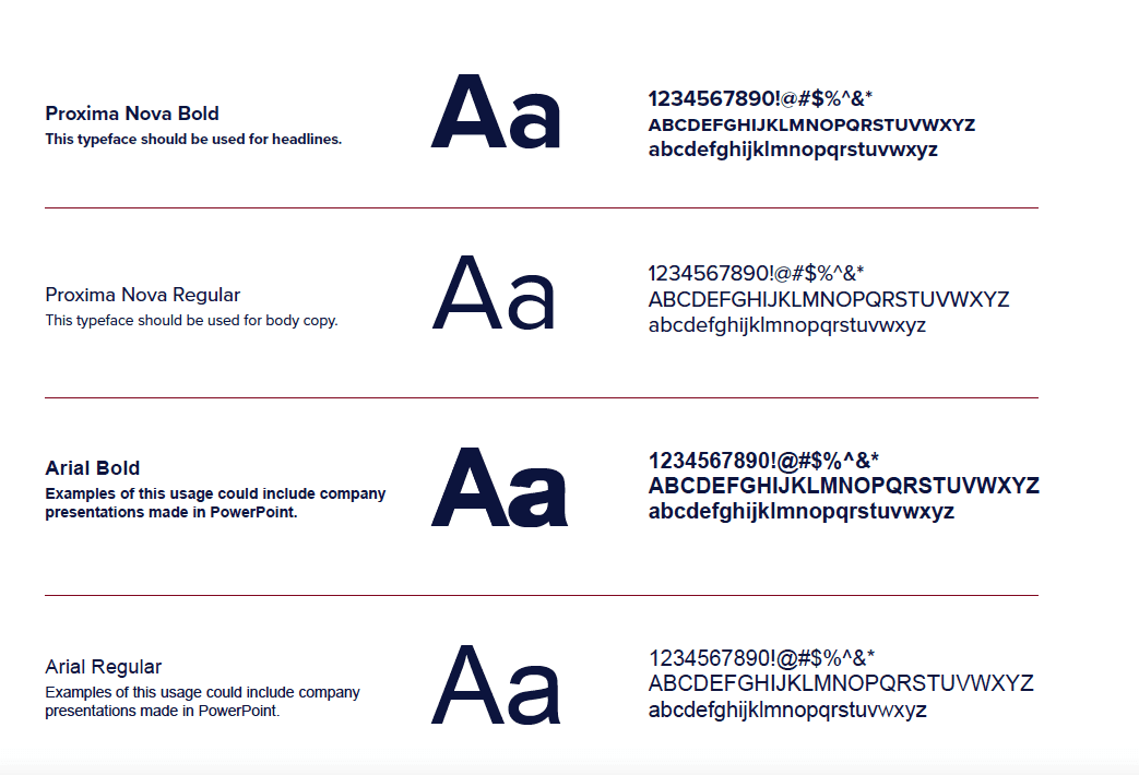
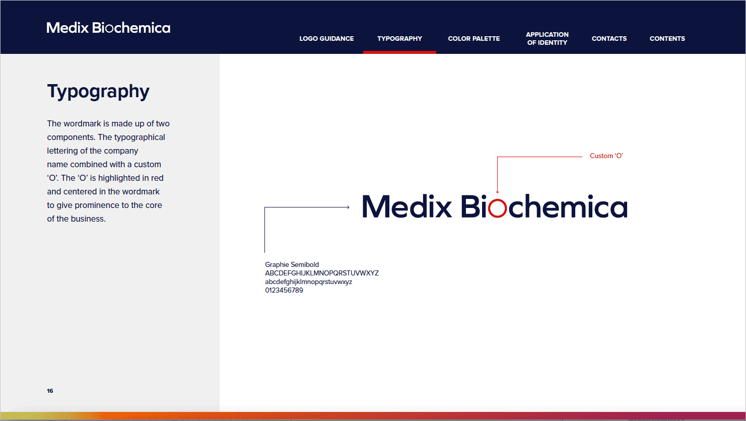
Typography needed to be flexible. As a global agency we're sending collateral and assets across different territories with varying abilities. For this we defined 2 points.
Local markets will adapt collateral using Adobe products
Everything needs to be self-contained
For this reason we stuck with TypeKit fonts as they're easily sync-able and are able to be packaged up without territory licensing issues. Proxima Nova had the cleanest leading at smaller sizes and easily adaptable as a webfont.
Brand tone and voice
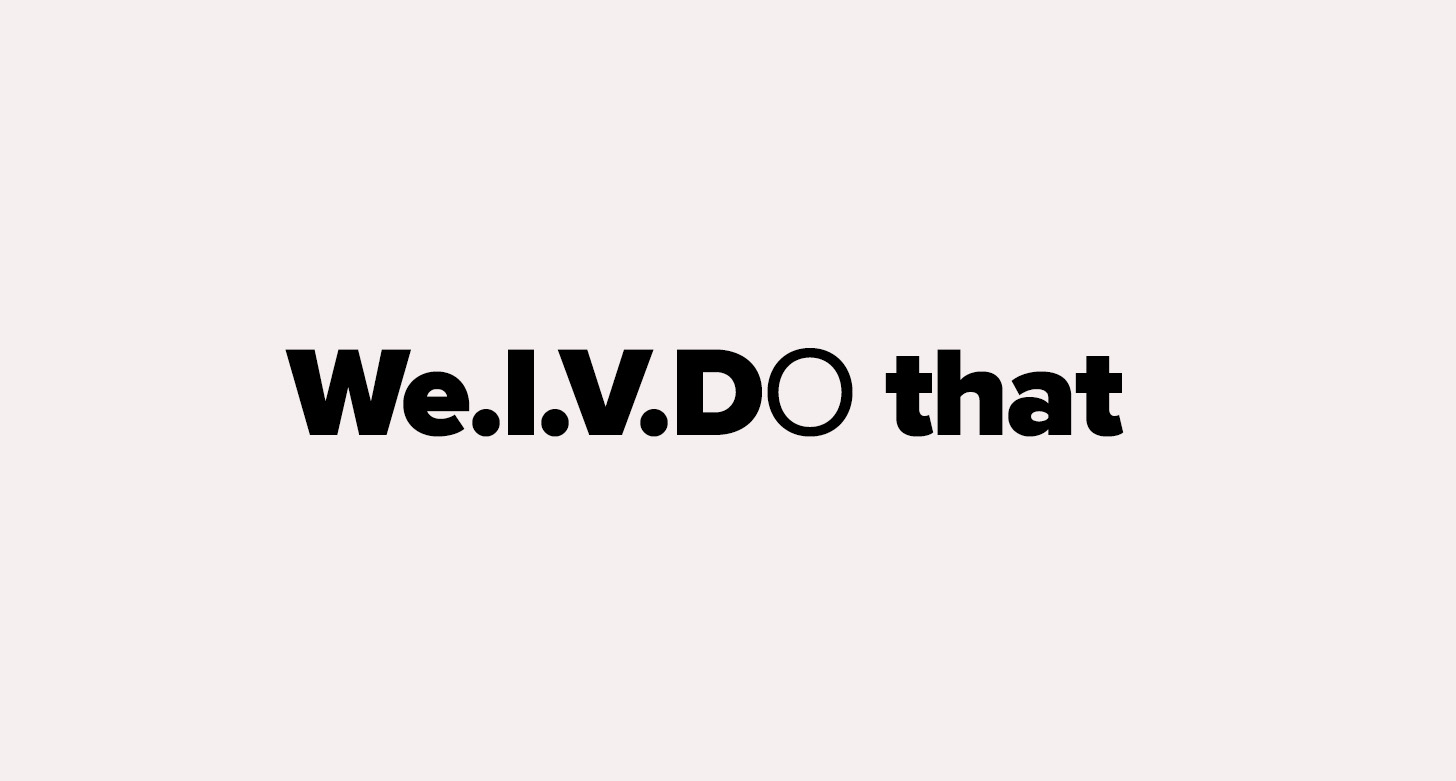
This focused on clear, accessible, and authoritative language in all communications, both technical and non-technical. We created a leading tagline for launch 'We I.V.Do that' to capture the essence of the new Medix brand.
Sustainability emphasis
As part of the new tone of voice, Medix wanted a sustainable production method and commitment to environmental responsibility as a differentiator in the market. This came in various way of responsible paper sourcing and tree-planting carbon offsets from mill-supplied paper.
Testing
Build tangible representations of the proposed ideas, including brand visuals, messaging, and user experience prototypes.
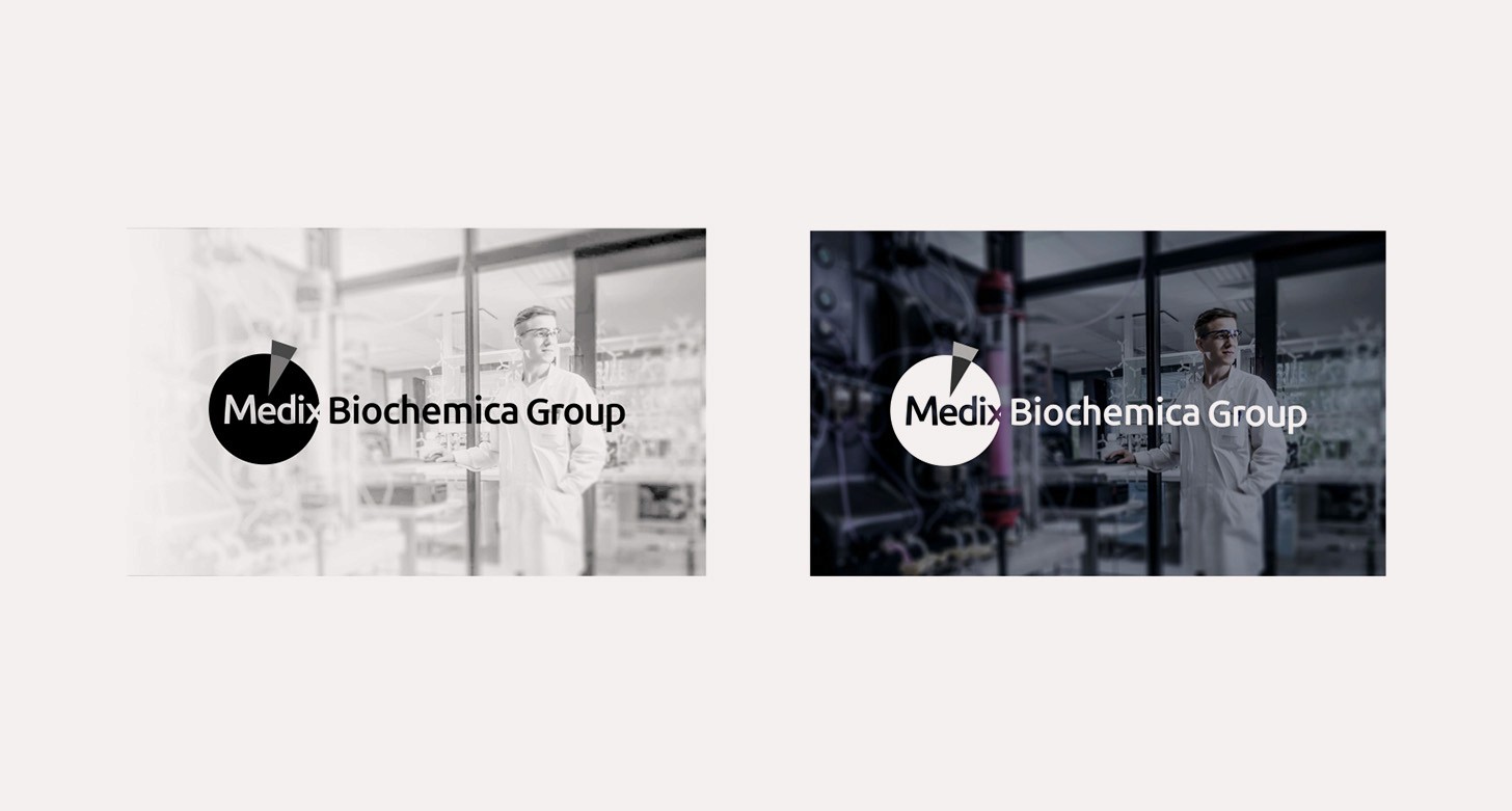
Brand styling and logo revision
After testing for logo and brand identity, a decision was made to form a clean, modern identity that will work across a broader range of collateral.
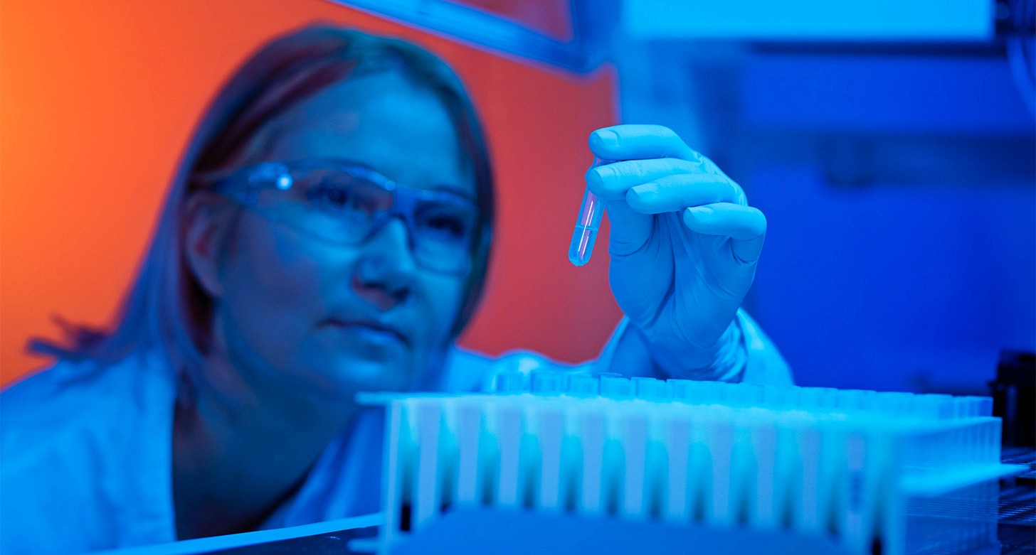
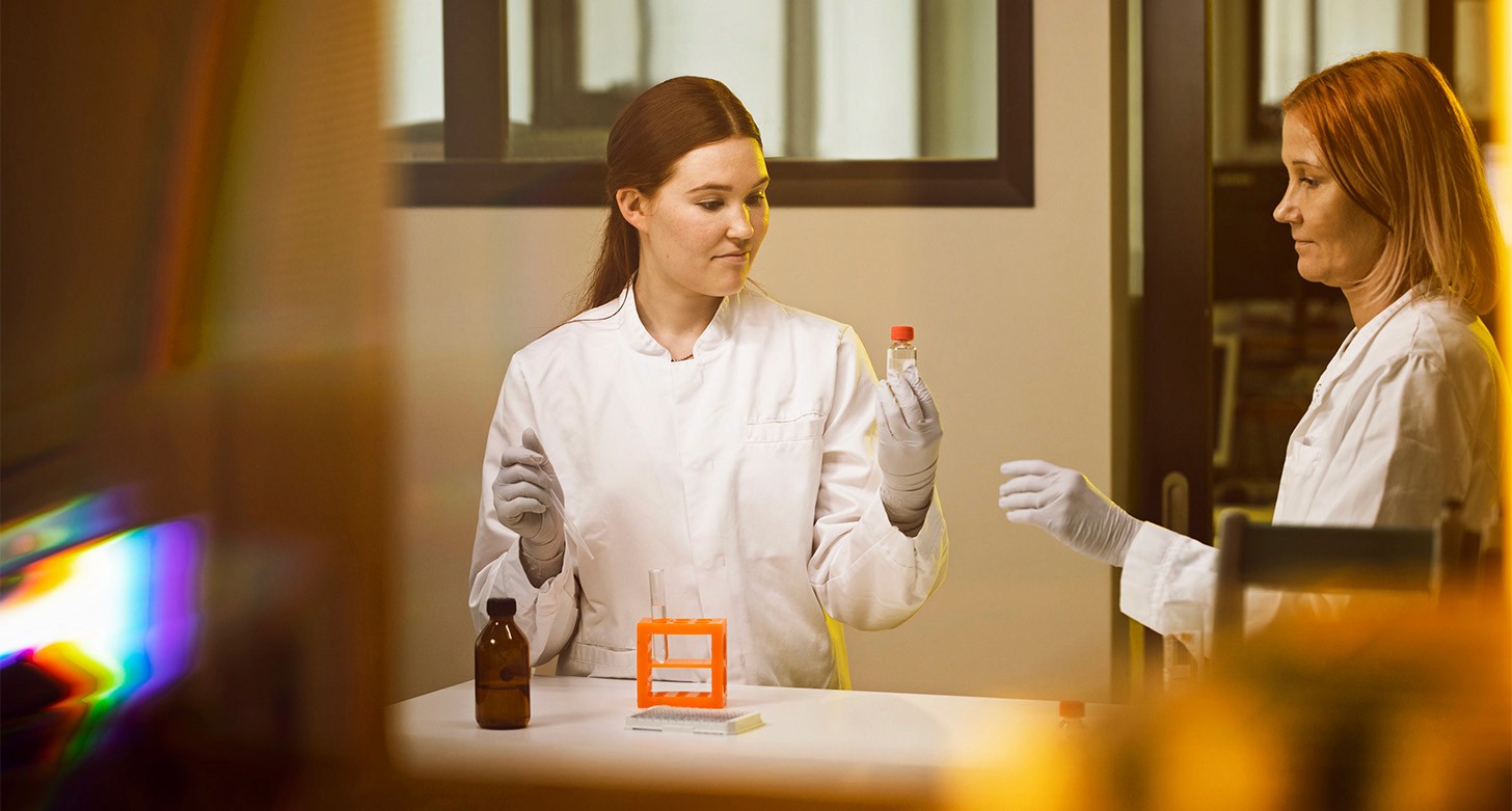
Photography and colour
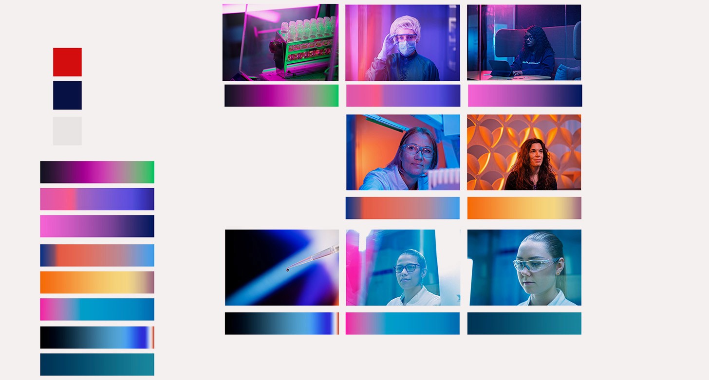
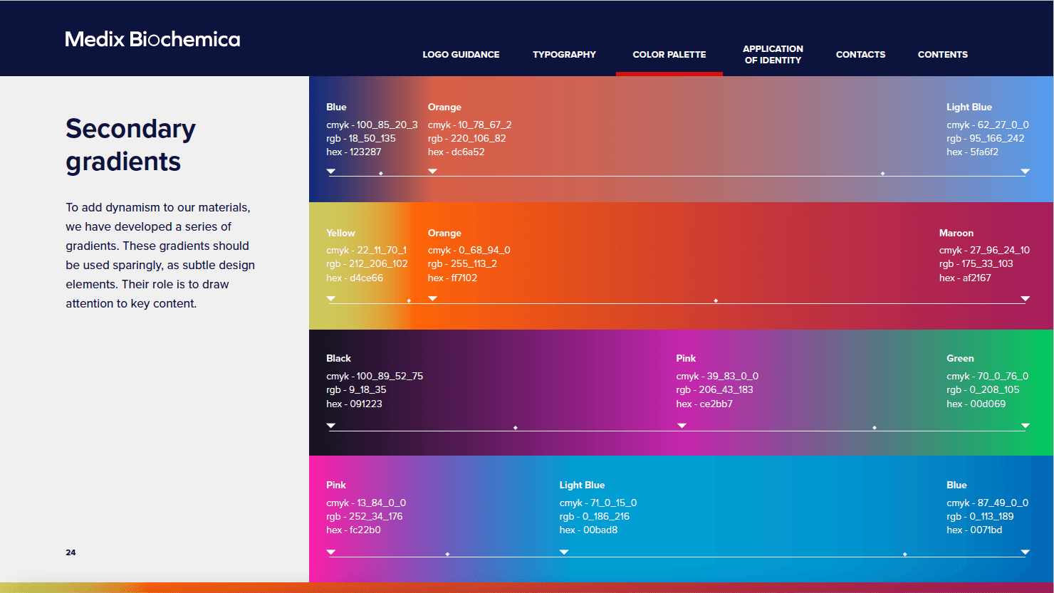
The photography route has a strong colour gradient running through it which we leveraged into the general styling. This added flair outside the core colourway.
User testing
Sharing the new design and communication materials with a small group of existing customers, industry professionals, and employees. We asked these Key Questions:
Does the new visual identity resonate with you?
How do you feel about the brand message and tone?
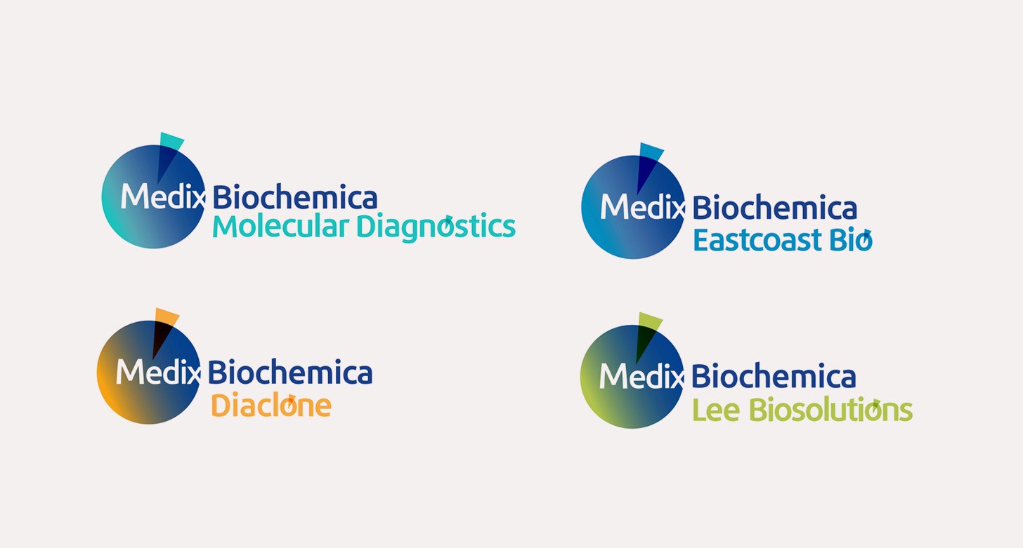
The medix branding was clean but it needed more flair for specific instances like the MDx brand whose managing director was very keen to push colour.
We leveraged out photography and looked at creating a set of key visuals that worked these in.
Key visual
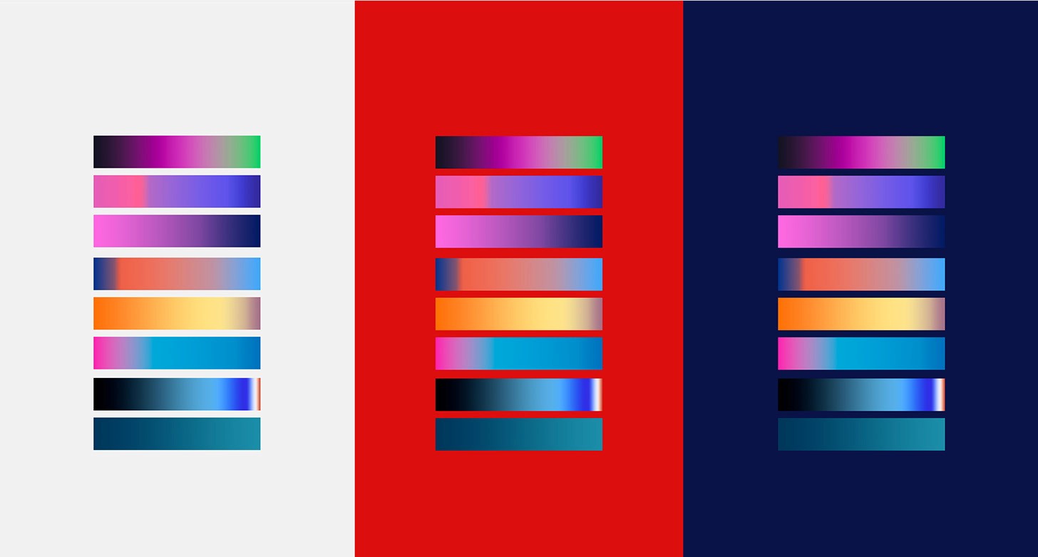
As above, leveraging the colourway a bit more, we tapered the gradients from photography into the graphic elements. Reflecting the desired brand attributes (trust, innovation, and global leadership).
Mockup collateral
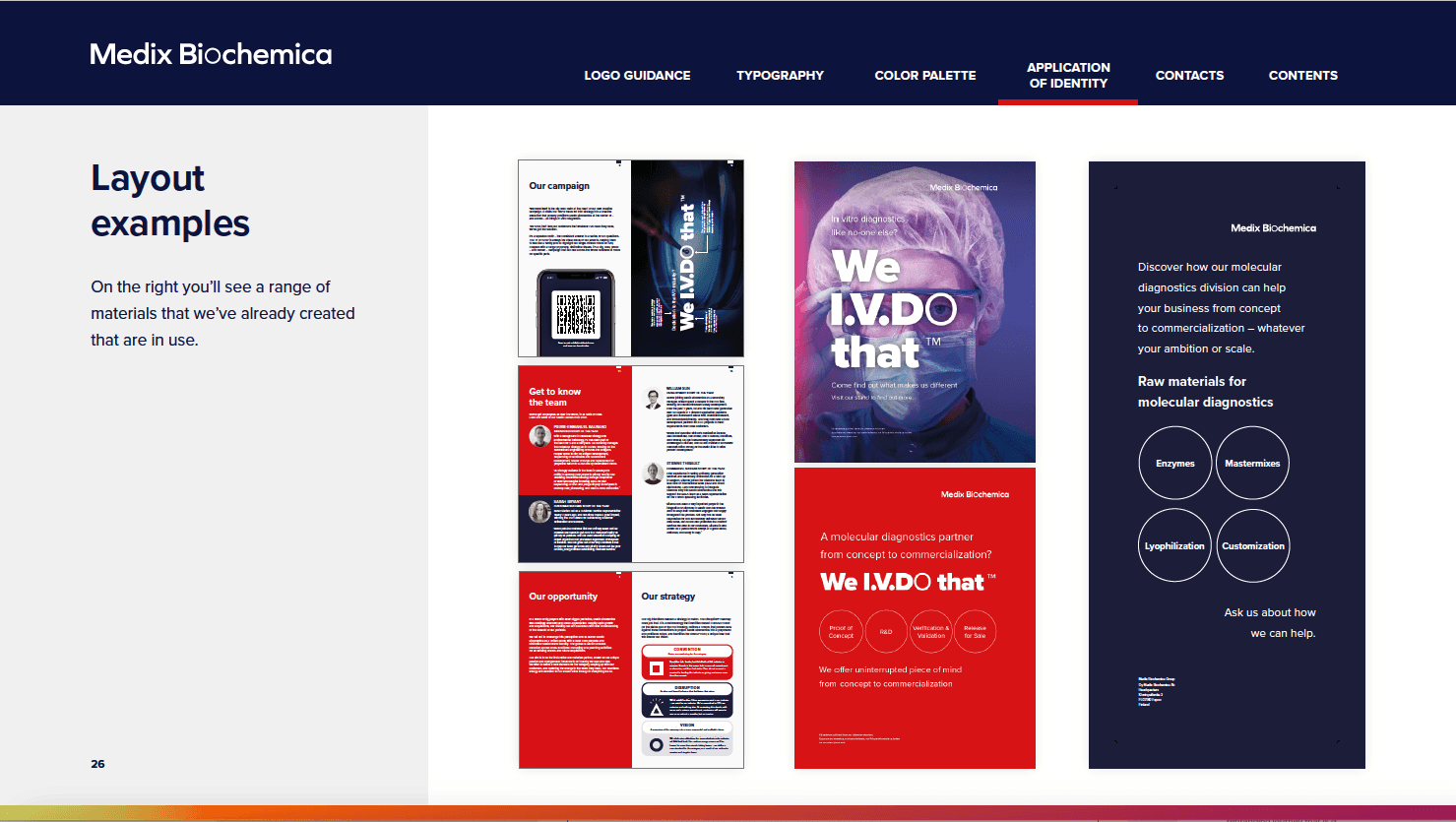
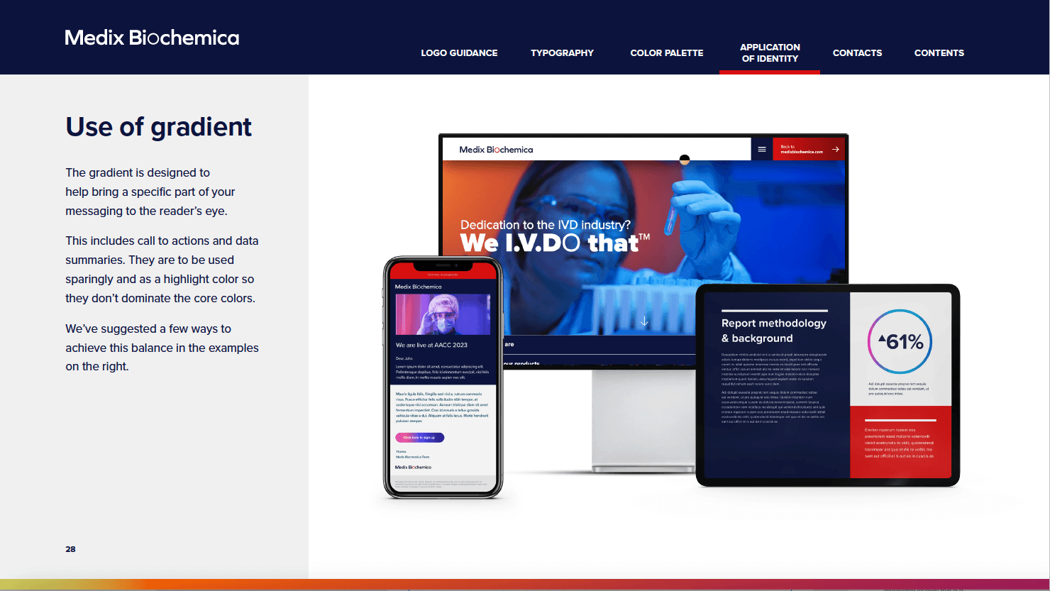
Building this into a set of collateral to be used by Medix we blend the core colourway which would be utilised for internal core brand use and the gradient colour and photography to add flair when needed.
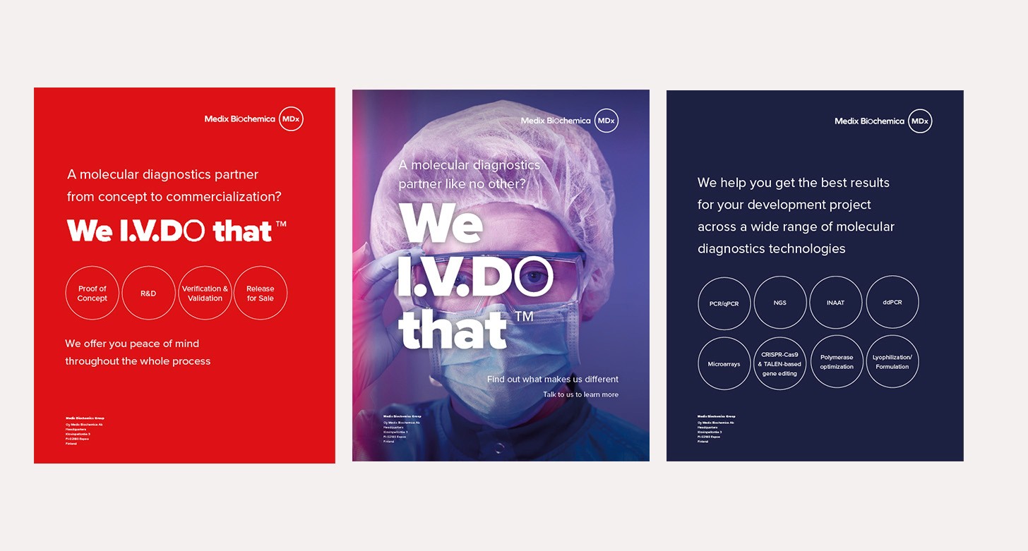
Customer communication
Core collateral kept the tri-tone of the main branding.
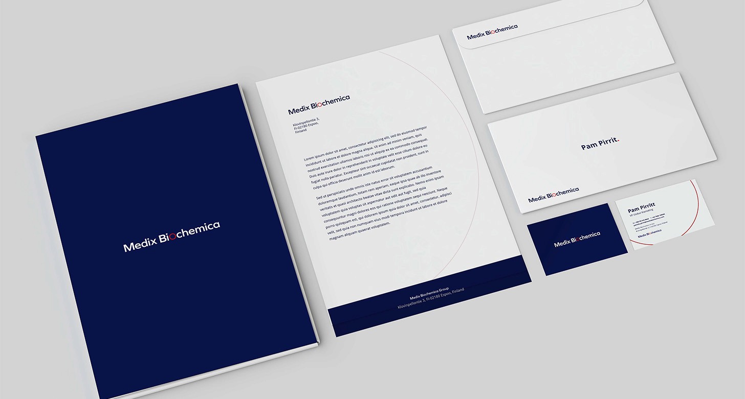
Brand Guidelines
Neatly wrapped into a set of brand guidelines and core guidance documents like a series of booklets, a presentation website and interactive Visual Aid for key in-vitro products.
Conclusion
By applying design thinking, Medix Biochemica can embark on a rebranding journey that is grounded in empathy, user insights, and iterative design. The result will be a refreshed, modern identity that not only strengthens its position in the market but also deepens connections with customers, employees, and partners. The new brand will convey trust, innovation, and a global outlook, making Medix Biochemica a standout leader in the in-vitro diagnostics industry.
