Sobi
An interactive tool for treating haemophilia-A
An interactive tool for treating haemophilia-A
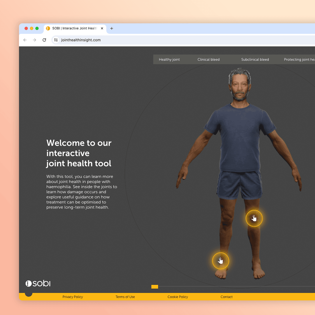
A promotional website for Sobi’s drug ELOCTA used to treat haemophilia-A patients and an interactive look to help assist healthcare professionals and patients understand their causality.

Project type
Project type
Webapp
Webapp
Company
Company
Sobi
Sobi
Location
Location
UK
UK
Industry
Industry
Pharmacutical
Pharmacutical
Role
Role
Product Designer
Product Designer
Tools
Tools
Adobe XD/Figma/FigJam
Adobe XD/Figma/FigJam
Empathise
The problem
ELOCTA, a medicine used to treat and prevent bleeding in patients with haemophillia A launched in 2014. It was the first treatment to require significantly less injections than competitors. The ELOCTA team have been using traditional collateral and sales methodology up to this point but a recent survey found they didn’t have much impact amongst HCPs.
Our strategy team have worked with SOBI to conclude a digital tool will help uplift the brand by providing an interactive element they can showcase at congress events and give HCPs access to add a visual aid to patient discussions.
From the client
Lets create an engaging XR experience that highlights the impact of joint bleeds and showcases the protection ELOCTA and ALPROLIX provide.
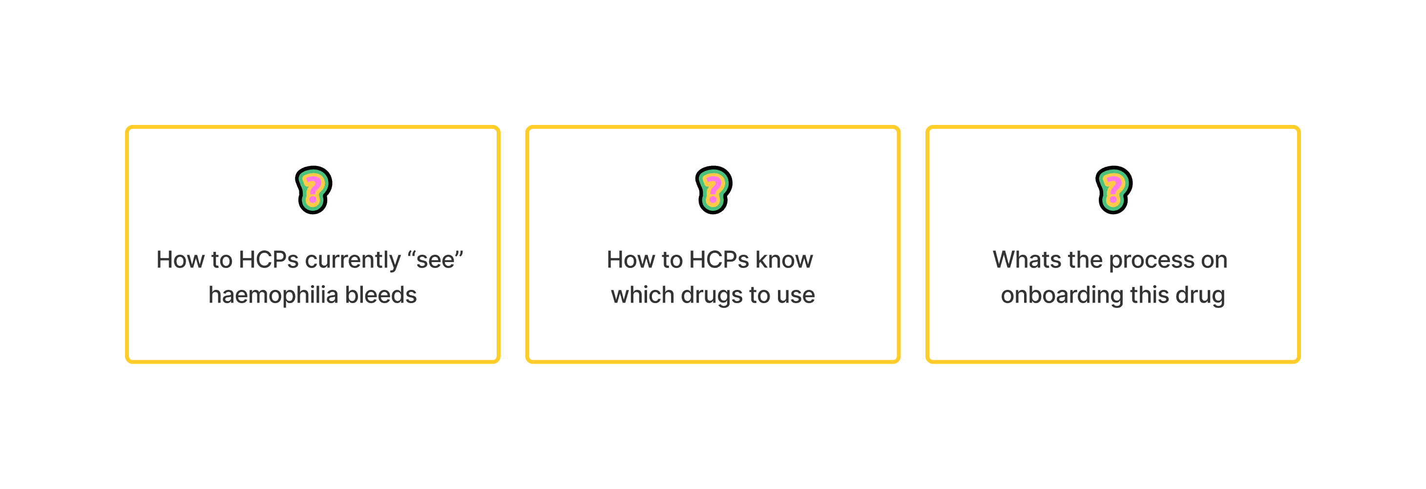

Understanding the market
The hemophilia A drug market in the UK is evolving rapidly due to advancements in gene therapies and extended half-life treatments. In 2022, the market was valued at approximately £250 million and is expected to grow at a steady compound annual growth rate (CAGR) of 2.8% through to 2030, reaching nearly £310 million.
Key drivers of this growth include the introduction of novel therapies, such as Sanofi's ALTUVIIIO, a once-weekly factor VIII replacement therapy, and gene therapies like BioMarin's Roctavian. These newer treatments are designed to improve patient outcomes by reducing the frequency of infusions and potentially offering long-term bleed protection, thereby enhancing the quality of life for patients with severe hemophilia A. Hemlibra (Roche) continues to hold a strong market share, especially among patients with inhibitors, due to its subcutaneous administration and high efficacy in prophylactic treatment.
While the demand for advanced therapies is rising, the high upfront costs of gene therapies could pose a barrier to broader market adoption. However, the UK’s National Health Service (NHS) reimbursement policies, which prioritize cost-effective solutions, are expected to mitigate some of these challenges by providing greater access to these innovative treatments.
The competitive landscape includes major players like Roche, Sanofi, BioMarin, Novo Nordisk, and Pfizer, all actively developing and marketing hemophilia A therapies. Looking ahead, the market will likely see increased competition as more gene therapies and extended half-life products become available
Understanding ELOCTA
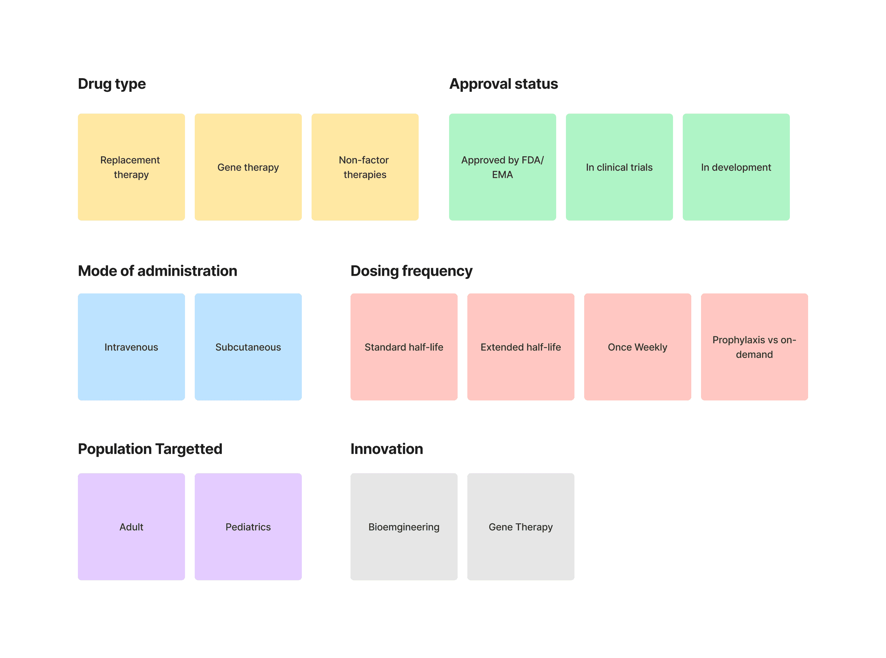
Creating an affinity map for competitors of a hemophilia A drug like ELOCTA (efmoroctocog alfa) involves categorizing various competitor drugs based on different dimensions such as therapeutic mechanism, market presence, approval status, and innovative features.


Research summary
Objective: This research proposal aims to compare the therapeutic landscape for hemophilia A, focusing on how ELOCTA competes against other therapies in terms of dosing convenience, patient outcomes, and innovation.
Scope: The study will involve clinical trial data, patient outcomes, and market analysis for leading hemophilia A drugs (ELOCTA, Advate, Hemlibra, Roctavian, and others).
Methods: Utilising an affinity map, the research will categorize drugs based on factors like efficacy, innovation, and patient accessibility.
Outcome: SOBl will identify strategic opportunities for ELOCTA to enhance its market position, based on competitive analysis.
Define
Identifying product goals
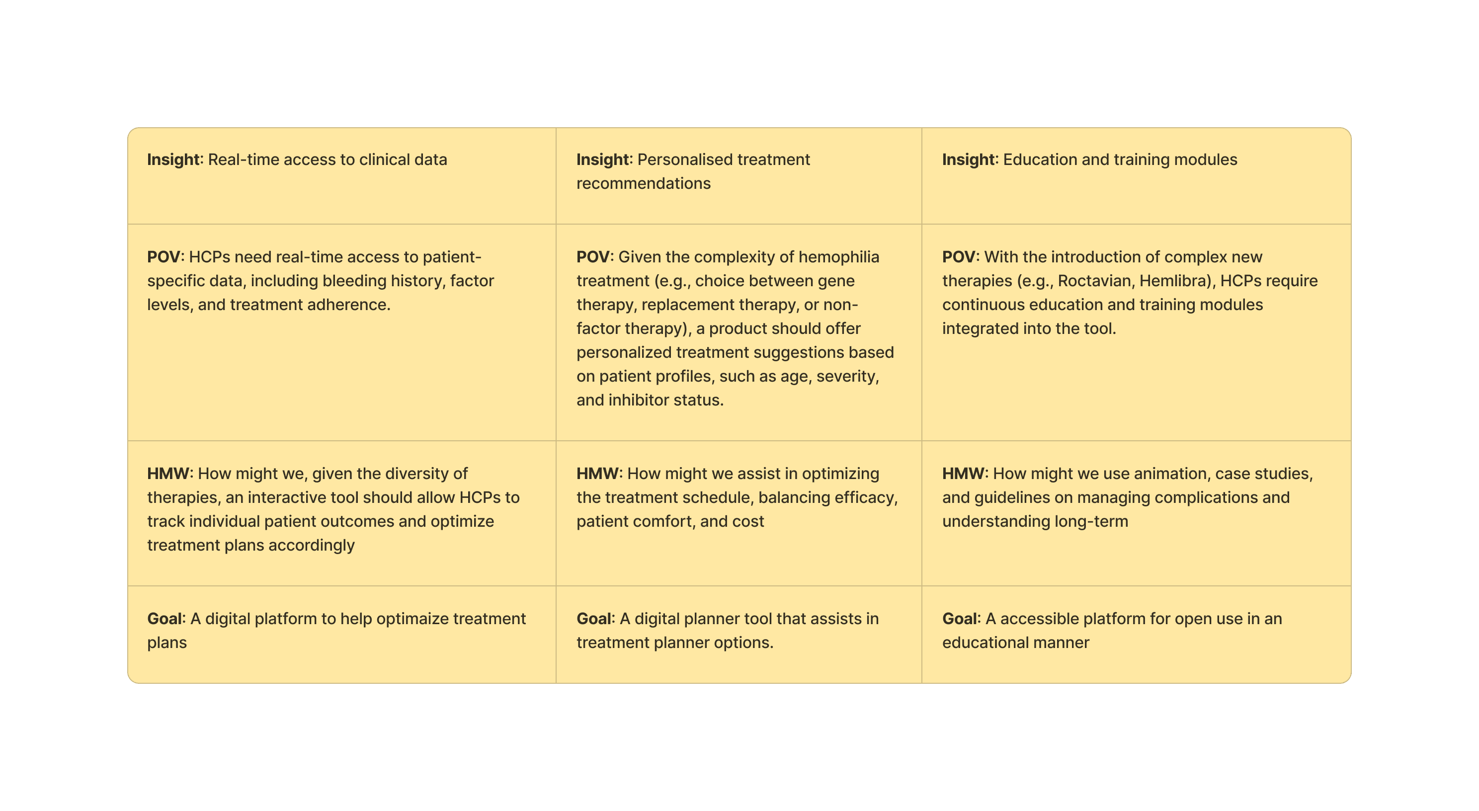
Workshopping findings with the ELOCTA and SOBI team we structured some goals we want the tool to drive towards and answer three main questions:
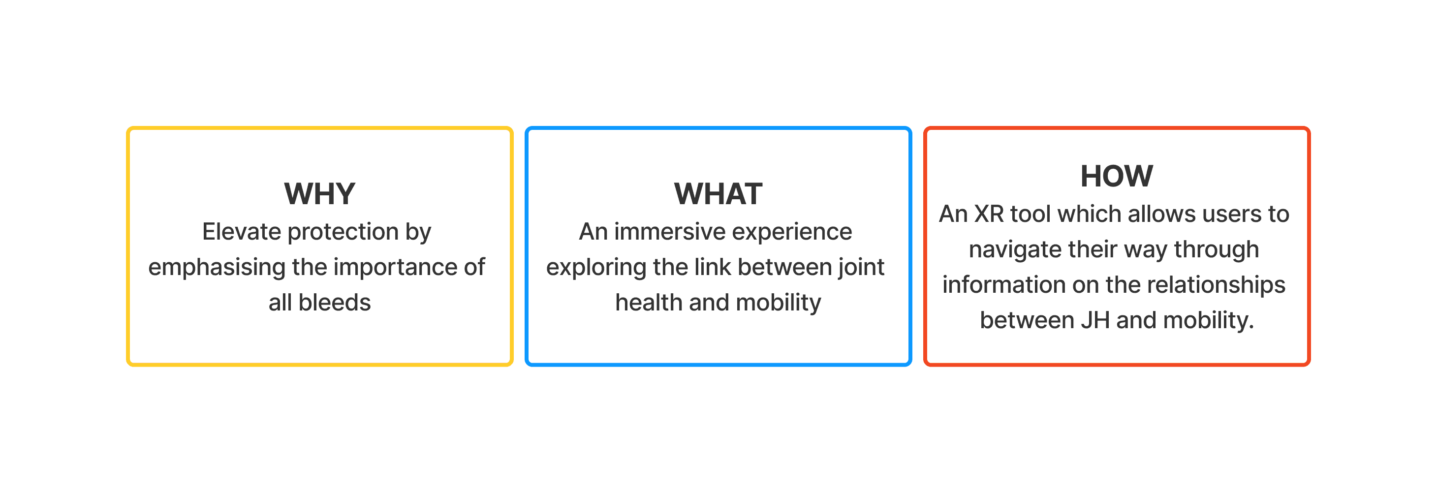

Translating insights into goals
Discussions around how those initial insights can translate to goals for the site. How can HCPs and patients benefit from this?

Ideate
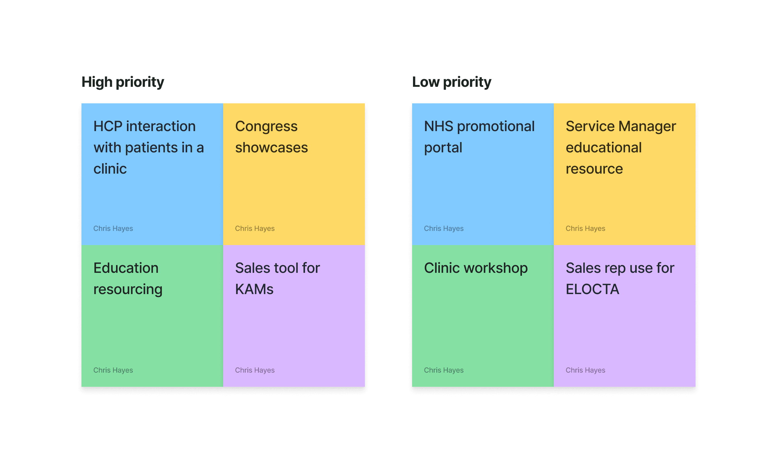
Workshopping a user-first need
We have a few ideas based on research and initial discussions with the SOBI team to ladder up to their project goals. We workshopped a few ideas to understand their level of priority for the user. This is 90% promotional material has to be kept behind a gate which will restrict public access.

Education and training module:
We landed on Education and training for two main reasons
It ladders up to their business objective of better brand awareness in the market acting as an educational resource
It bypasses gated domains by becoming a public site gives greater free access.
Developing a site-map
Now we have a direction, we need to look at the type of content we want to showcase. This has been bucked it into client needs and research from the medical team on what the treatment procedure is.
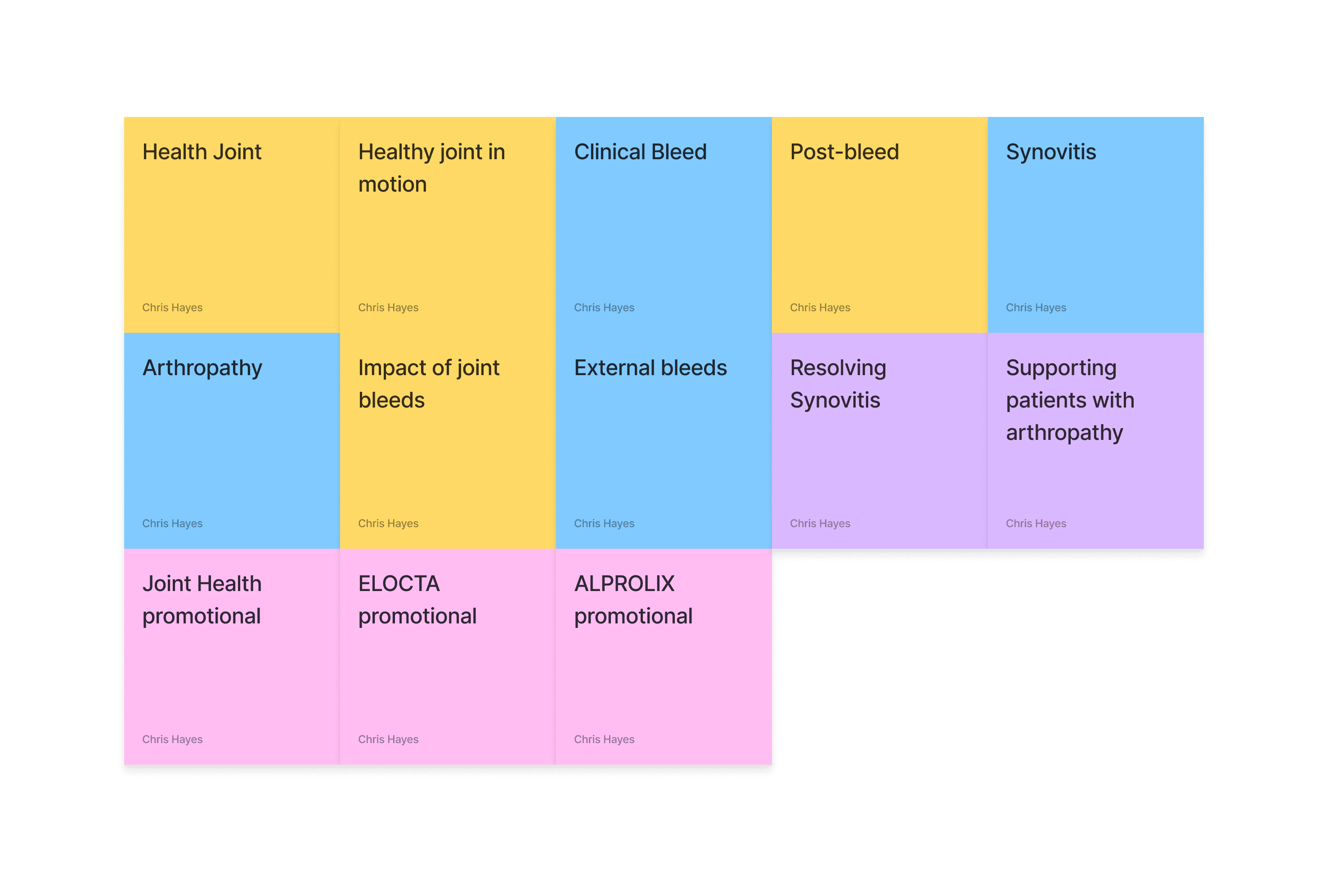

Digesting the key pages into something usable
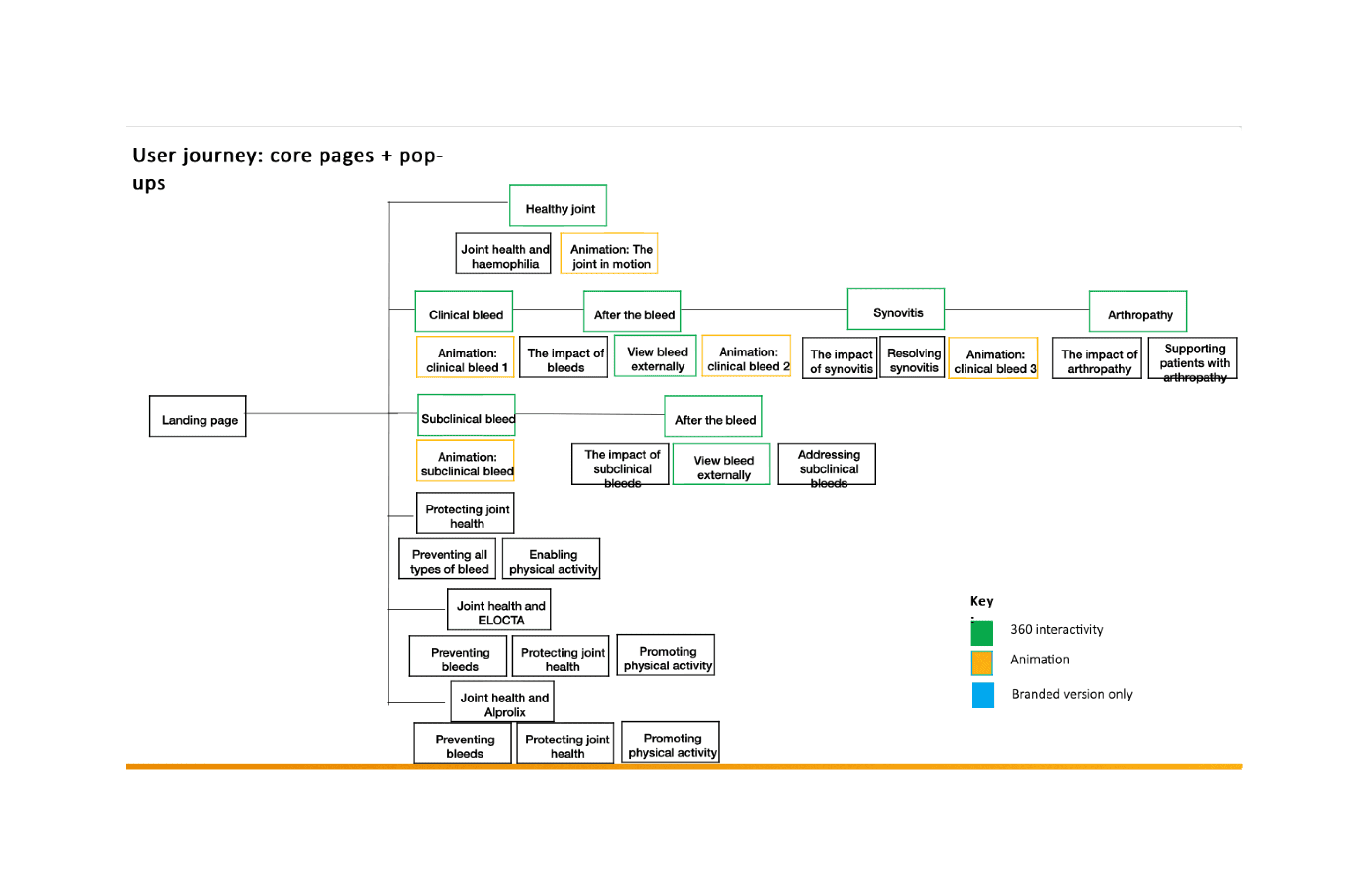

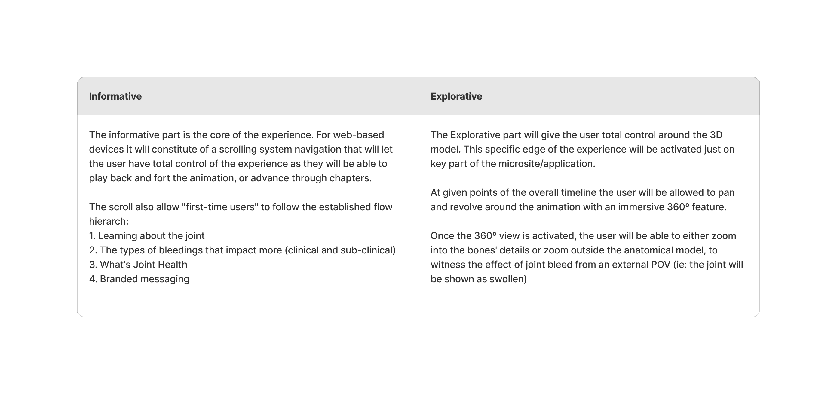
Letsbucket our experience in two parts

Prototype
For a non-linear style webapp the L&F might influence the structure of the site. We didn't want to be constrained by the typical brochure-site styling that users are used to, it needs to follow a transient flow that remains easy to use.
We'll be plugging into the SOBI corporate branding but can add a unique touch to the styling thats unique to this project.
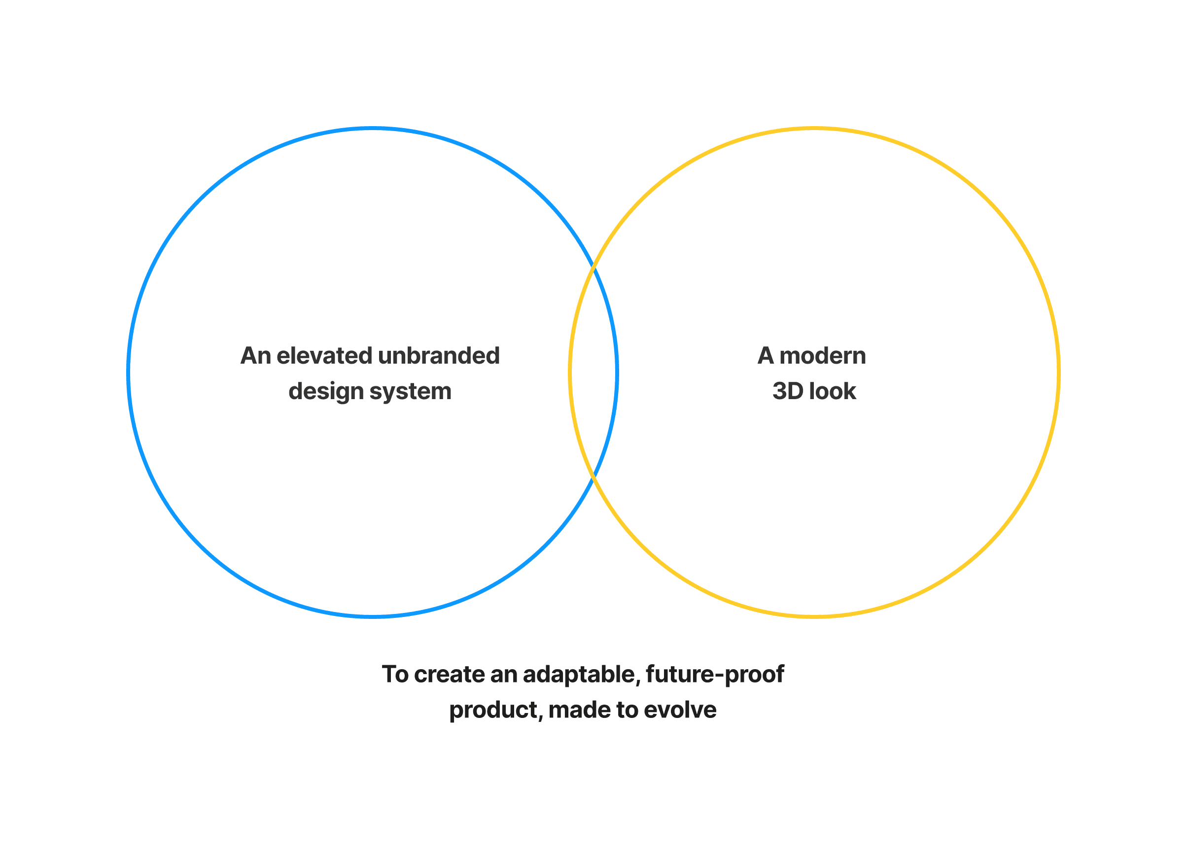

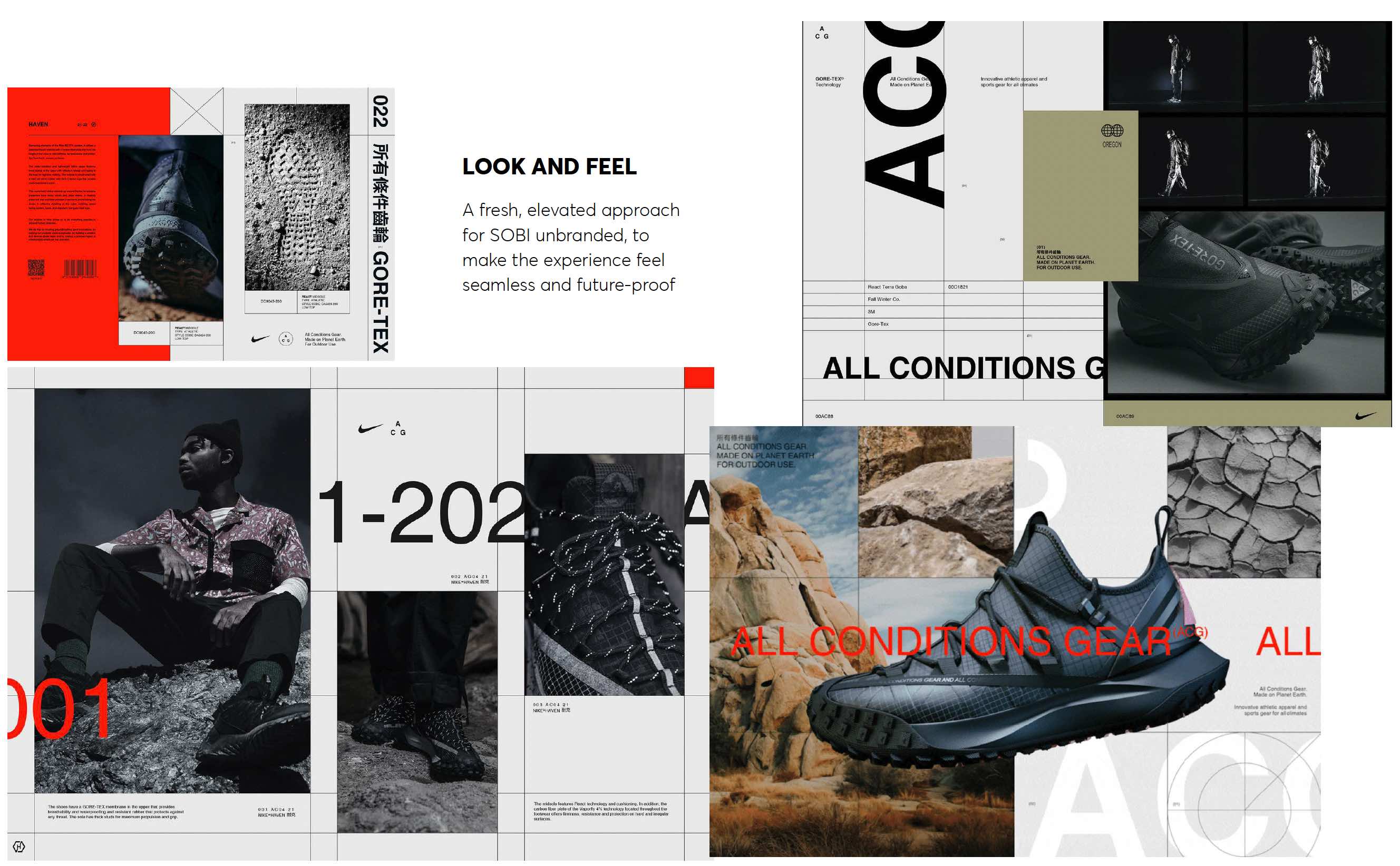
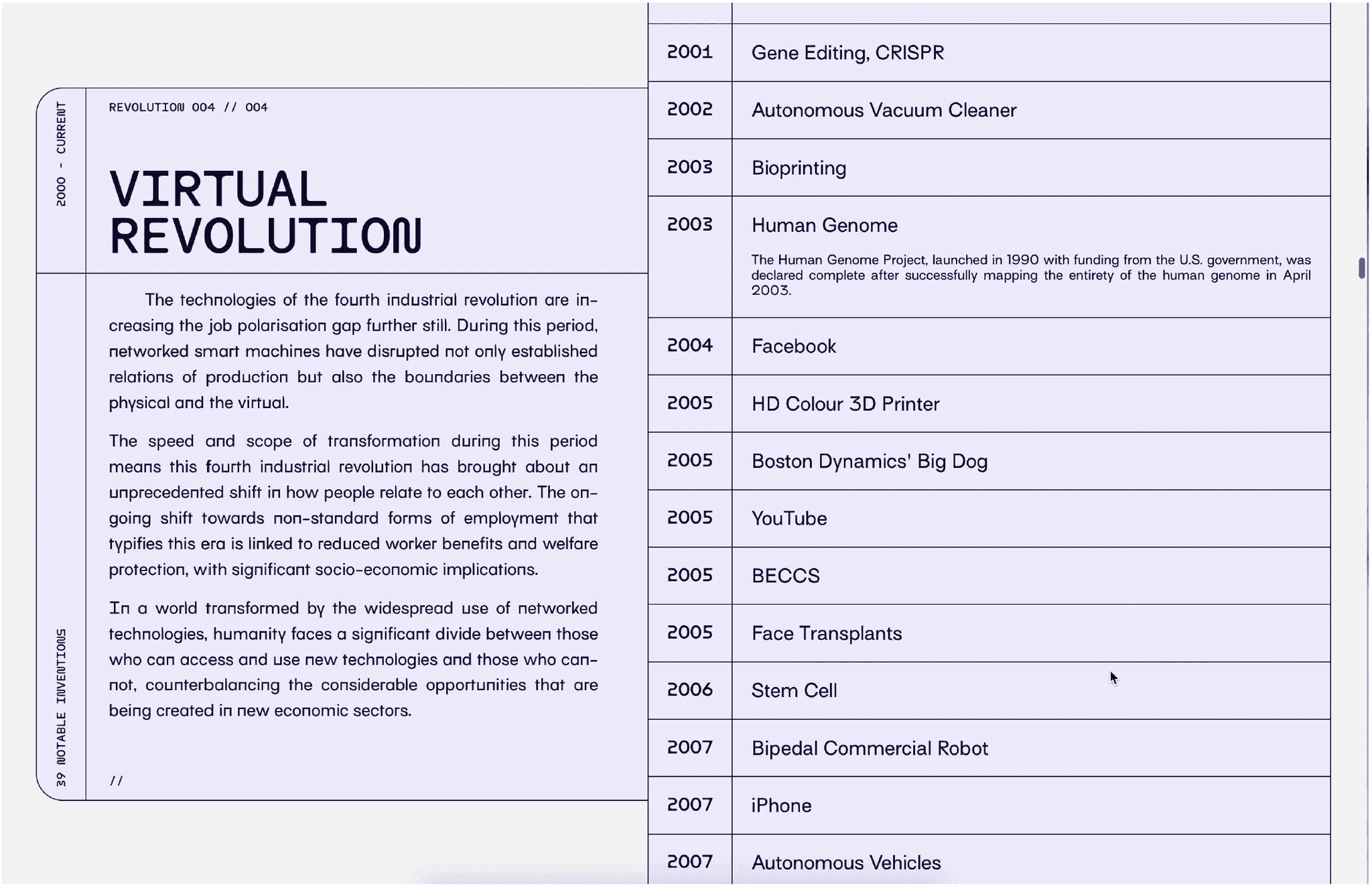
A fresh, elevated approach for SOBI unbranded, to make the experience feel seamless and future-proof. A key element on subtle technical lines to give strong definition to informatiom heirarchy
With a general style agreed we looked at identifying key pages in the site that needed multiple forms of interactivity. We partnered with CASSETTE, a local development agency who have supported us and SOBI in the past so were aware of any devlopment constraints.
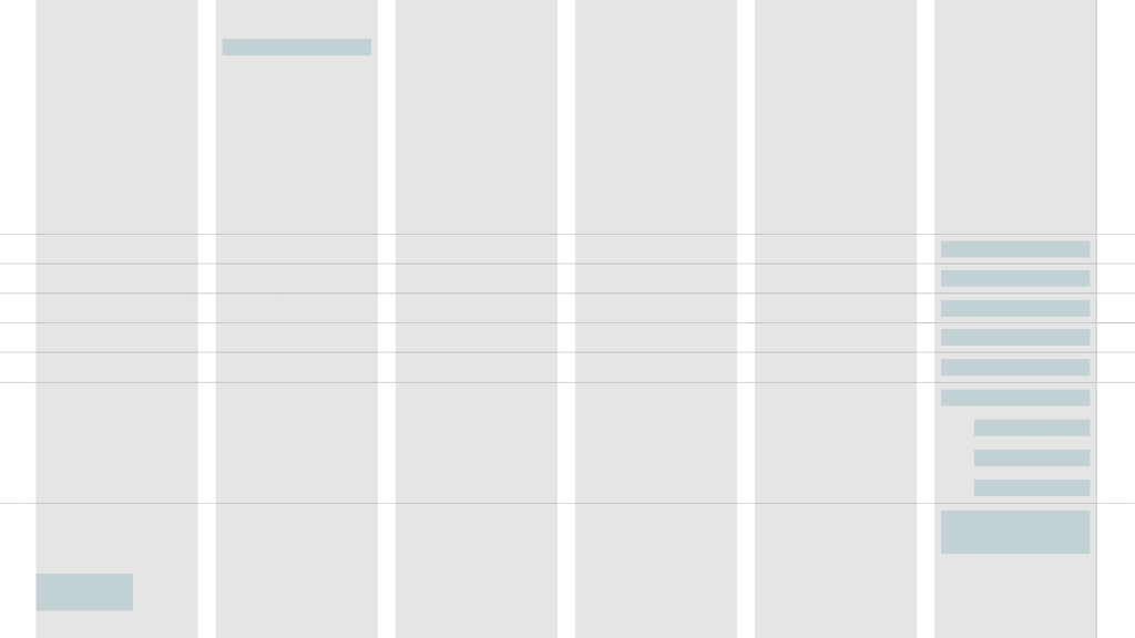
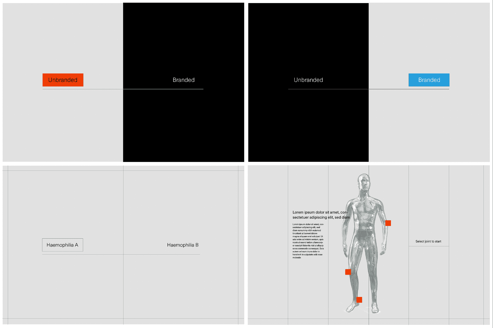
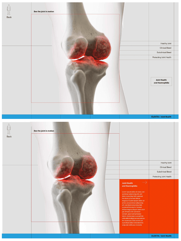
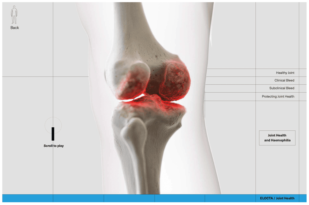
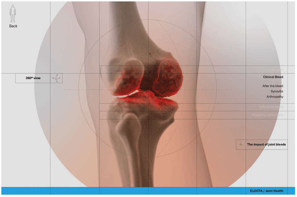
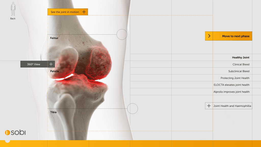
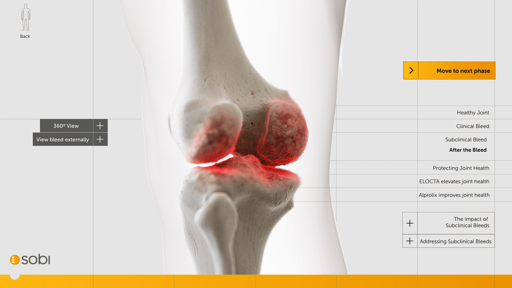
We looked at frameworks and supplied 4 visuals for desktop that would work as a laddering process for all other screens.
Home screen (main nav)
Copy
360 animation
Video
Pre-determined rules around functionality helped the dev team understand the parameters. Copy dropping from top-down, boxes always cased in 20px padding.
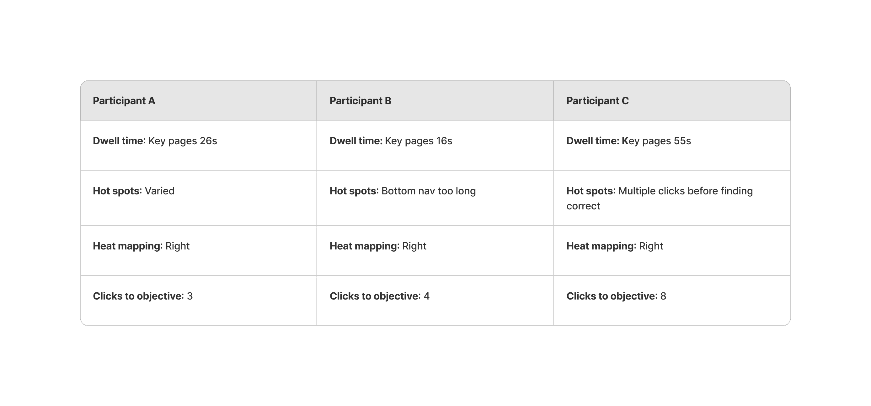
After key page builds we tested the interactivity with a specific user group. Due to the nature of the medical data that was going on a public domain we were unable to test outside of an internal select group. We set each group an objective to find vertain criterea of a page to understand how they best use the site. The objectives were:
Object animation
Overview of the product
Find branded recommendation
We can start to overlay our look and feel into our four standardised frames.
Building a 3D model
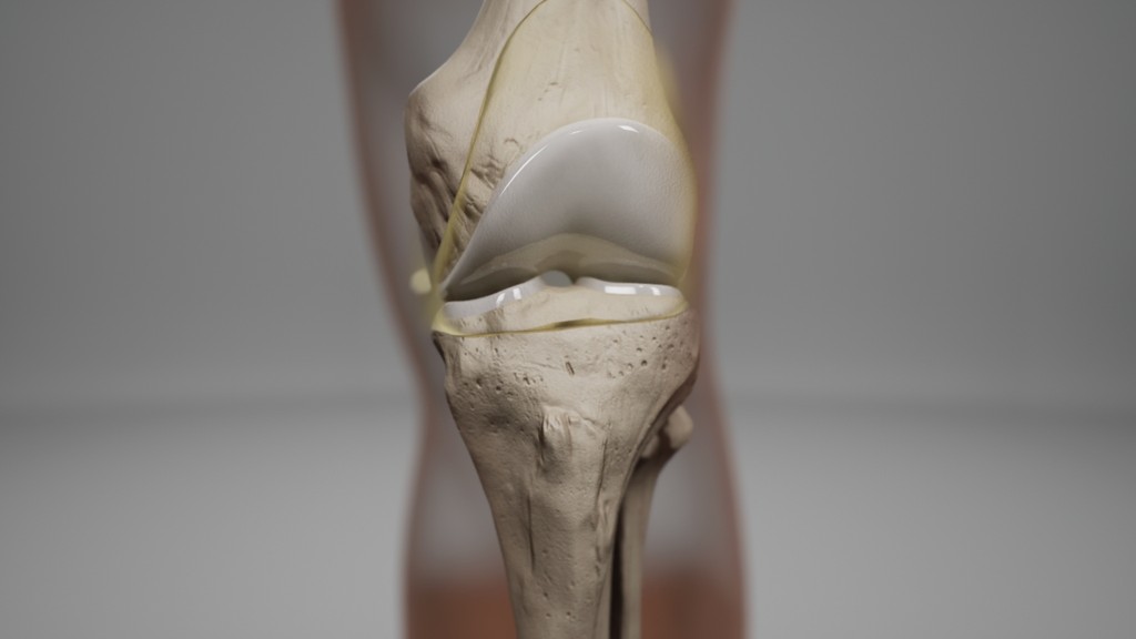
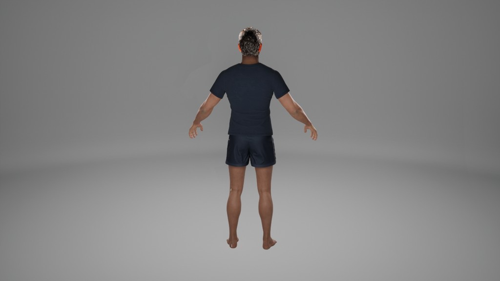
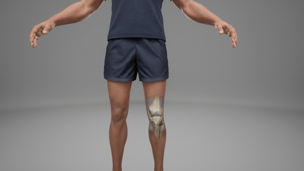
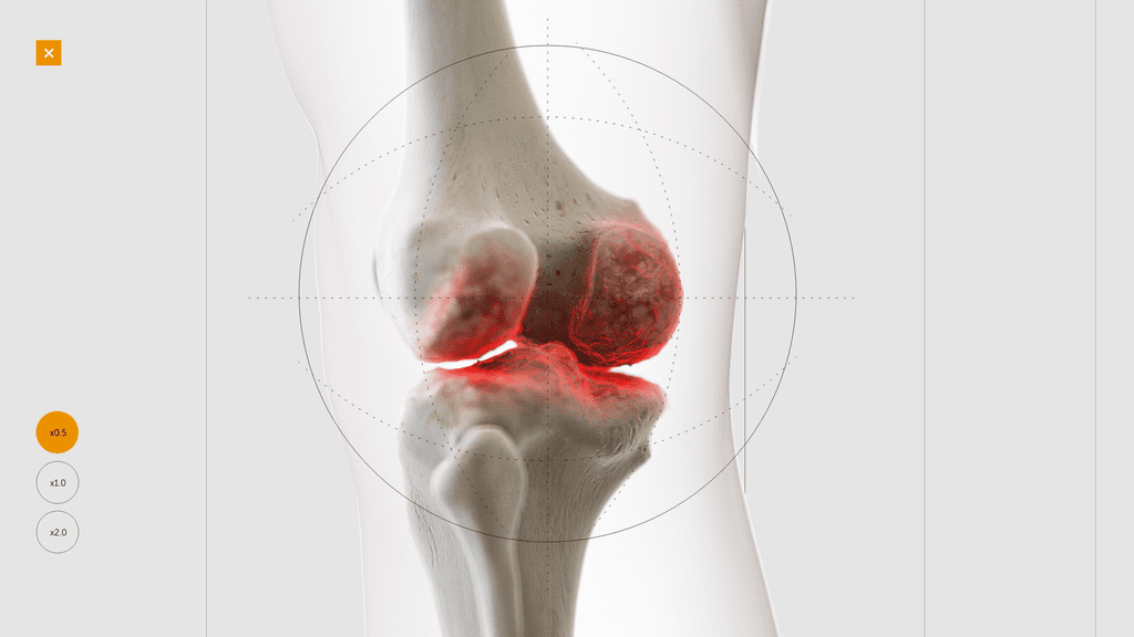
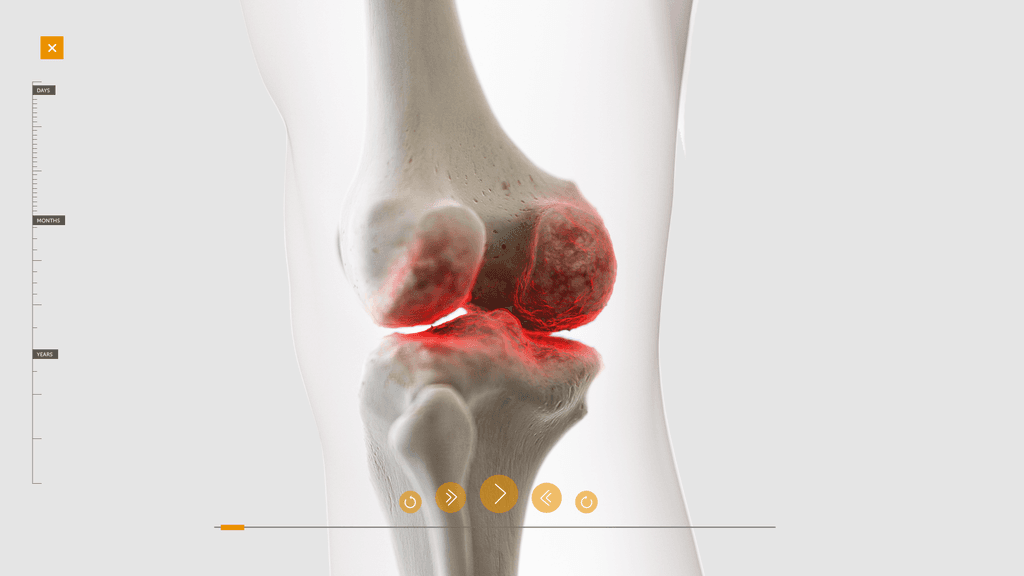
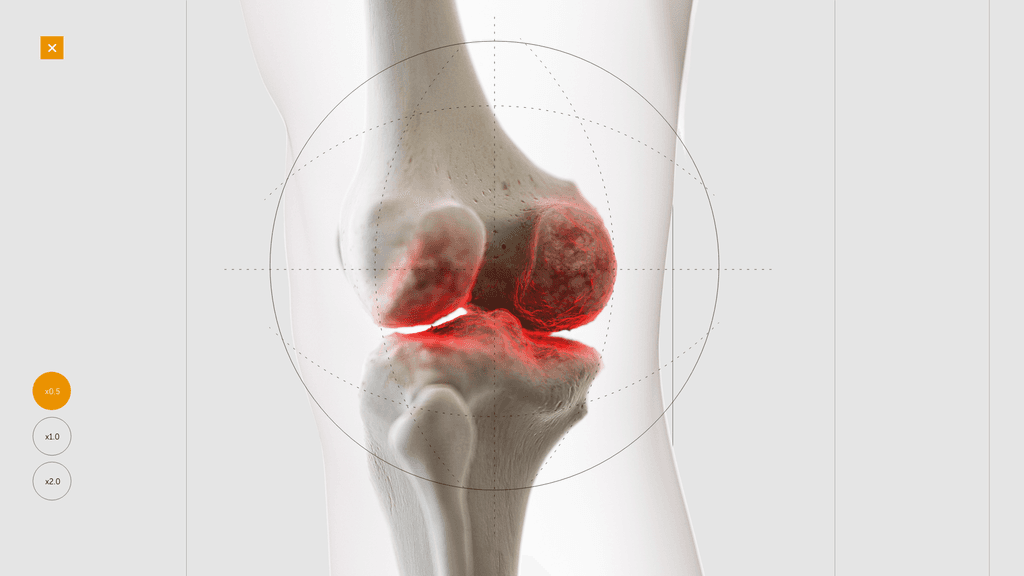
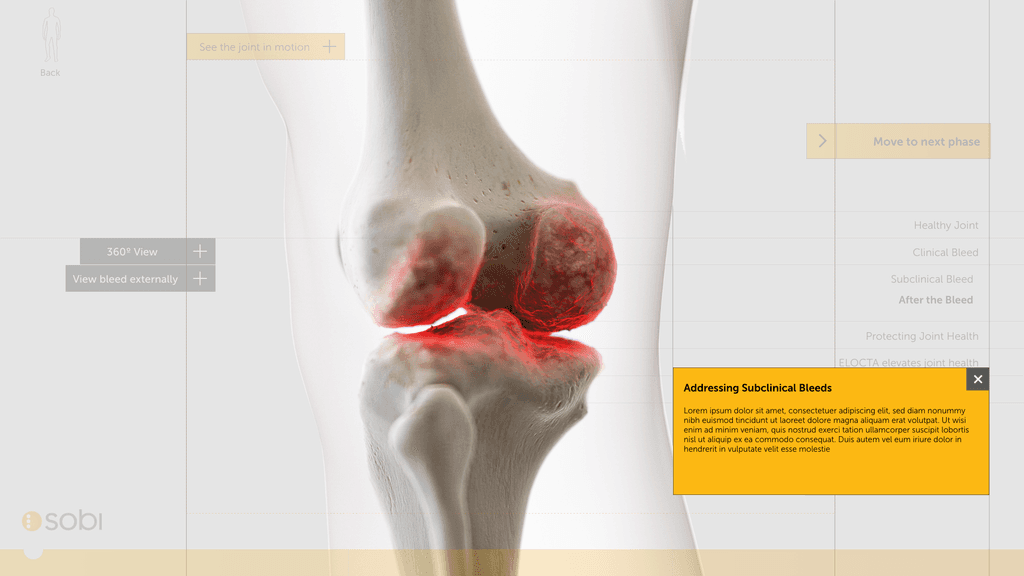
At this stage we worked with CASSETTE to build a 3D model of our knee for bleed examples. It was important to get the accuracy of the knee right so we consulted frequently with a haemophilia surgical specialist from SOBI who was able to guide the detailing on the knee. This was done by our in-house modeller.
Testing the wireframe
Testing of responsiveness and breaker points over the coming pages tweaked the styling a little to remove the grid lines as this was causing break-point issues. We UT the navigation and found it too difficult to understand for our target audience. We had to make a few assumptions as the medical dat was not public domain at this stage.
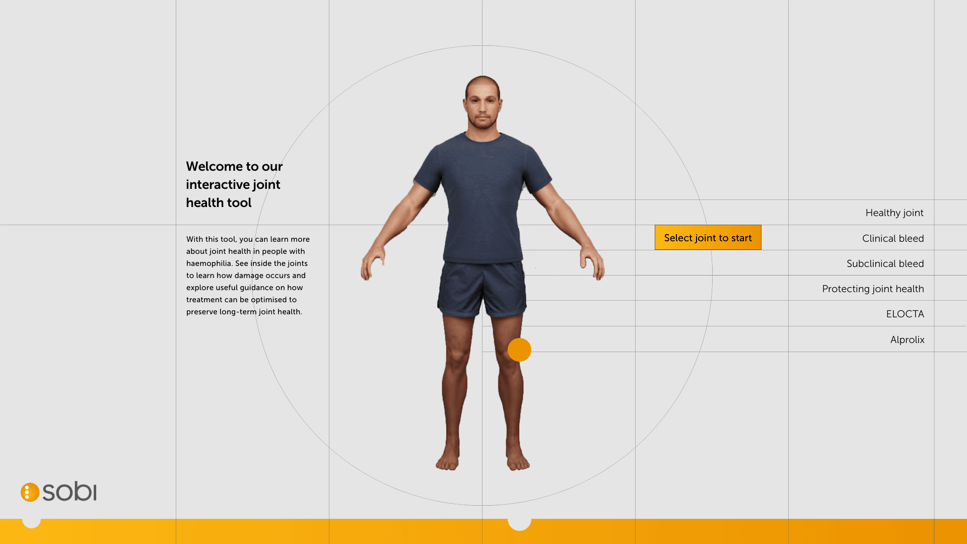

Styling throughout animated pages
After aligning on a central navigation as a first draft, we can look at flowing the styling into the key pages and then key branded pages.
Testing
Wireframe revisions
User testing amongst target audience showed general navigation was a bit chaotic and narrative flow was a bit confusing. We had issues in development of the technical lines crossing over the text. It was difficult to generate rules around it so we decided to remove and iterate leaving us with a fairly clean final product.
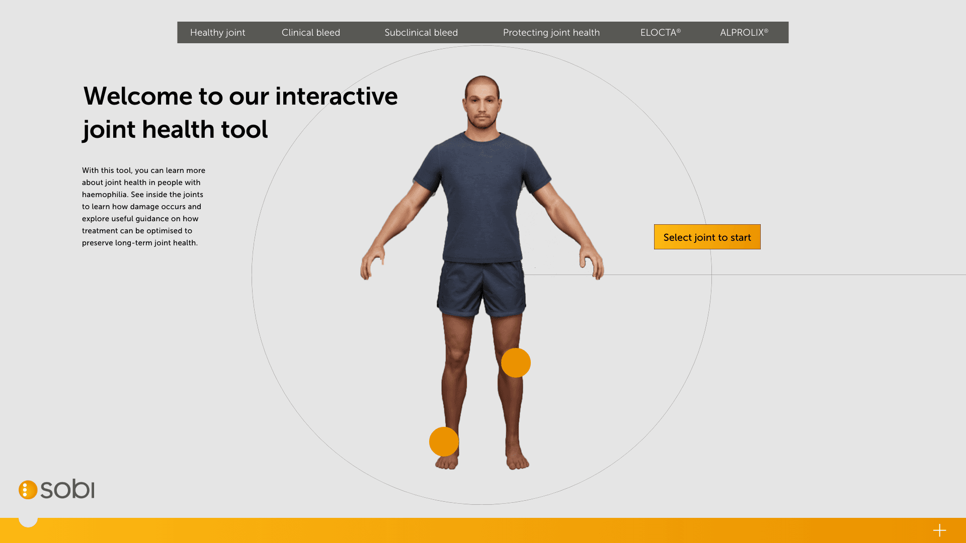

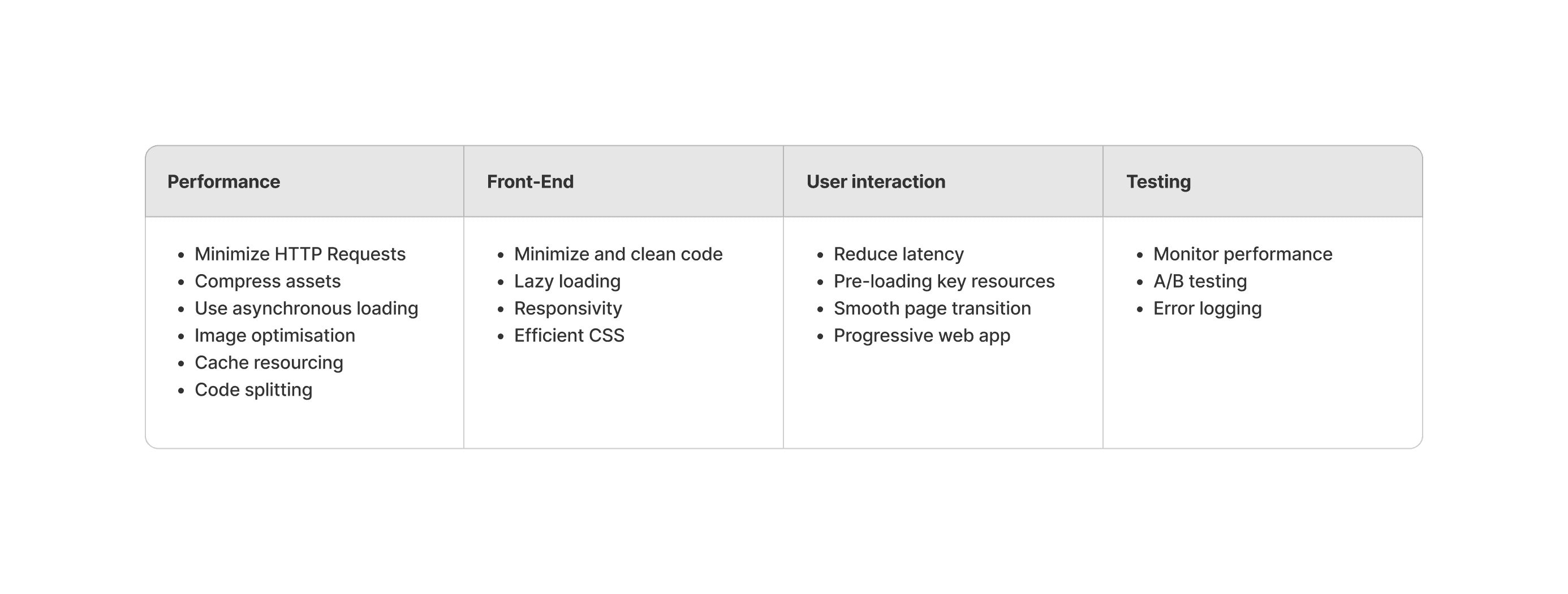
At this stage we have an MVP and so can begin optimising and testing for use. We have a congress coming up the client wants a showcase for so we ran optimisation sprints for the following:
We used our internal team to regularly test for optimisation and collected analytics to see how users worked with the site. Due to the strict nature of the narrative, we weren’t easily able to adjust the flow or core structure.

At this stage Sobi tasked us with removing their XR tool name and comceptualising a new one. We ran with three options:
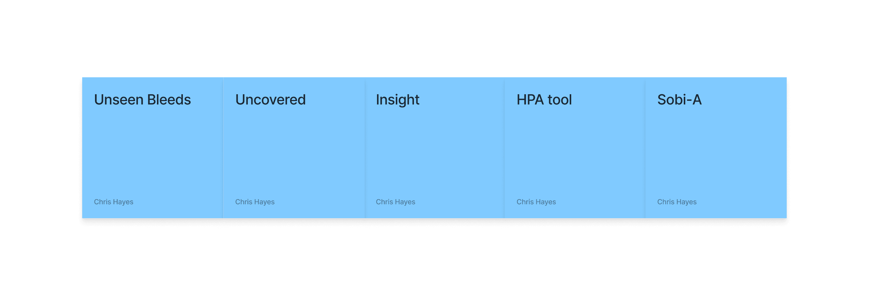

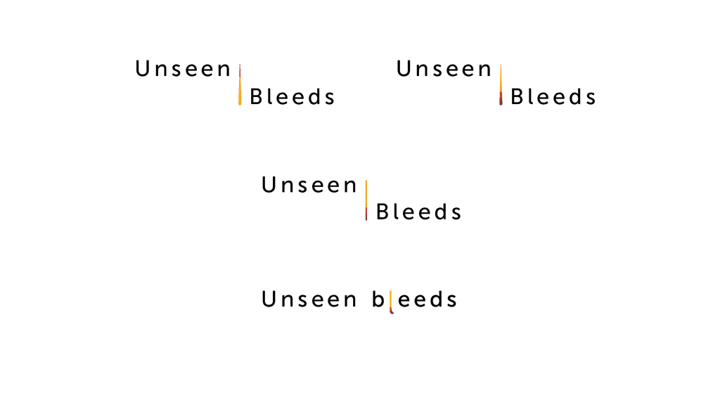
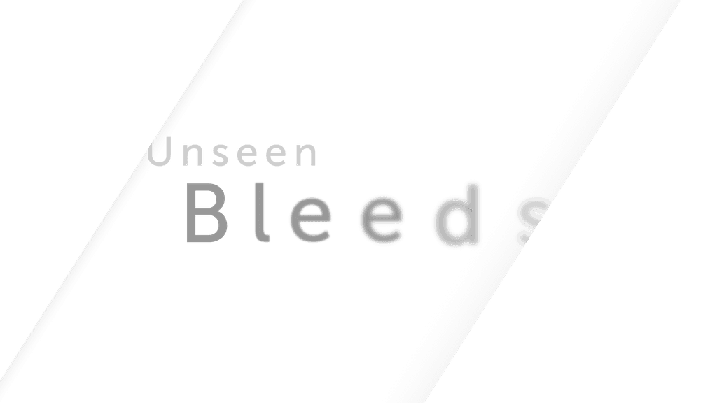
We workshopped these options with the client team and landed on an option: Unseen Bleeds. We took this to styling and worked up some options based on collateral going into an existing Interactive Visual Aid.
We tested this with an internal group and found the word ”bleed” gave patients a harsh impression when discussions were being had outside of HCP conversations, even though HCPs themselves preferred it due to the direct nature.
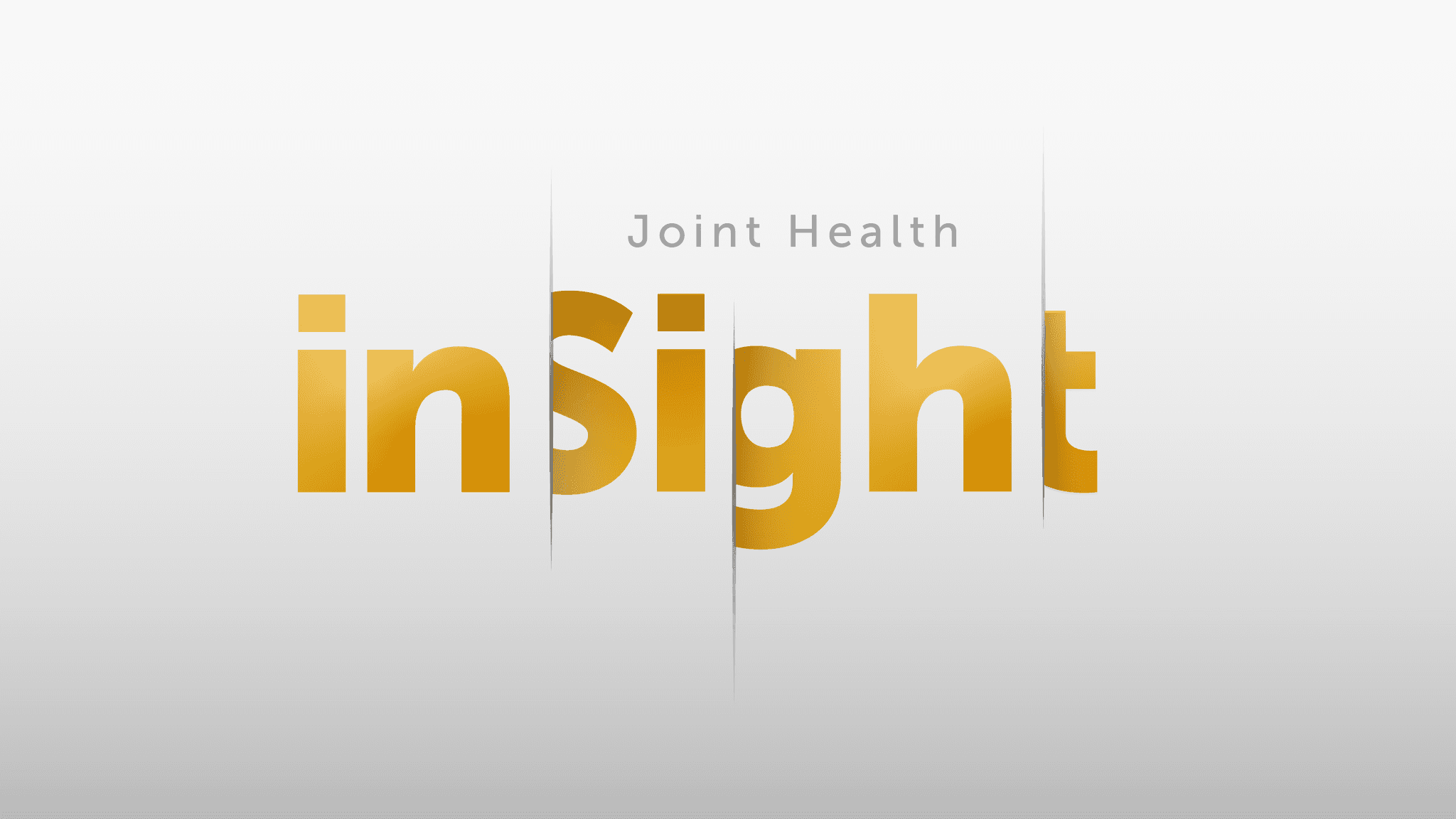
We went back to the workshop tool and landed on InSight as the next solution.
Phase 1 delivery
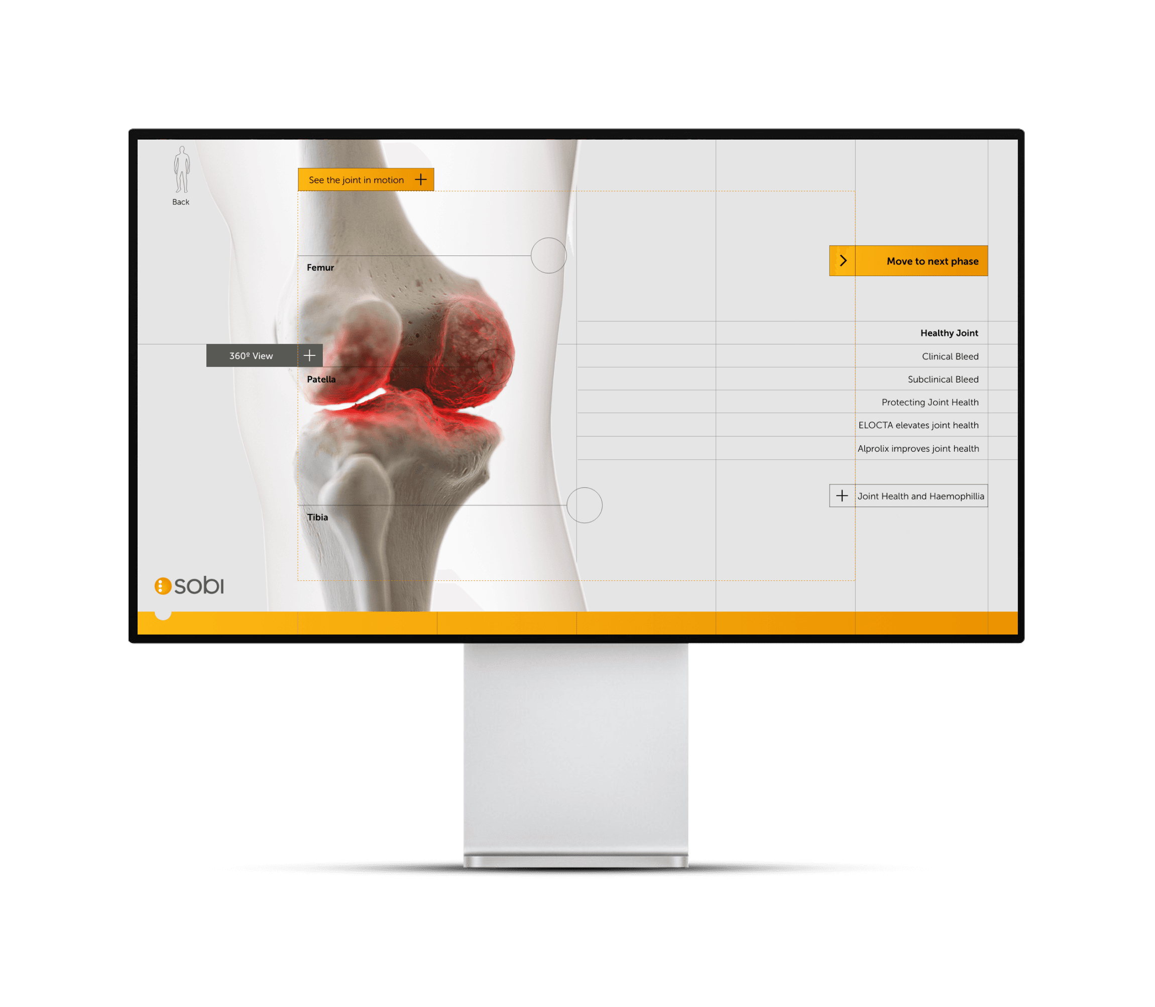
iSight tool was deployed for congress use in the UK with phase 2 in progress for responsive on mobile applications.

Next steps
Site is currently being optimised and adapted for other uses. The branded ELOCTA and ALPROLIX pages are now in place as part of the overall narrative and broader user testing is underway on a larger scale.
Empathise
The problem
ELOCTA, a medicine used to treat and prevent bleeding in patients with haemophillia A launched in 2014. It was the first treatment to require significantly less injections than competitors. The ELOCTA team have been using traditional collateral and sales methodology up to this point but a recent survey found they didn’t have much impact amongst HCPs.
Our strategy team have worked with SOBI to conclude a digital tool will help uplift the brand by providing an interactive element they can showcase at congress events and give HCPs access to add a visual aid to patient discussions.
From the client
Lets create an engaging XR experience that highlights the impact of joint bleeds and showcases the protection ELOCTA and ALPROLIX provide.

Understanding the market
The hemophilia A drug market in the UK is evolving rapidly due to advancements in gene therapies and extended half-life treatments. In 2022, the market was valued at approximately £250 million and is expected to grow at a steady compound annual growth rate (CAGR) of 2.8% through to 2030, reaching nearly £310 million.
Key drivers of this growth include the introduction of novel therapies, such as Sanofi's ALTUVIIIO, a once-weekly factor VIII replacement therapy, and gene therapies like BioMarin's Roctavian. These newer treatments are designed to improve patient outcomes by reducing the frequency of infusions and potentially offering long-term bleed protection, thereby enhancing the quality of life for patients with severe hemophilia A. Hemlibra (Roche) continues to hold a strong market share, especially among patients with inhibitors, due to its subcutaneous administration and high efficacy in prophylactic treatment.
While the demand for advanced therapies is rising, the high upfront costs of gene therapies could pose a barrier to broader market adoption. However, the UK’s National Health Service (NHS) reimbursement policies, which prioritize cost-effective solutions, are expected to mitigate some of these challenges by providing greater access to these innovative treatments.
The competitive landscape includes major players like Roche, Sanofi, BioMarin, Novo Nordisk, and Pfizer, all actively developing and marketing hemophilia A therapies. Looking ahead, the market will likely see increased competition as more gene therapies and extended half-life products become available
Understanding ELOCTA
Creating an affinity map for competitors of a hemophilia A drug like ELOCTA (efmoroctocog alfa) involves categorizing various competitor drugs based on different dimensions such as therapeutic mechanism, market presence, approval status, and innovative features.


Research summary
Objective: This research proposal aims to compare the therapeutic landscape for hemophilia A, focusing on how ELOCTA competes against other therapies in terms of dosing convenience, patient outcomes, and innovation.
Scope: The study will involve clinical trial data, patient outcomes, and market analysis for leading hemophilia A drugs (ELOCTA, Advate, Hemlibra, Roctavian, and others).
Methods: Utilising an affinity map, the research will categorize drugs based on factors like efficacy, innovation, and patient accessibility.
Outcome: SOBl will identify strategic opportunities for ELOCTA to enhance its market position, based on competitive analysis.
Define
Identifying product goals
Workshopping findings with the ELOCTA and SOBI team we structured some goals we want the tool to drive towards and answer three main questions:

Translating insights into goals
Discussions around how those initial insights can translate to goals for the site. How can HCPs and patients benefit from this?

Ideate
Workshopping a user-first need
We have a few ideas based on research and initial discussions with the SOBI team to ladder up to their project goals. We workshopped a few ideas to understand their level of priority for the user. This is 90% promotional material has to be kept behind a gate which will restrict public access.

Education and training module:
We landed on Education and training for two main reasons
It ladders up to their business objective of better brand awareness in the market acting as an educational resource
It bypasses gated domains by becoming a public site gives greater free access.
Developing a site-map
Now we have a direction, we need to look at the type of content we want to showcase. This has been bucked it into client needs and research from the medical team on what the treatment procedure is.

Digesting the key pages into something usable

Letsbucket our experience in two parts

Prototype
For a non-linear style webapp the L&F might influence the structure of the site. We didn't want to be constrained by the typical brochure-site styling that users are used to, it needs to follow a transient flow that remains easy to use.
We'll be plugging into the SOBI corporate branding but can add a unique touch to the styling thats unique to this project.

A fresh, elevated approach for SOBI unbranded, to make the experience feel seamless and future-proof. A key element on subtle technical lines to give strong definition to informatiom heirarchy
With a general style agreed we looked at identifying key pages in the site that needed multiple forms of interactivity. We partnered with CASSETTE, a local development agency who have supported us and SOBI in the past so were aware of any devlopment constraints.
We looked at frameworks and supplied 4 visuals for desktop that would work as a laddering process for all other screens.
Home screen (main nav)
Copy
360 animation
Video
Pre-determined rules around functionality helped the dev team understand the parameters. Copy dropping from top-down, boxes always cased in 20px padding.
After key page builds we tested the interactivity with a specific user group. Due to the nature of the medical data that was going on a public domain we were unable to test outside of an internal select group. We set each group an objective to find vertain criterea of a page to understand how they best use the site. The objectives were:
Object animation
Overview of the product
Find branded recommendation
We can start to overlay our look and feel into our four standardised frames.
Building a 3D model
At this stage we worked with CASSETTE to build a 3D model of our knee for bleed examples. It was important to get the accuracy of the knee right so we consulted frequently with a haemophilia surgical specialist from SOBI who was able to guide the detailing on the knee. This was done by our in-house modeller.
Testing the wireframe
Testing of responsiveness and breaker points over the coming pages tweaked the styling a little to remove the grid lines as this was causing break-point issues. We UT the navigation and found it too difficult to understand for our target audience. We had to make a few assumptions as the medical dat was not public domain at this stage.

Styling throughout animated pages
After aligning on a central navigation as a first draft, we can look at flowing the styling into the key pages and then key branded pages.
Testing
Wireframe revisions
User testing amongst target audience showed general navigation was a bit chaotic and narrative flow was a bit confusing. We had issues in development of the technical lines crossing over the text. It was difficult to generate rules around it so we decided to remove and iterate leaving us with a fairly clean final product.

At this stage we have an MVP and so can begin optimising and testing for use. We have a congress coming up the client wants a showcase for so we ran optimisation sprints for the following:
We used our internal team to regularly test for optimisation and collected analytics to see how users worked with the site. Due to the strict nature of the narrative, we weren’t easily able to adjust the flow or core structure.

At this stage Sobi tasked us with removing their XR tool name and comceptualising a new one. We ran with three options:

We workshopped these options with the client team and landed on an option: Unseen Bleeds. We took this to styling and worked up some options based on collateral going into an existing Interactive Visual Aid.
We tested this with an internal group and found the word ”bleed” gave patients a harsh impression when discussions were being had outside of HCP conversations, even though HCPs themselves preferred it due to the direct nature.
We went back to the workshop tool and landed on InSight as the next solution.
Phase 1 delivery
iSight tool was deployed for congress use in the UK with phase 2 in progress for responsive on mobile applications.

Next steps
Site is currently being optimised and adapted for other uses. The branded ELOCTA and ALPROLIX pages are now in place as part of the overall narrative and broader user testing is underway on a larger scale.

Project type
Webapp
Company
Sobi
Location
UK
Industry
Pharmacutical
Role
Product Designer
Tools
Adobe XD/Figma/FigJam
Empathise
The problem
ELOCTA, a medicine used to treat and prevent bleeding in patients with haemophillia A launched in 2014. It was the first treatment to require significantly less injections than competitors. The ELOCTA team have been using traditional collateral and sales methodology up to this point but a recent survey found they didn’t have much impact amongst HCPs.
Our strategy team have worked with SOBI to conclude a digital tool will help uplift the brand by providing an interactive element they can showcase at congress events and give HCPs access to add a visual aid to patient discussions.
From the client
Lets create an engaging XR experience that highlights the impact of joint bleeds and showcases the protection ELOCTA and ALPROLIX provide.

Understanding the market
The hemophilia A drug market in the UK is evolving rapidly due to advancements in gene therapies and extended half-life treatments. In 2022, the market was valued at approximately £250 million and is expected to grow at a steady compound annual growth rate (CAGR) of 2.8% through to 2030, reaching nearly £310 million.
Key drivers of this growth include the introduction of novel therapies, such as Sanofi's ALTUVIIIO, a once-weekly factor VIII replacement therapy, and gene therapies like BioMarin's Roctavian. These newer treatments are designed to improve patient outcomes by reducing the frequency of infusions and potentially offering long-term bleed protection, thereby enhancing the quality of life for patients with severe hemophilia A. Hemlibra (Roche) continues to hold a strong market share, especially among patients with inhibitors, due to its subcutaneous administration and high efficacy in prophylactic treatment.
While the demand for advanced therapies is rising, the high upfront costs of gene therapies could pose a barrier to broader market adoption. However, the UK’s National Health Service (NHS) reimbursement policies, which prioritize cost-effective solutions, are expected to mitigate some of these challenges by providing greater access to these innovative treatments.
The competitive landscape includes major players like Roche, Sanofi, BioMarin, Novo Nordisk, and Pfizer, all actively developing and marketing hemophilia A therapies. Looking ahead, the market will likely see increased competition as more gene therapies and extended half-life products become available
Understanding ELOCTA
Creating an affinity map for competitors of a hemophilia A drug like ELOCTA (efmoroctocog alfa) involves categorizing various competitor drugs based on different dimensions such as therapeutic mechanism, market presence, approval status, and innovative features.


Research summary
Objective: This research proposal aims to compare the therapeutic landscape for hemophilia A, focusing on how ELOCTA competes against other therapies in terms of dosing convenience, patient outcomes, and innovation.
Scope: The study will involve clinical trial data, patient outcomes, and market analysis for leading hemophilia A drugs (ELOCTA, Advate, Hemlibra, Roctavian, and others).
Methods: Utilising an affinity map, the research will categorize drugs based on factors like efficacy, innovation, and patient accessibility.
Outcome: SOBl will identify strategic opportunities for ELOCTA to enhance its market position, based on competitive analysis.
Define
Identifying product goals
Workshopping findings with the ELOCTA and SOBI team we structured some goals we want the tool to drive towards and answer three main questions:

Translating insights into goals
Discussions around how those initial insights can translate to goals for the site. How can HCPs and patients benefit from this?

Ideate
Workshopping a user-first need
We have a few ideas based on research and initial discussions with the SOBI team to ladder up to their project goals. We workshopped a few ideas to understand their level of priority for the user. This is 90% promotional material has to be kept behind a gate which will restrict public access.

Education and training module:
We landed on Education and training for two main reasons
It ladders up to their business objective of better brand awareness in the market acting as an educational resource
It bypasses gated domains by becoming a public site gives greater free access.
Developing a site-map
Now we have a direction, we need to look at the type of content we want to showcase. This has been bucked it into client needs and research from the medical team on what the treatment procedure is.

Digesting the key pages into something usable

Letsbucket our experience in two parts

Prototype
For a non-linear style webapp the L&F might influence the structure of the site. We didn't want to be constrained by the typical brochure-site styling that users are used to, it needs to follow a transient flow that remains easy to use.
We'll be plugging into the SOBI corporate branding but can add a unique touch to the styling thats unique to this project.

A fresh, elevated approach for SOBI unbranded, to make the experience feel seamless and future-proof. A key element on subtle technical lines to give strong definition to informatiom heirarchy
With a general style agreed we looked at identifying key pages in the site that needed multiple forms of interactivity. We partnered with CASSETTE, a local development agency who have supported us and SOBI in the past so were aware of any devlopment constraints.
We looked at frameworks and supplied 4 visuals for desktop that would work as a laddering process for all other screens.
Home screen (main nav)
Copy
360 animation
Video
Pre-determined rules around functionality helped the dev team understand the parameters. Copy dropping from top-down, boxes always cased in 20px padding.
After key page builds we tested the interactivity with a specific user group. Due to the nature of the medical data that was going on a public domain we were unable to test outside of an internal select group. We set each group an objective to find vertain criterea of a page to understand how they best use the site. The objectives were:
Object animation
Overview of the product
Find branded recommendation
We can start to overlay our look and feel into our four standardised frames.
Building a 3D model
At this stage we worked with CASSETTE to build a 3D model of our knee for bleed examples. It was important to get the accuracy of the knee right so we consulted frequently with a haemophilia surgical specialist from SOBI who was able to guide the detailing on the knee. This was done by our in-house modeller.
Testing the wireframe
Testing of responsiveness and breaker points over the coming pages tweaked the styling a little to remove the grid lines as this was causing break-point issues. We UT the navigation and found it too difficult to understand for our target audience. We had to make a few assumptions as the medical dat was not public domain at this stage.

Styling throughout animated pages
After aligning on a central navigation as a first draft, we can look at flowing the styling into the key pages and then key branded pages.
Testing
Wireframe revisions
User testing amongst target audience showed general navigation was a bit chaotic and narrative flow was a bit confusing. We had issues in development of the technical lines crossing over the text. It was difficult to generate rules around it so we decided to remove and iterate leaving us with a fairly clean final product.

At this stage we have an MVP and so can begin optimising and testing for use. We have a congress coming up the client wants a showcase for so we ran optimisation sprints for the following:
We used our internal team to regularly test for optimisation and collected analytics to see how users worked with the site. Due to the strict nature of the narrative, we weren’t easily able to adjust the flow or core structure.

At this stage Sobi tasked us with removing their XR tool name and comceptualising a new one. We ran with three options:

We workshopped these options with the client team and landed on an option: Unseen Bleeds. We took this to styling and worked up some options based on collateral going into an existing Interactive Visual Aid.
We tested this with an internal group and found the word ”bleed” gave patients a harsh impression when discussions were being had outside of HCP conversations, even though HCPs themselves preferred it due to the direct nature.
We went back to the workshop tool and landed on InSight as the next solution.
Phase 1 delivery
iSight tool was deployed for congress use in the UK with phase 2 in progress for responsive on mobile applications.

Next steps
Site is currently being optimised and adapted for other uses. The branded ELOCTA and ALPROLIX pages are now in place as part of the overall narrative and broader user testing is underway on a larger scale.
Empathise
The problem
ELOCTA, a medicine used to treat and prevent bleeding in patients with haemophillia A launched in 2014. It was the first treatment to require significantly less injections than competitors. The ELOCTA team have been using traditional collateral and sales methodology up to this point but a recent survey found they didn’t have much impact amongst HCPs.
Our strategy team have worked with SOBI to conclude a digital tool will help uplift the brand by providing an interactive element they can showcase at congress events and give HCPs access to add a visual aid to patient discussions.
From the client
Lets create an engaging XR experience that highlights the impact of joint bleeds and showcases the protection ELOCTA and ALPROLIX provide.

Understanding the market
The hemophilia A drug market in the UK is evolving rapidly due to advancements in gene therapies and extended half-life treatments. In 2022, the market was valued at approximately £250 million and is expected to grow at a steady compound annual growth rate (CAGR) of 2.8% through to 2030, reaching nearly £310 million.
Key drivers of this growth include the introduction of novel therapies, such as Sanofi's ALTUVIIIO, a once-weekly factor VIII replacement therapy, and gene therapies like BioMarin's Roctavian. These newer treatments are designed to improve patient outcomes by reducing the frequency of infusions and potentially offering long-term bleed protection, thereby enhancing the quality of life for patients with severe hemophilia A. Hemlibra (Roche) continues to hold a strong market share, especially among patients with inhibitors, due to its subcutaneous administration and high efficacy in prophylactic treatment.
While the demand for advanced therapies is rising, the high upfront costs of gene therapies could pose a barrier to broader market adoption. However, the UK’s National Health Service (NHS) reimbursement policies, which prioritize cost-effective solutions, are expected to mitigate some of these challenges by providing greater access to these innovative treatments.
The competitive landscape includes major players like Roche, Sanofi, BioMarin, Novo Nordisk, and Pfizer, all actively developing and marketing hemophilia A therapies. Looking ahead, the market will likely see increased competition as more gene therapies and extended half-life products become available
Understanding ELOCTA
Creating an affinity map for competitors of a hemophilia A drug like ELOCTA (efmoroctocog alfa) involves categorizing various competitor drugs based on different dimensions such as therapeutic mechanism, market presence, approval status, and innovative features.


Research summary
Objective: This research proposal aims to compare the therapeutic landscape for hemophilia A, focusing on how ELOCTA competes against other therapies in terms of dosing convenience, patient outcomes, and innovation.
Scope: The study will involve clinical trial data, patient outcomes, and market analysis for leading hemophilia A drugs (ELOCTA, Advate, Hemlibra, Roctavian, and others).
Methods: Utilising an affinity map, the research will categorize drugs based on factors like efficacy, innovation, and patient accessibility.
Outcome: SOBl will identify strategic opportunities for ELOCTA to enhance its market position, based on competitive analysis.
Define
Identifying product goals
Workshopping findings with the ELOCTA and SOBI team we structured some goals we want the tool to drive towards and answer three main questions:

Translating insights into goals
Discussions around how those initial insights can translate to goals for the site. How can HCPs and patients benefit from this?

Ideate
Workshopping a user-first need
We have a few ideas based on research and initial discussions with the SOBI team to ladder up to their project goals. We workshopped a few ideas to understand their level of priority for the user. This is 90% promotional material has to be kept behind a gate which will restrict public access.

Education and training module:
We landed on Education and training for two main reasons
It ladders up to their business objective of better brand awareness in the market acting as an educational resource
It bypasses gated domains by becoming a public site gives greater free access.
Developing a site-map
Now we have a direction, we need to look at the type of content we want to showcase. This has been bucked it into client needs and research from the medical team on what the treatment procedure is.

Digesting the key pages into something usable

Letsbucket our experience in two parts

Prototype
For a non-linear style webapp the L&F might influence the structure of the site. We didn't want to be constrained by the typical brochure-site styling that users are used to, it needs to follow a transient flow that remains easy to use.
We'll be plugging into the SOBI corporate branding but can add a unique touch to the styling thats unique to this project.

A fresh, elevated approach for SOBI unbranded, to make the experience feel seamless and future-proof. A key element on subtle technical lines to give strong definition to informatiom heirarchy
With a general style agreed we looked at identifying key pages in the site that needed multiple forms of interactivity. We partnered with CASSETTE, a local development agency who have supported us and SOBI in the past so were aware of any devlopment constraints.
We looked at frameworks and supplied 4 visuals for desktop that would work as a laddering process for all other screens.
Home screen (main nav)
Copy
360 animation
Video
Pre-determined rules around functionality helped the dev team understand the parameters. Copy dropping from top-down, boxes always cased in 20px padding.
After key page builds we tested the interactivity with a specific user group. Due to the nature of the medical data that was going on a public domain we were unable to test outside of an internal select group. We set each group an objective to find vertain criterea of a page to understand how they best use the site. The objectives were:
Object animation
Overview of the product
Find branded recommendation
We can start to overlay our look and feel into our four standardised frames.
Building a 3D model
At this stage we worked with CASSETTE to build a 3D model of our knee for bleed examples. It was important to get the accuracy of the knee right so we consulted frequently with a haemophilia surgical specialist from SOBI who was able to guide the detailing on the knee. This was done by our in-house modeller.
Testing the wireframe
Testing of responsiveness and breaker points over the coming pages tweaked the styling a little to remove the grid lines as this was causing break-point issues. We UT the navigation and found it too difficult to understand for our target audience. We had to make a few assumptions as the medical dat was not public domain at this stage.

Styling throughout animated pages
After aligning on a central navigation as a first draft, we can look at flowing the styling into the key pages and then key branded pages.
Testing
Wireframe revisions
User testing amongst target audience showed general navigation was a bit chaotic and narrative flow was a bit confusing. We had issues in development of the technical lines crossing over the text. It was difficult to generate rules around it so we decided to remove and iterate leaving us with a fairly clean final product.

At this stage we have an MVP and so can begin optimising and testing for use. We have a congress coming up the client wants a showcase for so we ran optimisation sprints for the following:
We used our internal team to regularly test for optimisation and collected analytics to see how users worked with the site. Due to the strict nature of the narrative, we weren’t easily able to adjust the flow or core structure.

At this stage Sobi tasked us with removing their XR tool name and comceptualising a new one. We ran with three options:

We workshopped these options with the client team and landed on an option: Unseen Bleeds. We took this to styling and worked up some options based on collateral going into an existing Interactive Visual Aid.
We tested this with an internal group and found the word ”bleed” gave patients a harsh impression when discussions were being had outside of HCP conversations, even though HCPs themselves preferred it due to the direct nature.
We went back to the workshop tool and landed on InSight as the next solution.
Phase 1 delivery
iSight tool was deployed for congress use in the UK with phase 2 in progress for responsive on mobile applications.

Next steps
Site is currently being optimised and adapted for other uses. The branded ELOCTA and ALPROLIX pages are now in place as part of the overall narrative and broader user testing is underway on a larger scale.
