Vertex
Website for innovative treatment therapy
Website for innovative treatment therapy
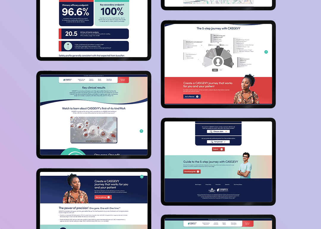
Vertex’ breakthrough CRISPR technology allows children with Sickle-cell Anaemia and beta-thalassemia to go from weekly blood transfusions and a low life expectancy to a single treatment that will give them their lives back.

Project type
Project type
End-to-end website
End-to-end website
Company
Company
Vertex
Vertex
Location
Location
UK
UK
Industry
Industry
Pharmacuticals
Pharmacuticals
Role
Role
UX Designer
UX Designer
Tools
Tools
Figma, FigJam
Figma, FigJam
Empathise
The problem
The problem
Vertex have launched an approved new treatment for sickle cell and beta-thalassemia in 2 indications under the brand name Exa-Cel. The current process of treatment collaboration is slow and not very collaborative between healthcare professionals, consultants and patients
The hero of this new treatment is it can work around the patients life and be flexible to them reducing as much stress from family life as possible.
The initial ask from Vertex is a classic brochure site-style webapp the shows the benefit of Exa-Cel aimed primarily to healthcare professionals.
With such an innovative treatment coming to market, we can elevate this proposition.
Understanding Exa-Cel
Understanding Exa-Cel
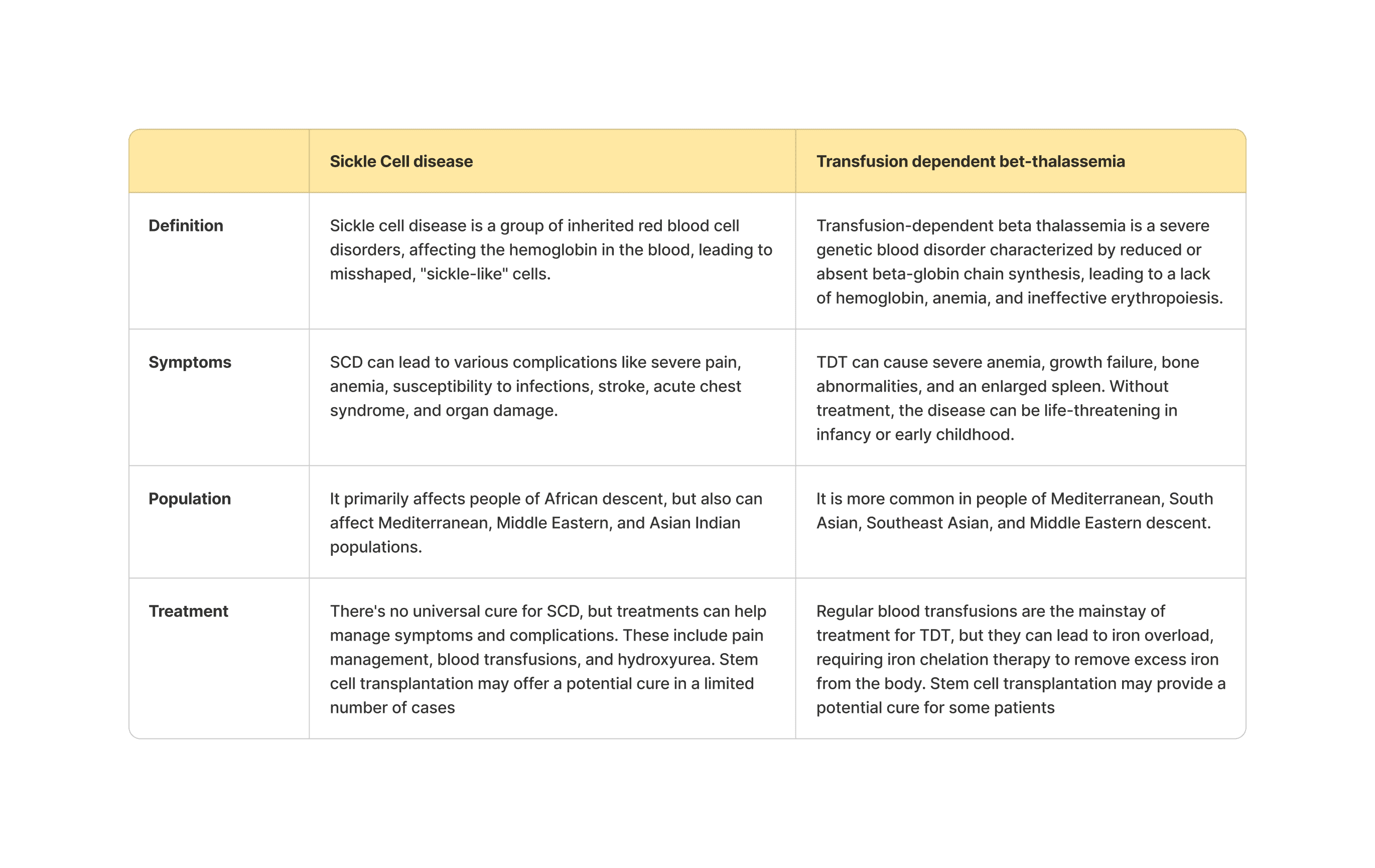
A broad top level overview of the two disease areas Exa-Cel is tackling.


How disease areas currently being addressed?
How disease areas currently being addressed?
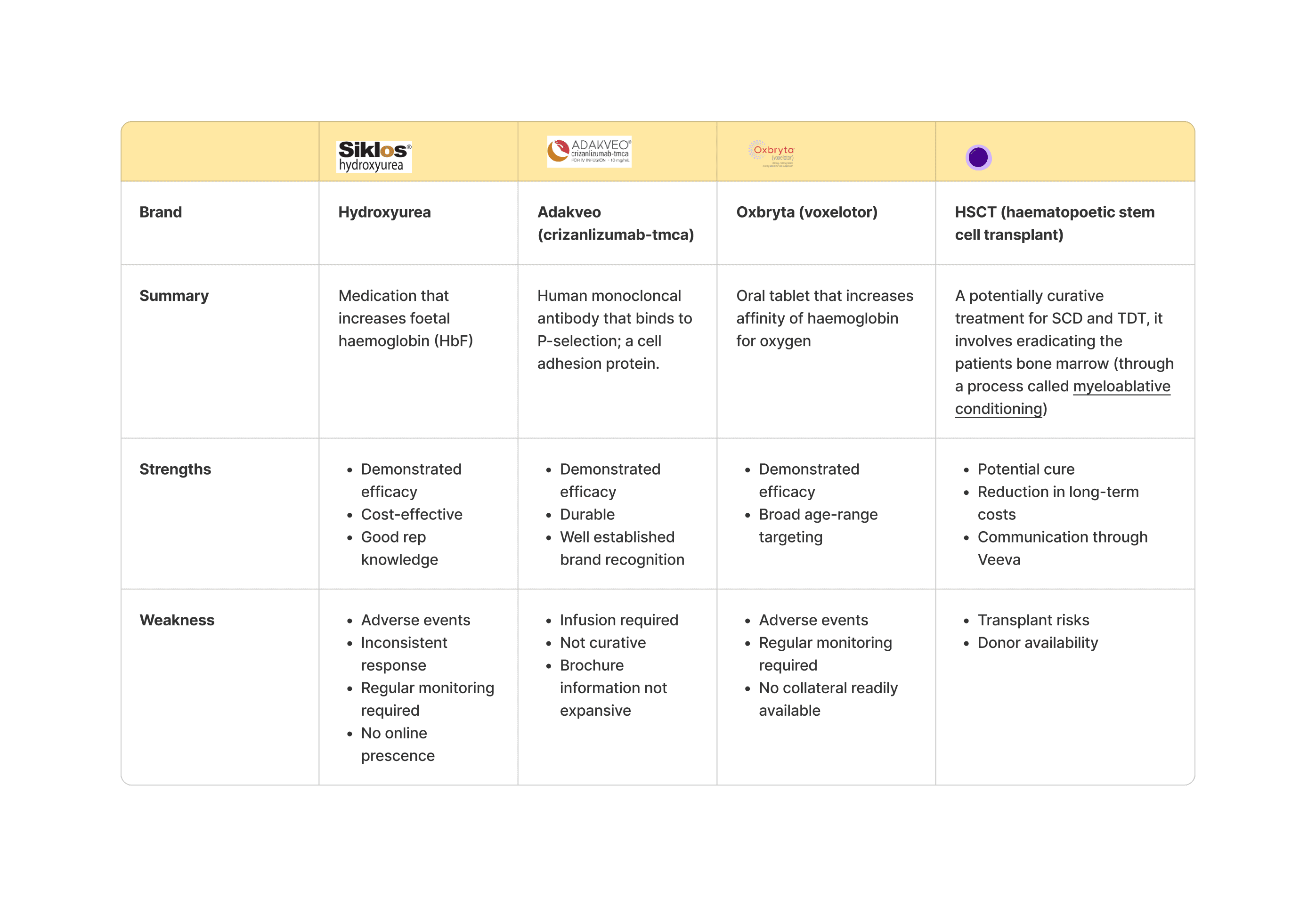
We compared four competitor brands working in this area which will help us understand the general offering on the market and how the website can give additional value over breakthrough treatment.


Define
What collaborative treatment plans work outside of direct competition
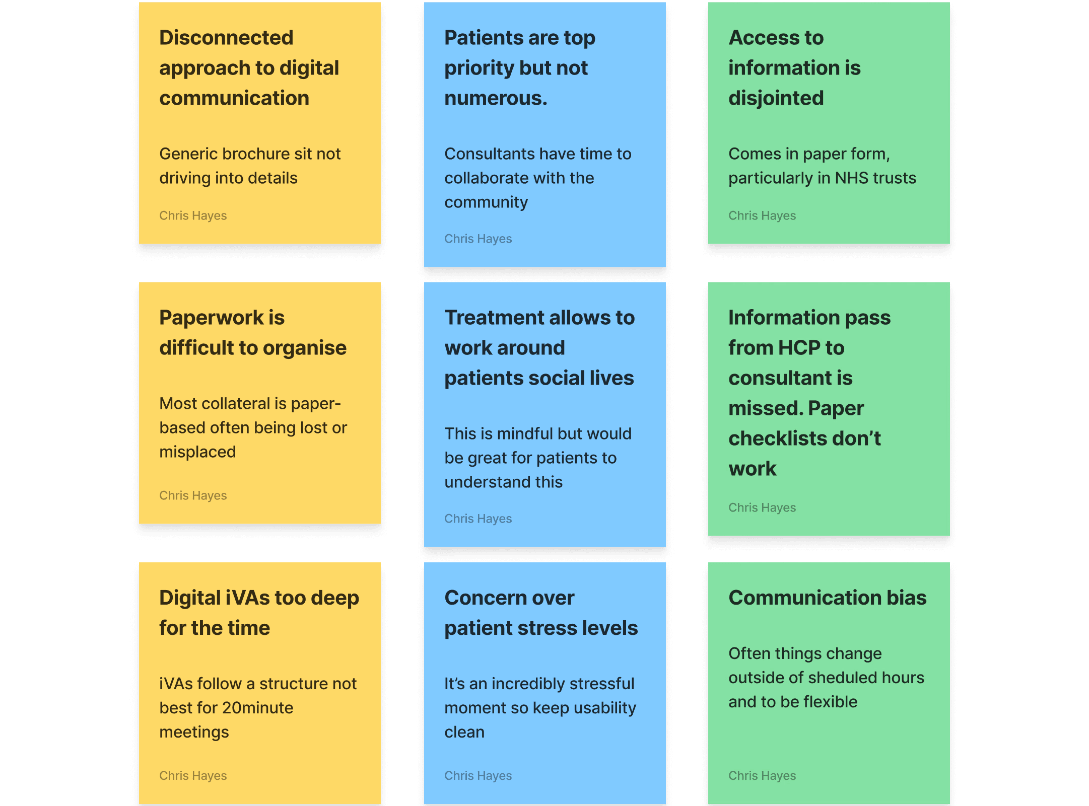
We interviewed 4 Vertex KAMs, consultants and patients to help drive down into what experience would allow Vertex to not only be the chosen treatment plan, but to offer tools that make the experience beneficial over the competition.
Expected outcomes:
Little to no digital support for consultants
Patient stress due to paperwork load
Interference in general and social life
Ananlysing user interviews

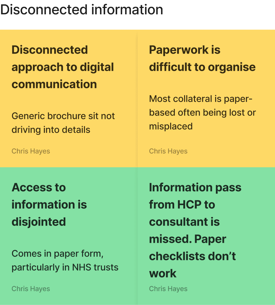

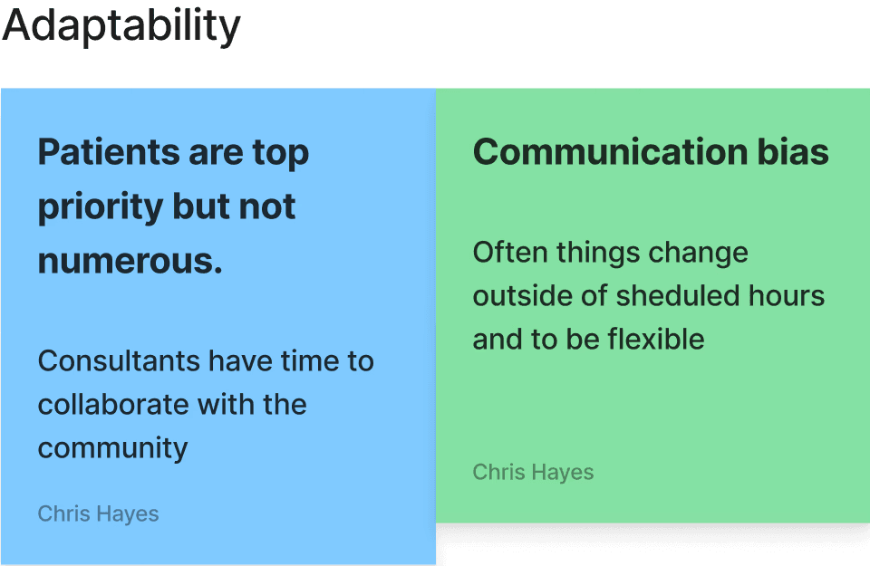

Affinity mapping


Insights from the Vertex team
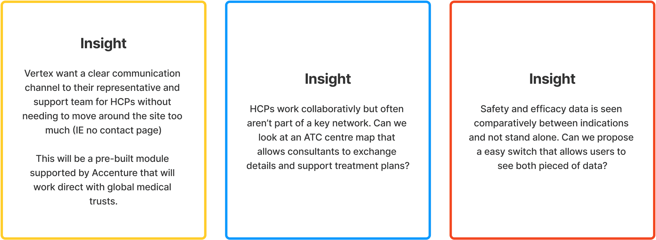

Ideate
Brainstorming Ideas
Using my insights I started brainstorming ideas. I know Vertex are keen to see new technologies implemented into the site to help give HCPs and consultants more flexibility to plan with patient plans, but we are on a tight timeline to build an implement. The ideation is done in 2 phases:
Core page information like safety data, product information, patient portals and contact to REPs are key. We need to understand a key feature that allows HCPs and patients to interact with their treatment plan.
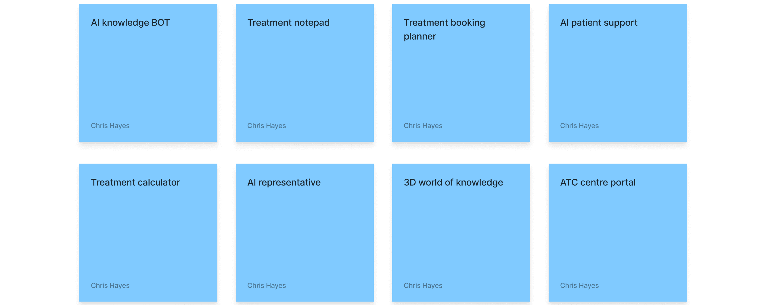
AI knowedge bots can help digest the vast amount of information available and answer questions quicker.
Ananlysing user interviews
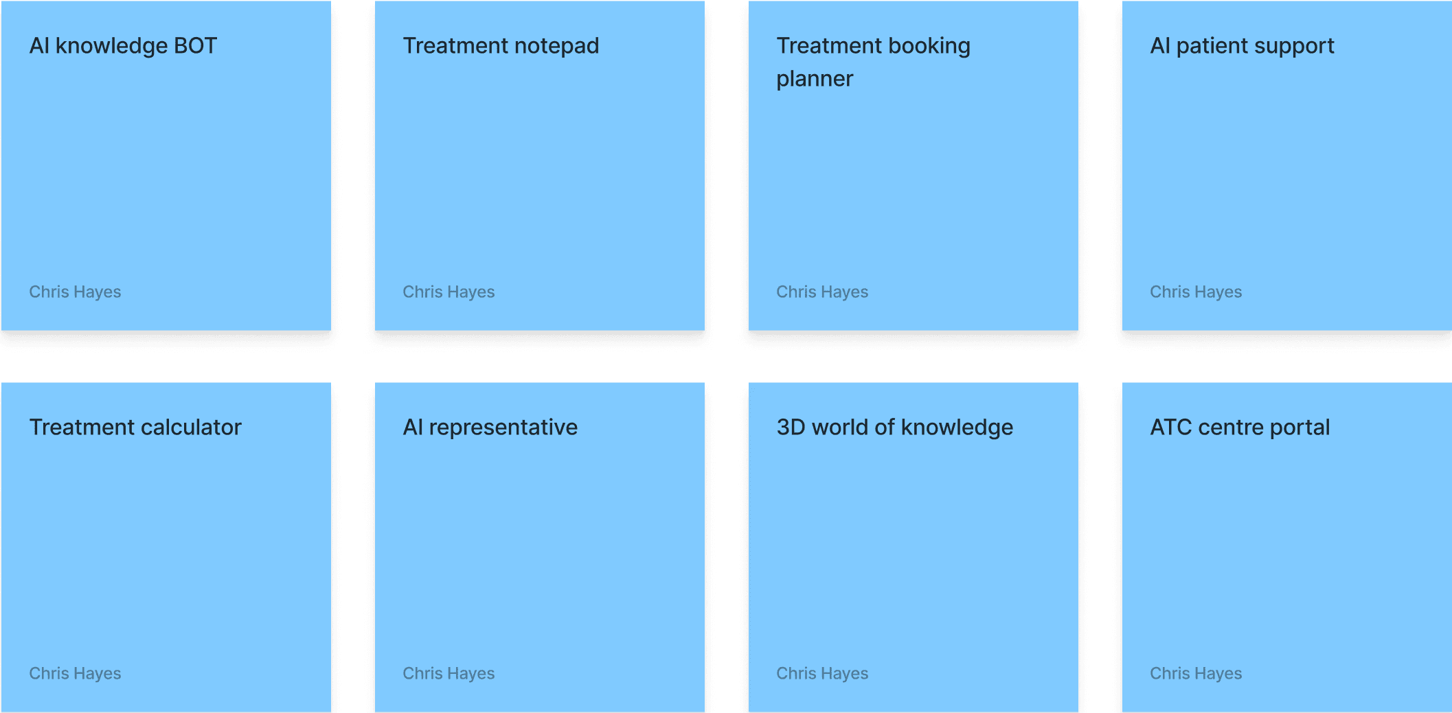

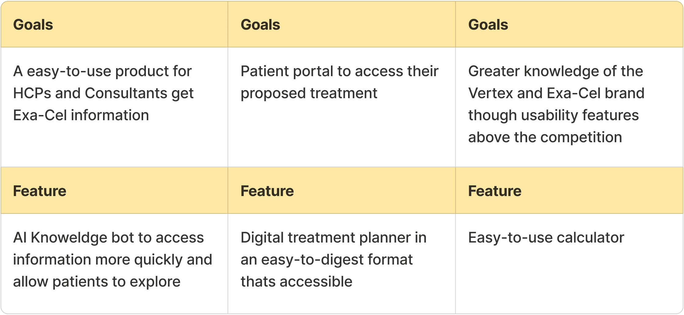
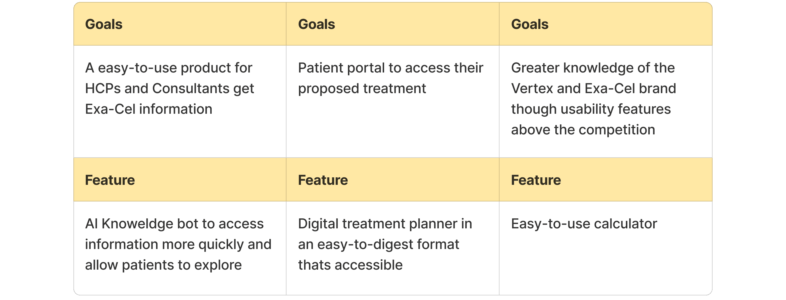
Aligning to project goals
Lets align the proposal to the broader project goals

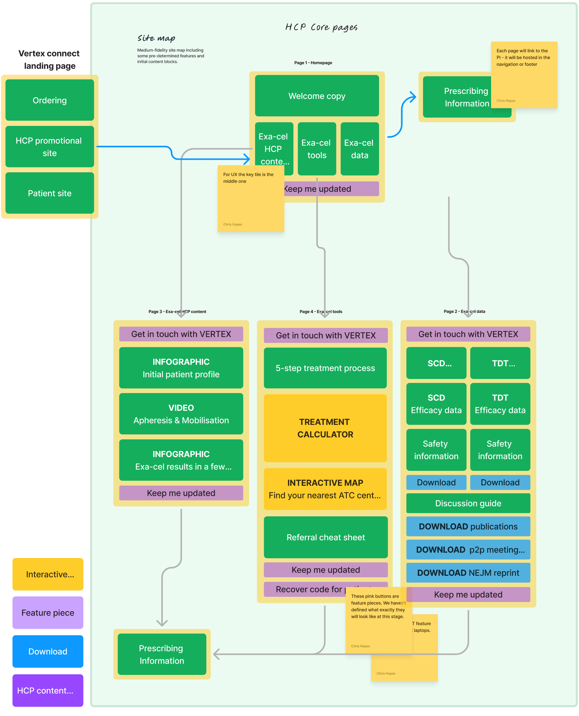
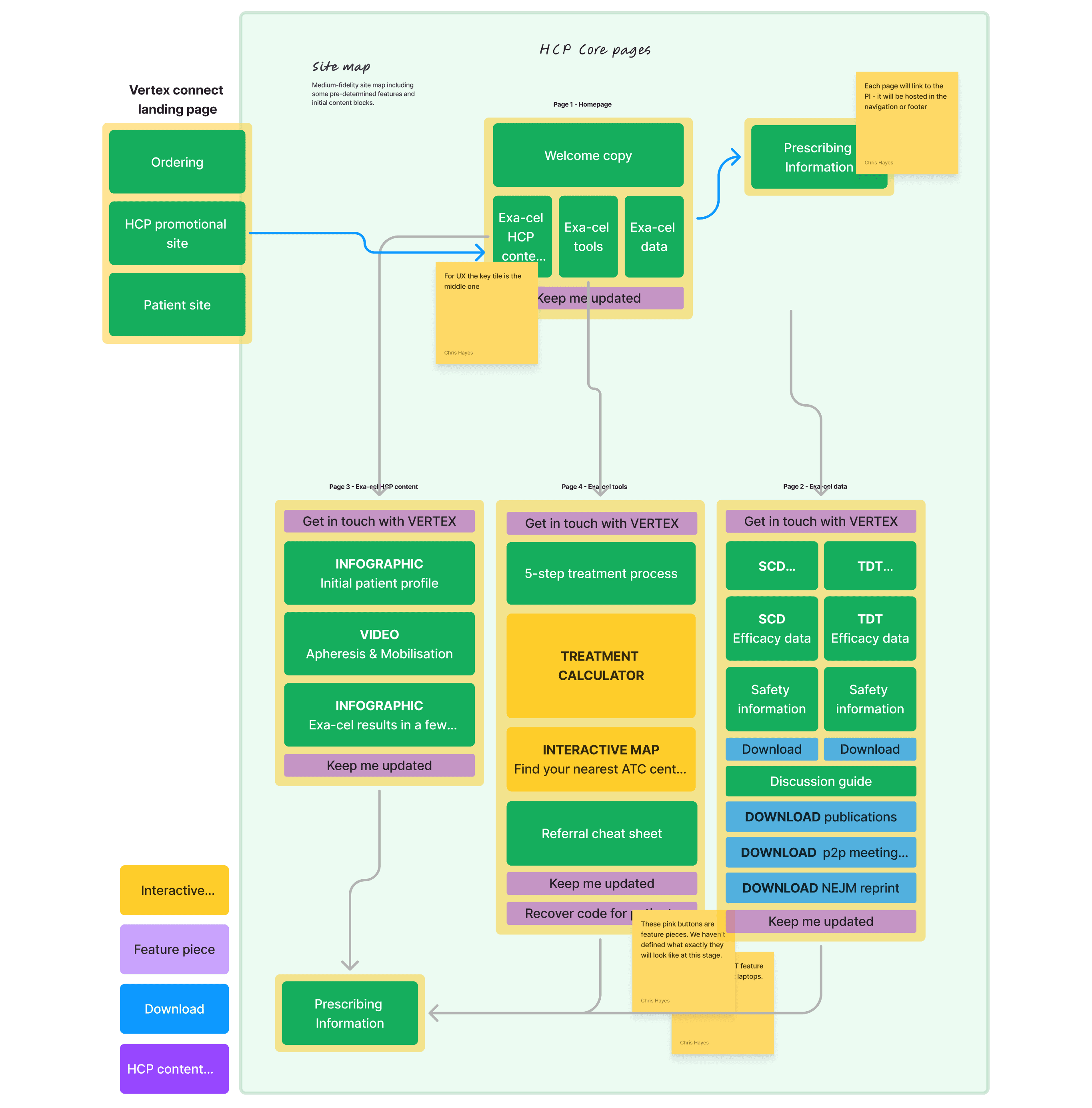
Site map
Using the features above, lets look at a basic site map

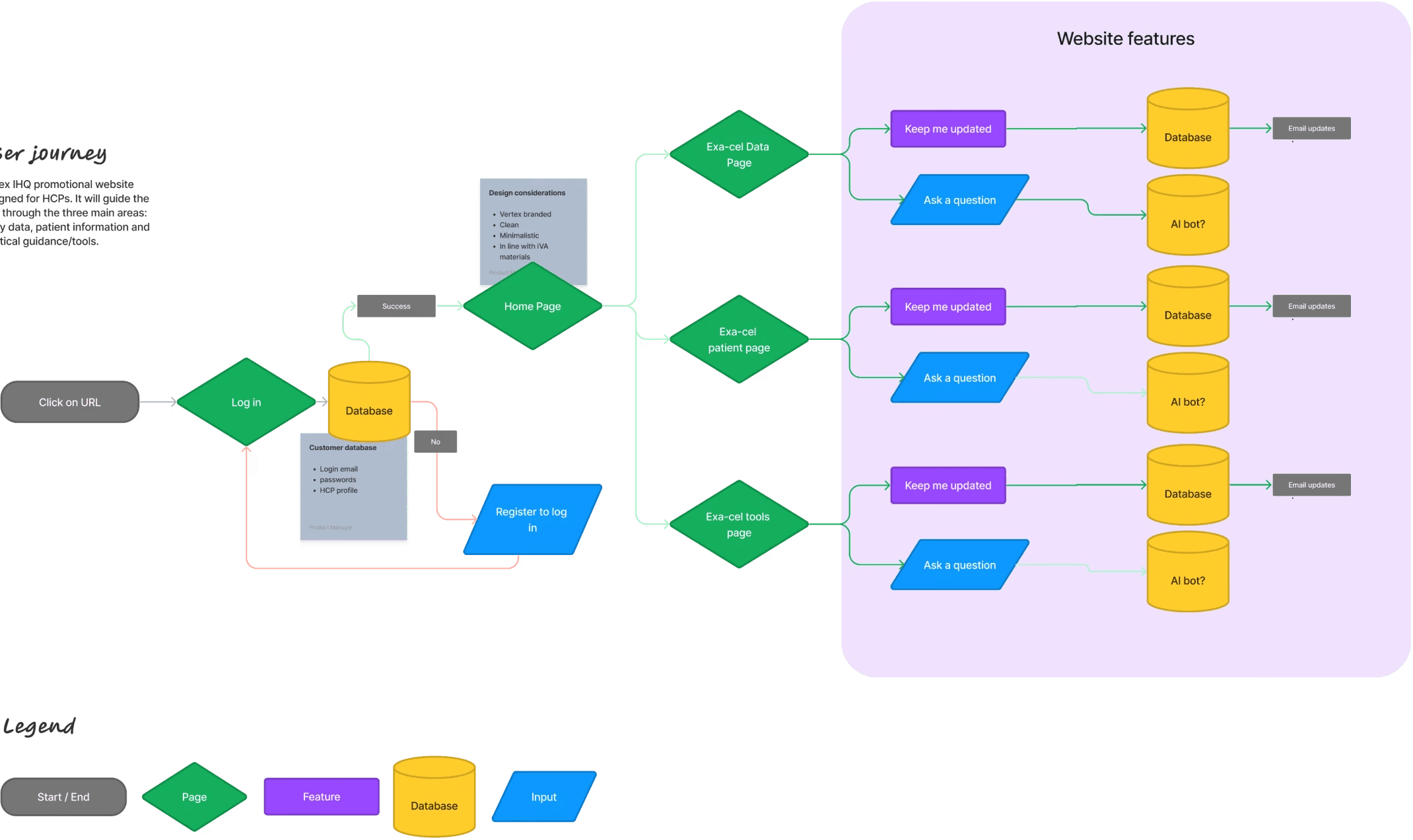

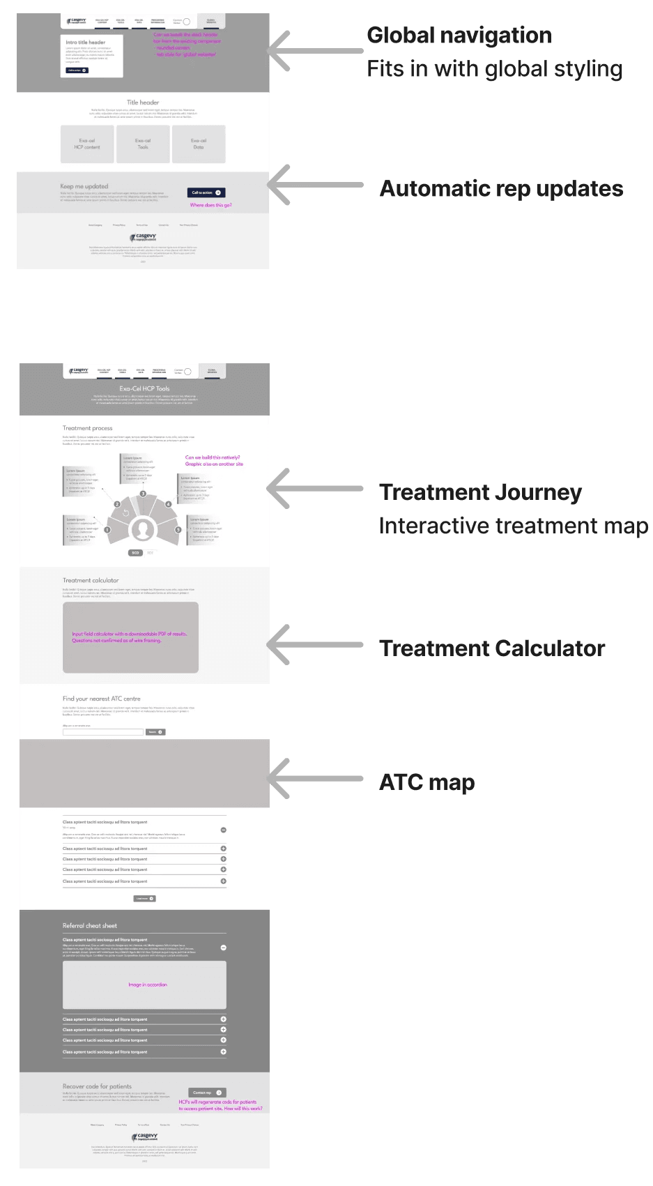
Wireframing
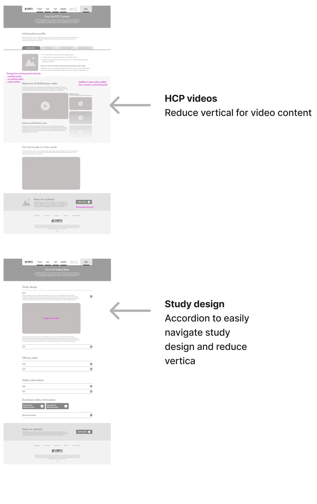
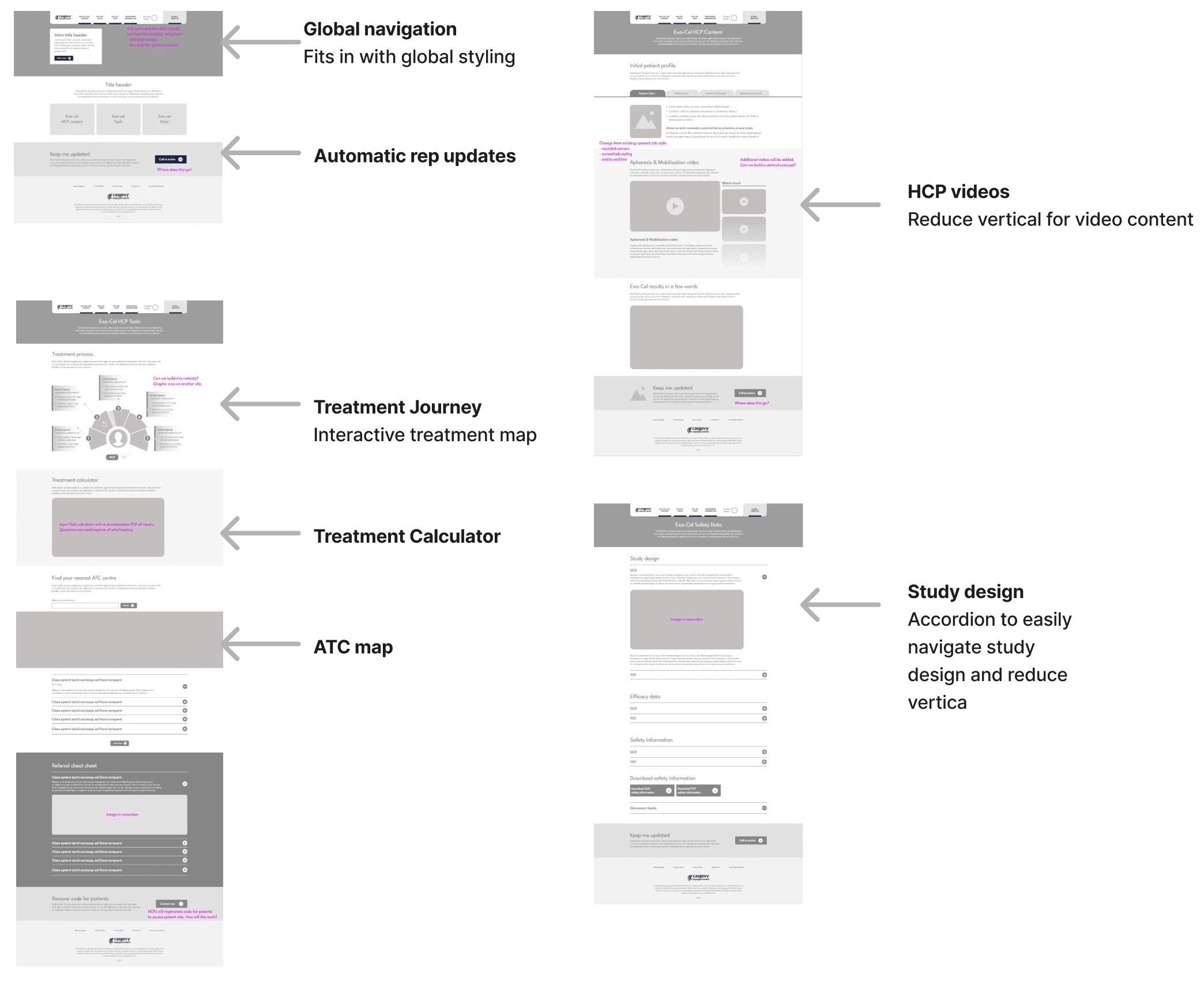
Usability testing on previous Vertex products gave us insights that desktop is a the most common device this will be accessed from mostly due to working from an office. Patients, however will most likely use mobile to view information as a receiver. For this we have ideated a simple rule.
Mobile-first is easier to scale up, and a key goal is to alleviate stress on the patients.
We want to minimise visual overload by settting a visual heirarchy, particularly in medical copy which can be expansive.


Testing
Initial wireframes are testing using Preely to see how users navigate the site. We have 2 primary criterea to benchmark:
East of navigation to Planner
Digestability of safety studies
I A/B testing three variations, benchmarking dwell time, reduction of clicks and ease experience. Two main pieces of feedback from HCP users:
Copy is too promotional in it’s tone
Patient journey mapping doesn’t align with regulatory concerns.
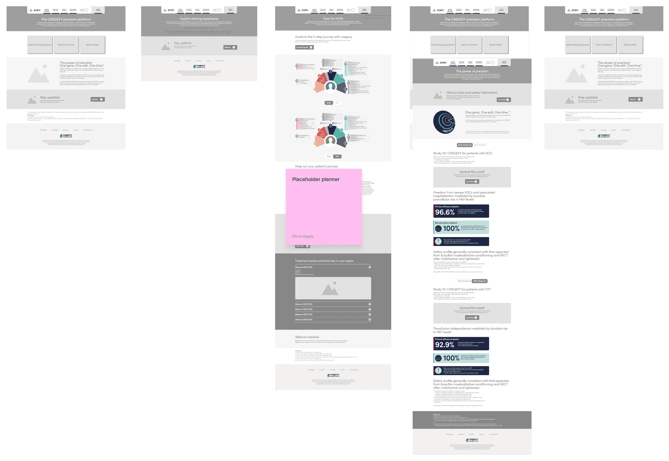

Prototype
Initial wireframes are testing using Preely to see how users navigate the site. We have 2 primary criteria to benchmark:
East of navigation to Planner
Digestibility of safety studies
A/B testing three variations, benchmarking dwell time, reduction of clicks and ease experience.
Refining the experience
After rounds of A/B and user testing we refined the concept down to the following points
Less is more Copy is overly promotional and HCPs want more data. This is a heavy lift from the client-side as the project is first and foremost a promotional endeavour.
Fewer clicks Dwell time and side-questing was too high for the batch of UT’s assigned for treatment planner.
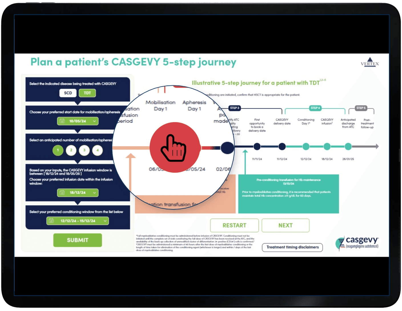

At this stage we were sensitive to the clients pre-vetted solution but after testing this on a browser it was a bit difficult to understand the flow of information but it did have 1 good value.
+ Information was live and allowed you to change your parameters for different results
- Interface was clunky and not very intuative for a patient who wouldn’t understand many of the terms
We workshopped a solution with the client to find a good webapp-friendly solution.
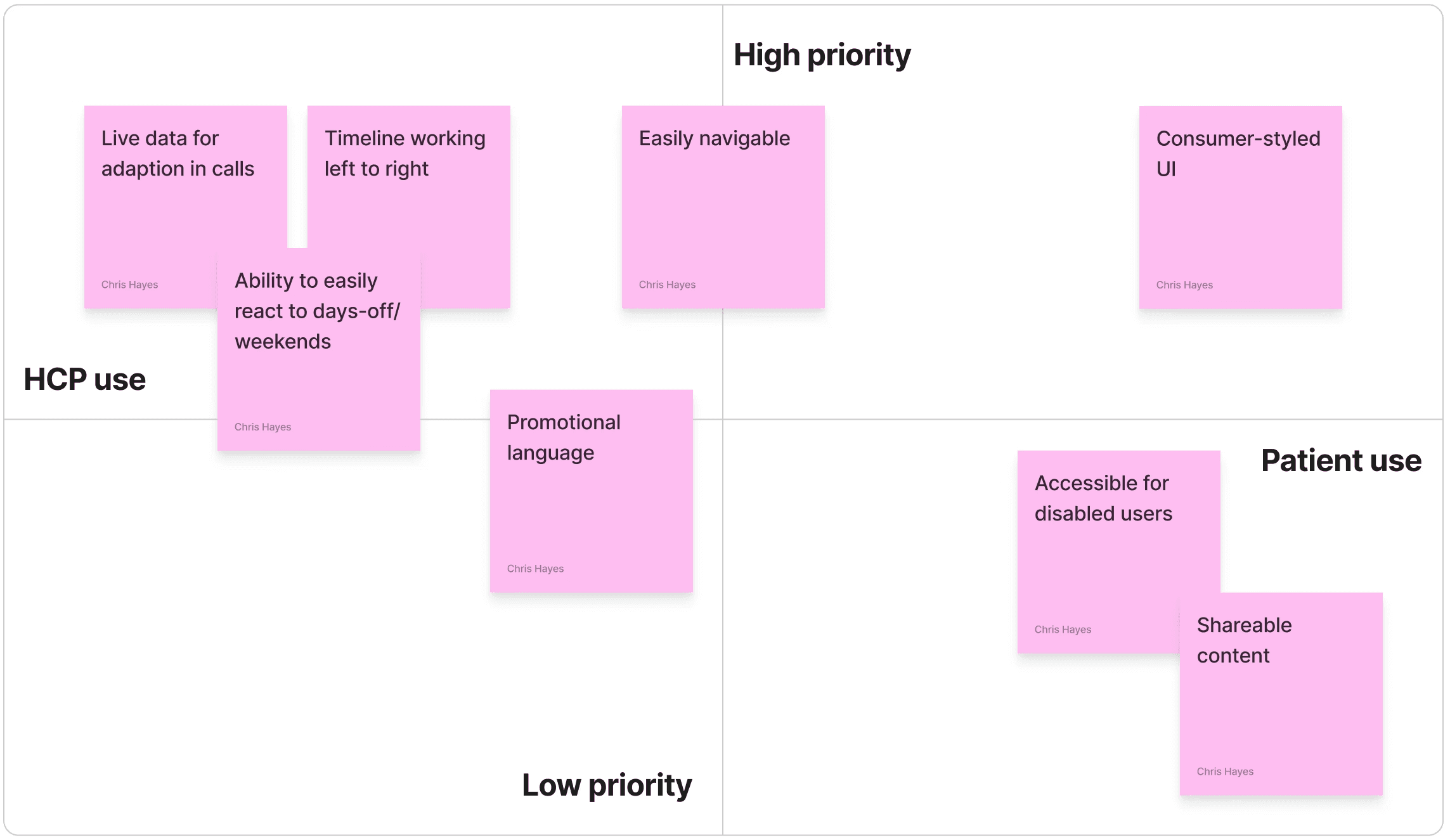

Looking around to found two examples in the workshop that we could use to test ideas with the group.
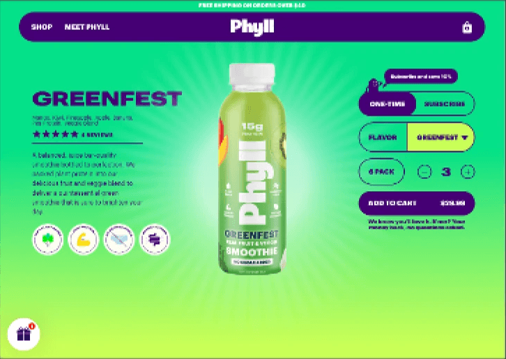

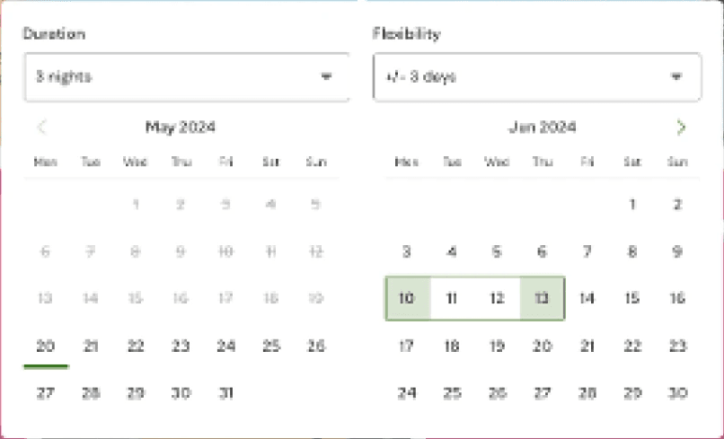

Based on the workshop findings we were able to conceptualise a treatment planner that would work with patients and HCPs.
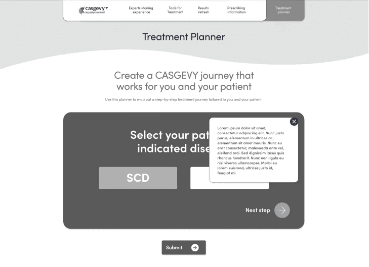

Moving a key goal to a feature


When hovering over a selected date, the traditional 3-day treatment window will cover the selected dates, but when moved over a weekend.
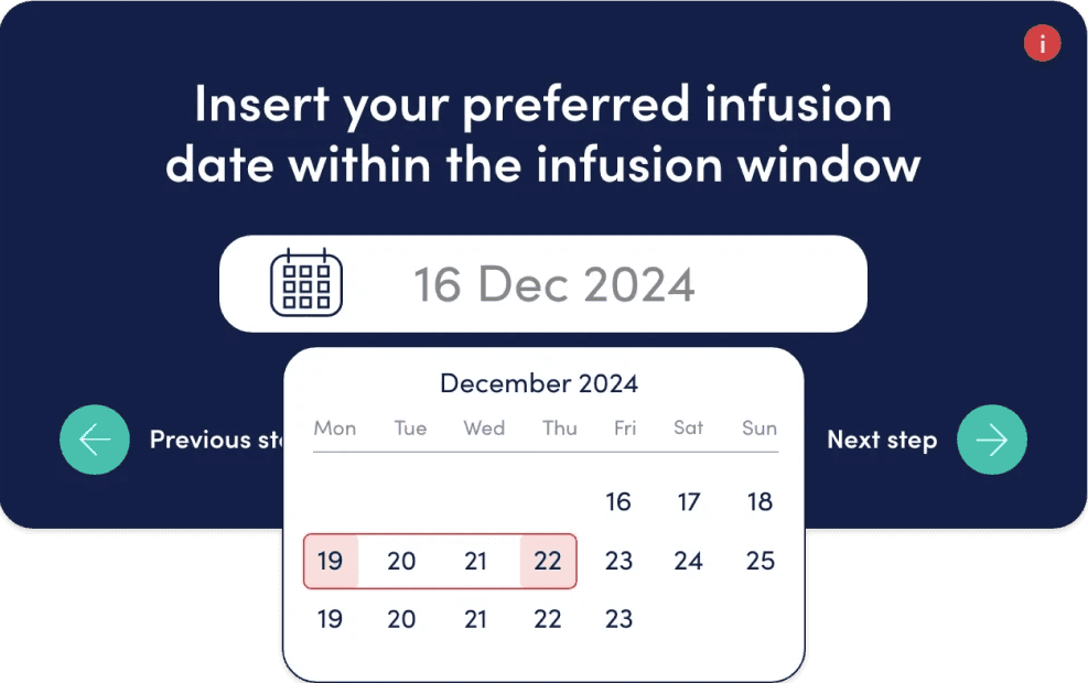

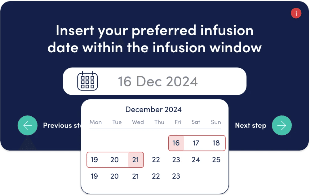

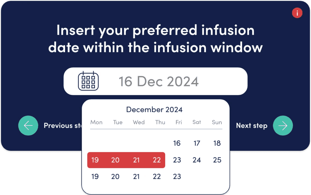

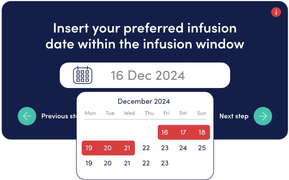

The feature allowed HCPs and patients to easily see their treatment windows and allowed for pre-defined time to be pencilled out avoiding mistakes.
Testing
At this stage we have a working wireframe we were happy with and so started to flow the branding in. We were part of the team understanding their fragmented brand by harmonising it and building their brand guidelines so to flow their brand styling into the UI was an easy lift. As we did so we incrementally tested pages with our UT base to make sure everything flowed in as normal.
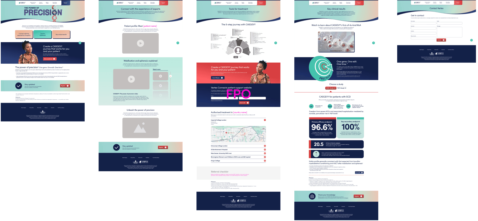

At this stage we have a working wireframe we were happy with and so started to flow the branding in. We were part of the team understanding their fragmented brand by harmonising it and building their brand guidelines so to flow their brand styling into the UI was an easy lift.
Review responses
Initial roll-out to HCP testers and internal medical practitioners was mostly positive with a strong understanding of the goals. Some copy was changed based on signatory feedback but mostly legal terminology.
Next steps
Vertex IHQ is still under testing. Initial responses were positive with HCPs praising a solution outside of traditional paperwork and flow with patients.
Define
What collaborative treatment plans work outside of direct competition
We interviewed 4 Vertex KAMs, consultants and patients to help drive down into what experience would allow Vertex to not only be the chosen treatment plan, but to offer tools that make the experience beneficial over the competition.
Expected outcomes:
Little to no digital support for consultants
Patient stress due to paperwork load
Interference in general and social life
Ananlysing user interviews
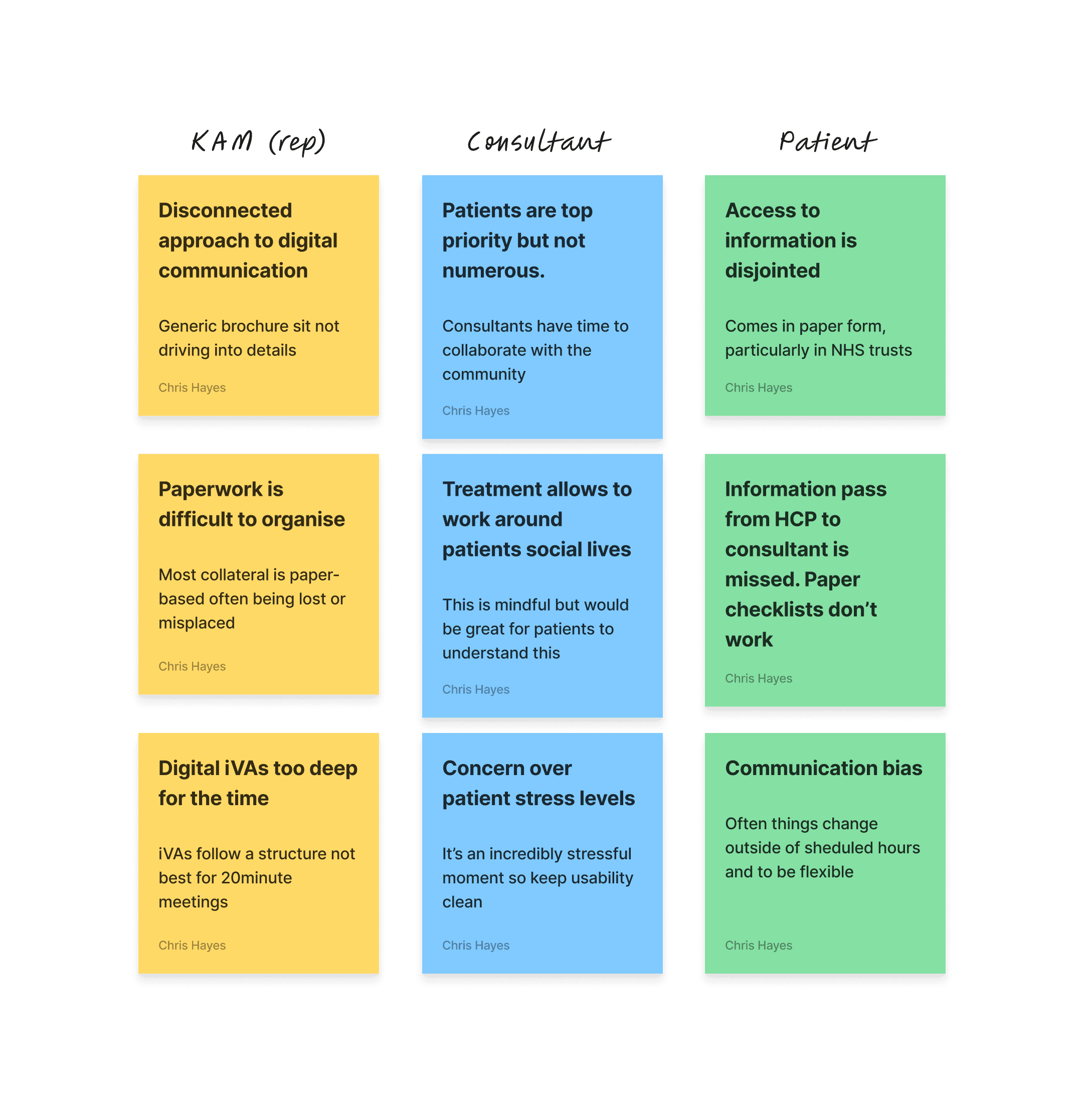

Affinity mapping
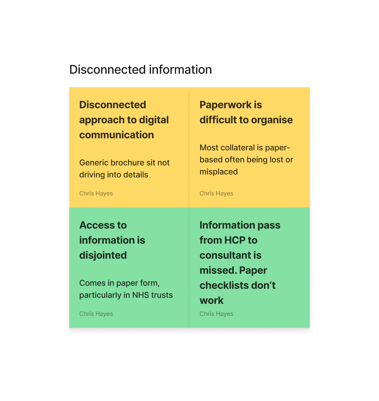

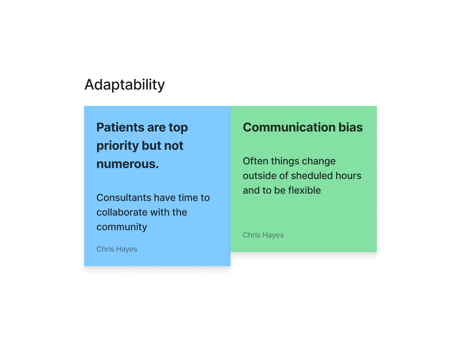

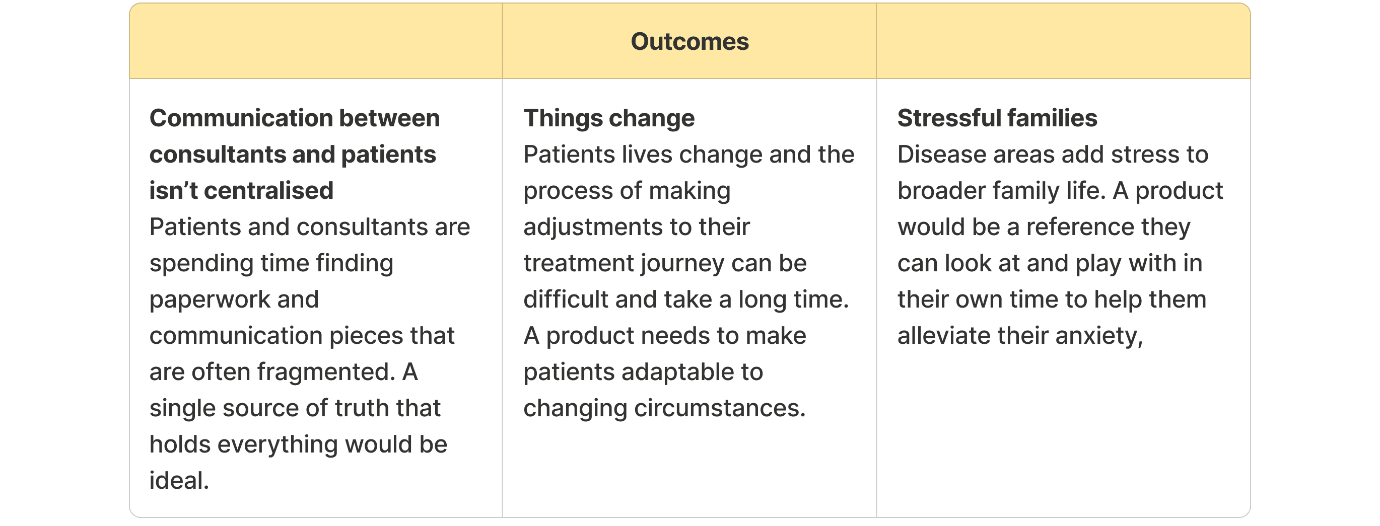

Direct insights from the Vertex team


Ideate
Brainstorming Ideas
Using my insights I started brainstorming ideas. I know Vertex are keen to see new technologies implemented into the site to help give HCPs and consultants more flexibility to plan with patient plans, but we are on a tight timeline to build an implement. The ideation is done in 2 phases:
Core page information like safety data, product information, patient portals and contact to REPs are key. We need to understand a key feature that allows HCPs and patients to interact with their treatment plan.
AI knowedge bots can help digest the vast amount of information available and answer questions quicker.
Ananlysing user interviews

Aligning to project goals
Lets align the proposal to the broader project goals

Site map
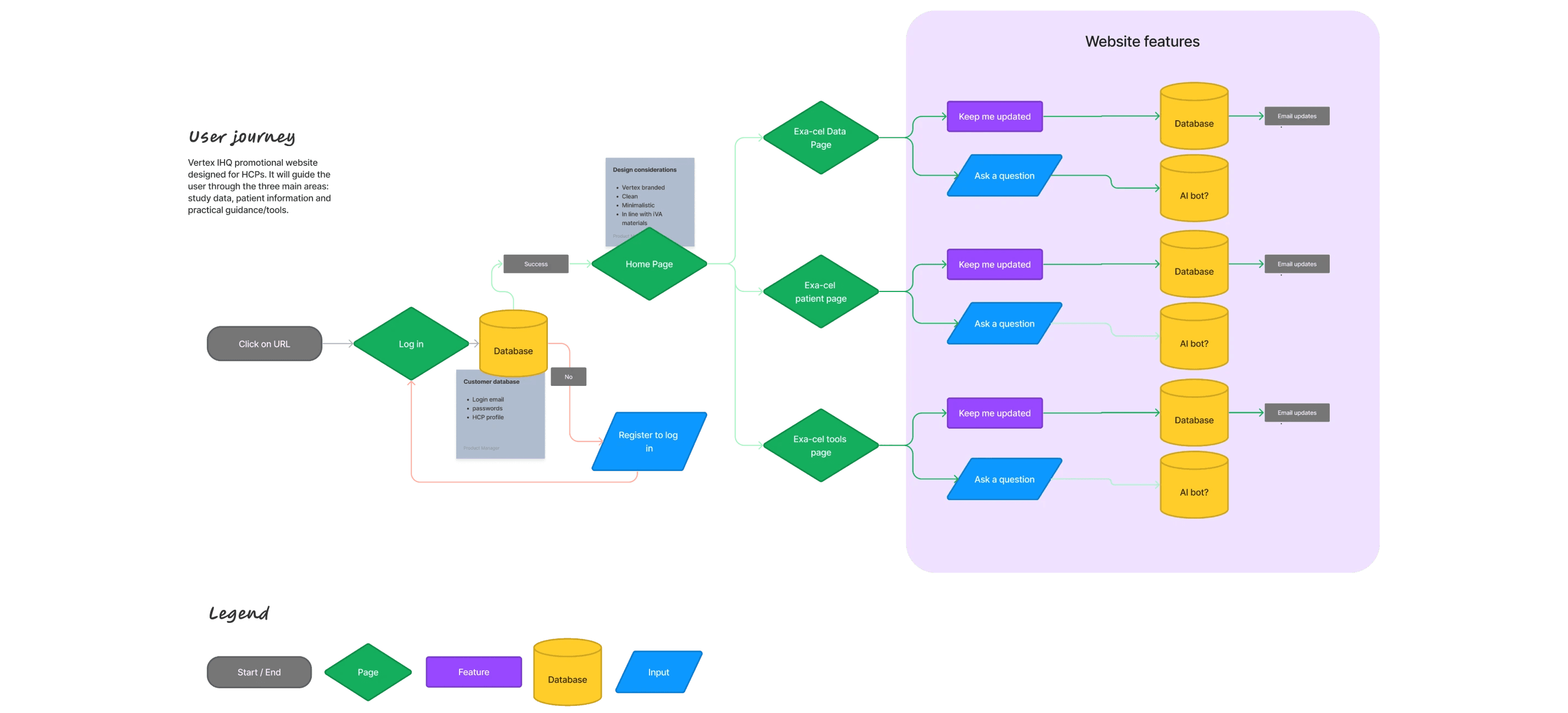
Using the features above, lets look at a basic site map


Wireframing
Usability testing on previous Vertex products gave us insights that desktop is a the most common device this will be accessed from mostly due to working from an office. Patients, however will most likely use mobile to view information as a receiver. For this we have ideated a simple rule.
Mobile-first is easier to scale up, and a key goal is to alleviate stress on the patients.
We want to minimise visual overload by settting a visual heirarchy, particularly in medical copy which can be expansive.

Testing
Initial wireframes are testing using Preely to see how users navigate the site. We have 2 primary criterea to benchmark:
East of navigation to Planner
Digestability of safety studies
I A/B testing three variations, benchmarking dwell time, reduction of clicks and ease experience. Two main pieces of feedback from HCP users:
Copy is too promotional in it’s tone
Patient journey mapping doesn’t align with regulatory concerns.


Prototype
Initial wireframes are testing using Preely to see how users navigate the site. We have 2 primary criteria to benchmark:
East of navigation to Planner
Digestibility of safety studies
A/B testing three variations, benchmarking dwell time, reduction of clicks and ease experience.
Refining the experience
After rounds of A/B and user testing we refined the concept down to the following points
Less is more Copy is overly promotional and HCPs want more data. This is a heavy lift from the client-side as the project is first and foremost a promotional endeavour.
Fewer clicks Dwell time and side-questing was too high for the batch of UT’s assigned for treatment planner.
Treatment planner
A key area of the site was a treatment planner. At this stage we were provided with a working prototype Vertex had done in-house that they launched at a HCP testing event some months before.
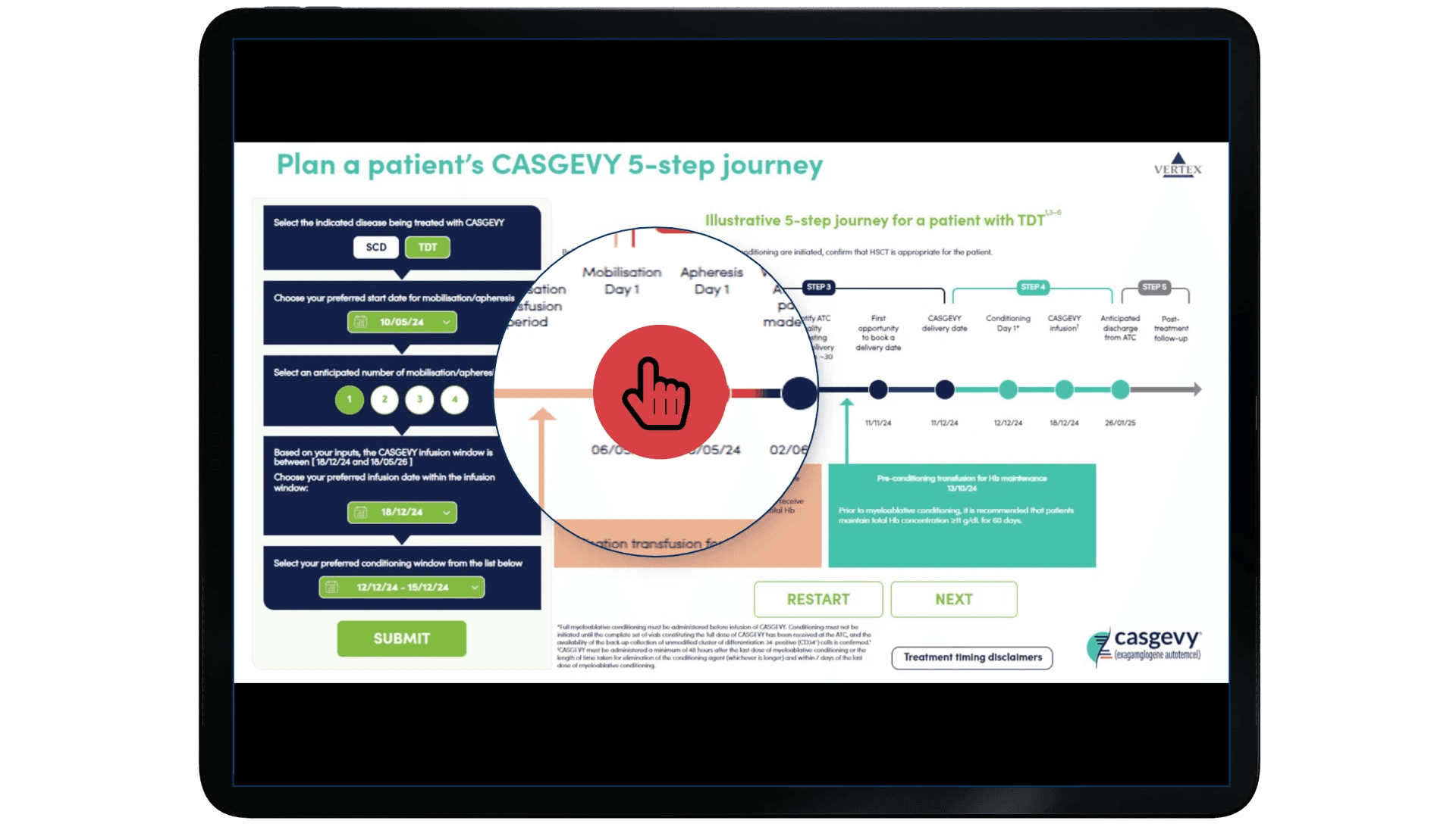

At this stage we were sensitive to the clients pre-vetted solution but after testing this on a browser it was a bit difficult to understand the flow of information but it did have 1 good value.
+ Information was live and allowed you to change your parameters for different results
- Interface was clunky and not very intuative for a patient who wouldn’t understand many of the terms
We workshopped a solution with the client to find a good webapp-friendly solution.
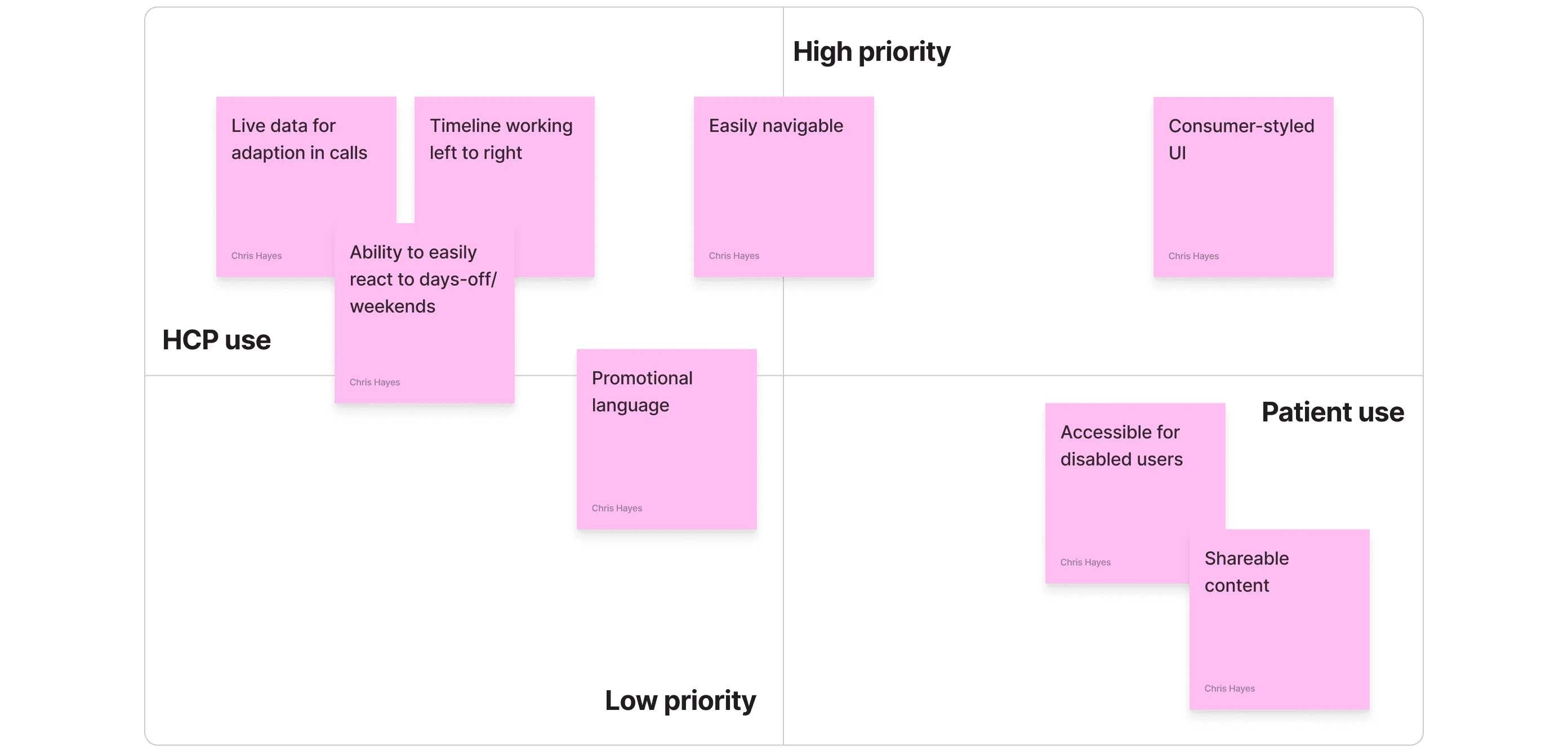

Looking around to found two examples in the workshop that we could use to test ideas with the group.


Based on the workshop findings we were able to conceptualise a treatment planner that would work with patients and HCPs.


Moving a key goal to a feature


When hovering over a selected date, the traditional 3-day treatment window will cover the selected dates, but when moved over a weekend.

Weekday

Weekend


The feature allowed HCPs and patients to easily see their treatment windows and allowed for pre-defined time to be pencilled out avoiding mistakes.
Testing
At this stage we have a working wireframe we were happy with and so started to flow the branding in. We were part of the team understanding their fragmented brand by harmonising it and building their brand guidelines so to flow their brand styling into the UI was an easy lift. As we did so we incrementally tested pages with our UT base to make sure everything flowed in as normal.

At this stage we have a working wireframe we were happy with and so started to flow the branding in. We were part of the team understanding their fragmented brand by harmonising it and building their brand guidelines so to flow their brand styling into the UI was an easy lift.
Review responses
Initial roll-out to HCP testers and internal medical practitioners was mostly positive with a strong understanding of the goals. Some copy was changed based on signatory feedback but mostly legal terminology.
Next steps
Vertex IHQ is still under testing. Initial responses were positive with HCPs praising a solution outside of traditional paperwork and flow with patients.